
The Reptile - Poster
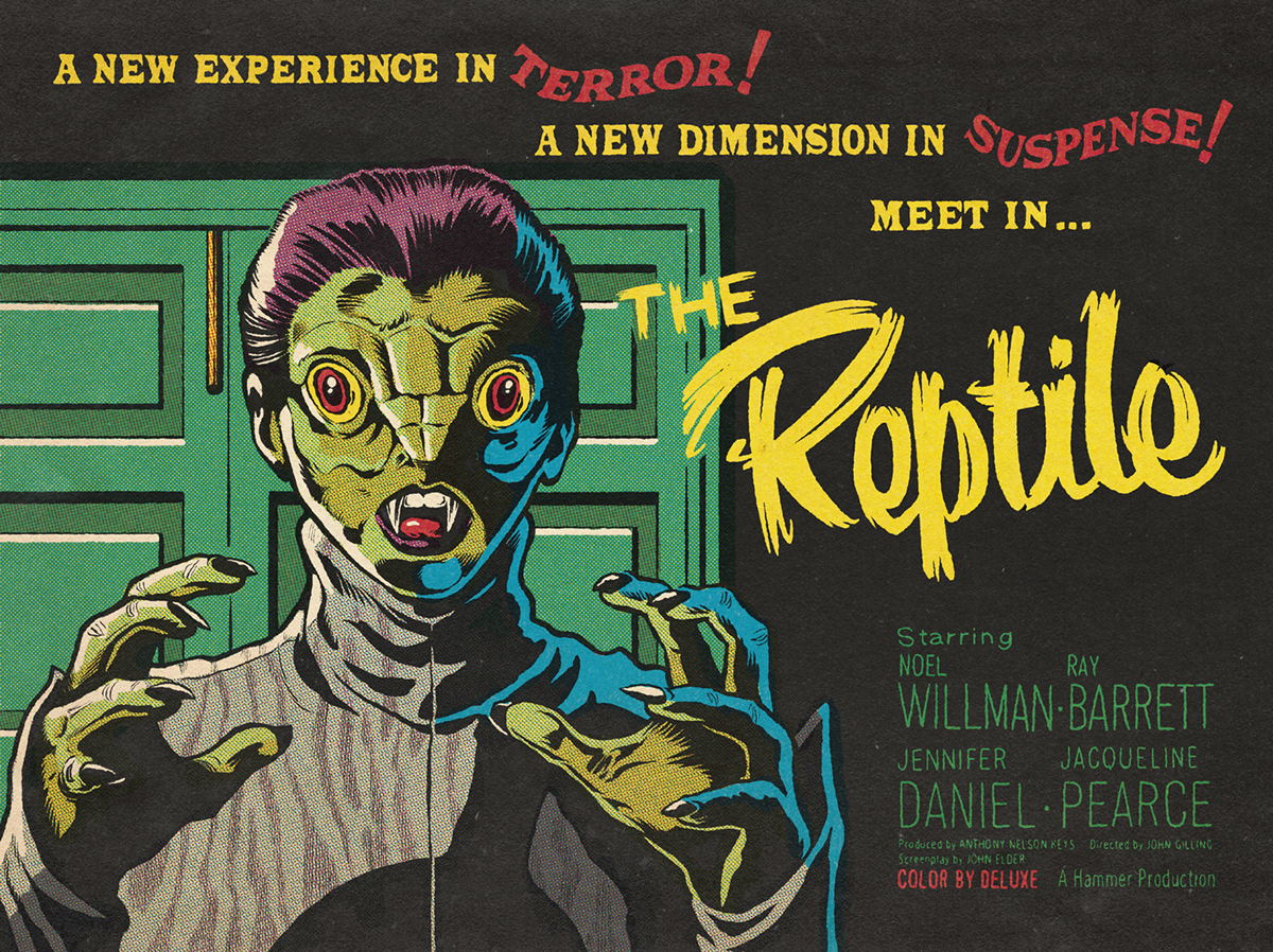
Hammer flicks are great, and maybe this is not one of the best. The movie has its flaws and maybe has a bit of "foreign danger" smell, but the monster is very original and the ambience is superb... reason enough for doing some artwork based on it!
Creative process


When I do a poster based on a movie, and begin all the documentation process I always choose the images than had more impact on me and I want to cause the same feeling to the viewer. Also it has to be something amusing to draw. The next step is do various rough sketches until I find what I want.


Also I make some research of the original art. They were true masters and you can learn a lot of things like format, compositions, colors, lettering, etc, and it's a great help on setting the blurry images that I have in my head. Sometimes all the brainstorming process happens on the progress as some kind of... let's call it... "unorganized order".


When I have the sketch of the composition I put my attention in designing the lettering. Following the documentation process I liked more the credits of the British trailer than the ones of the movie and I decided to use them for the poster. Then I begin my favorite part: the inking process.

Working with digital tools is very comfortable and makes things very easy because it allows to move, erase or adjust many stuff in your design. I love to get my hands dirty sometimes, but nowadays saving time commands all that we do!

This time, for the coloring process I used an amazing tool: the "True Grit Texture Supply". All the halftone coloring is based in the same way that was done in the past, also you have the option of distress your ink line and the paper textures are very neat. It was like playing video games with cheats and no one noticing it.
(Note: This was just an example, don't do this at home!)

Thanks for watching!


