Jimmy Cycles is not only a bike and accessories shop, but, first and foremost, it is customer service and a custom-made and professional experience provided for the customers.
In order to represent it at best in his shop but also in his brand identity, Jimmy Cycles asked Twodesigners to develop a strong and unique corporate identity.

The first challenge initiated by Jimmy Cycles was to convey through the brand image a story. Indeed, it is not enough anymore to sell the right product at the right place to satisfy the customers. They are constantly looking for stimulations and new experiences.
Therefore, it should tell a powerful and deep story, tell “Who is really Jimmy ?”.
Starting from this basis, Twodesigners created a modern and refreshing graphic universe. The team wanted to personify « Jimmy » and to create the image of a sympathetic and professional seller.
It allows us to create a global image of a sales service close to the customer and whose expertise and experience is not to be proven.
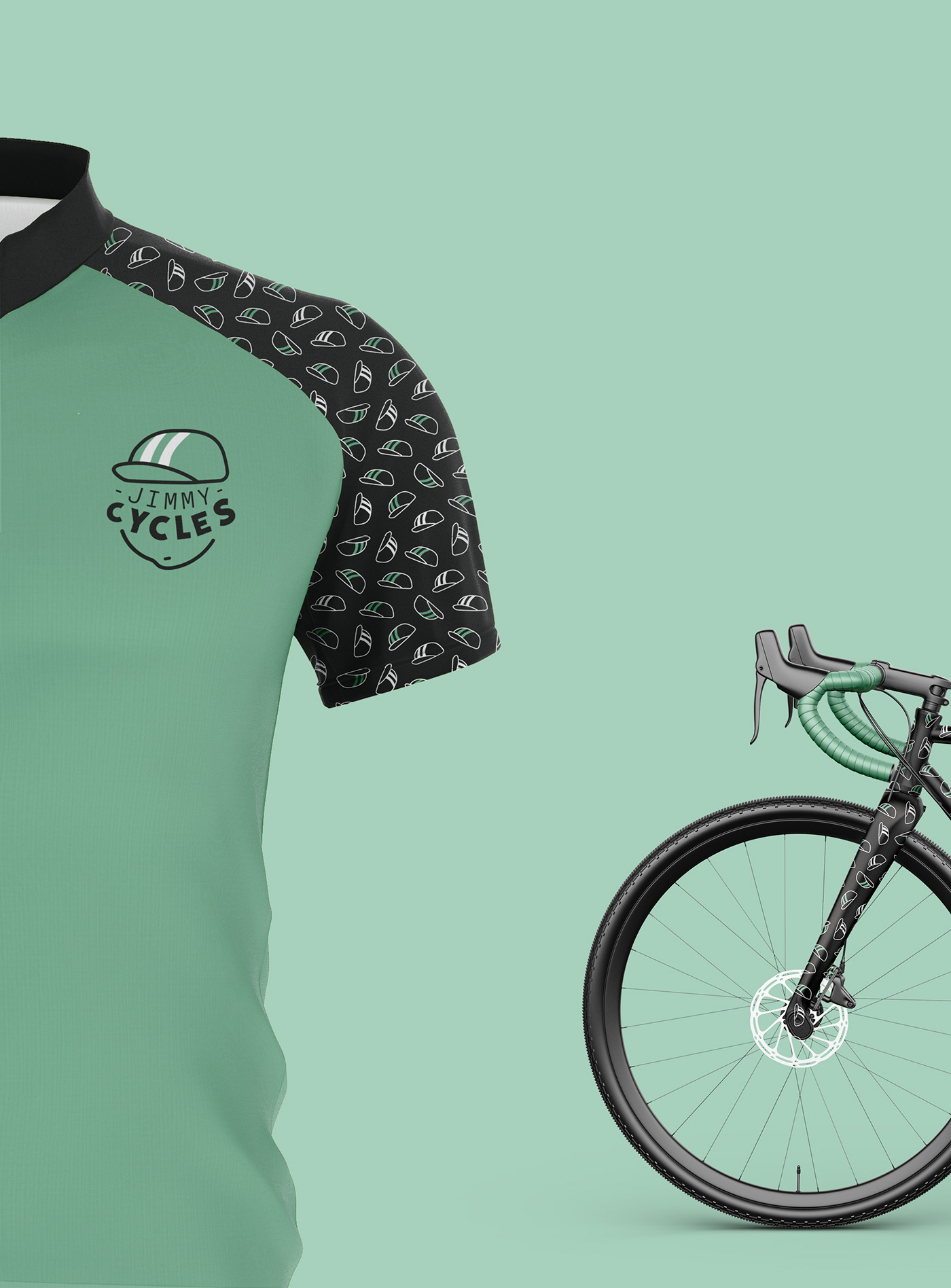
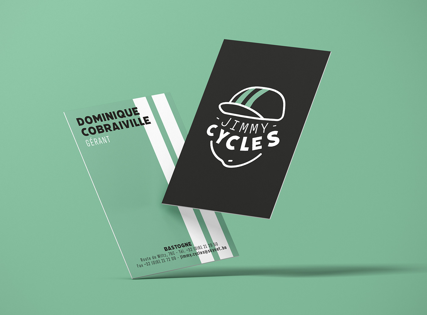
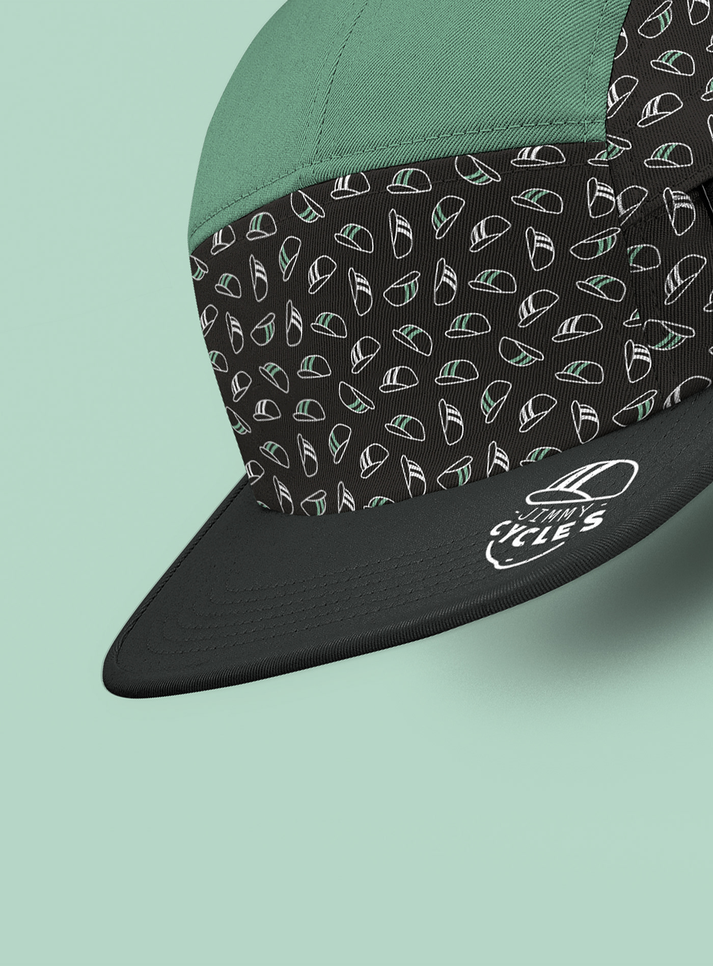
The graphic inspirations used for the creation of the character are related to the comic book for the global trait, and to the retro, as shown by the old school cyclist’s cap on the logo.
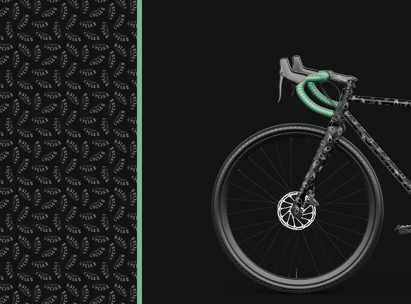
The prevailing colours in corporate identity are black and green with a white touch. The shade of green used brings a pop touch and softens the black colour. This colour blend can also be found in the store layout designed by Twodesigners’ team.
The second challenge was to modernise the different supports used. With its derivative products, Twodesigners imagined a graphic identity with modern and varied mockups, an identity that will persist outside of the shop. The use of these derivatives is in line with the idea of personifying Jimmy Cycles

