Sancré Lanches
• Rebrand
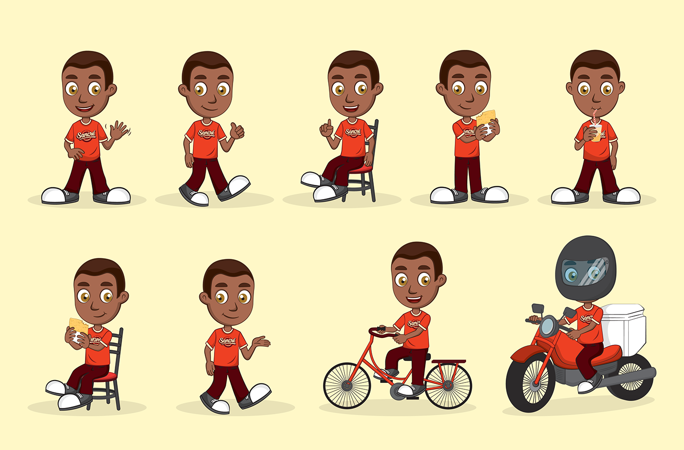
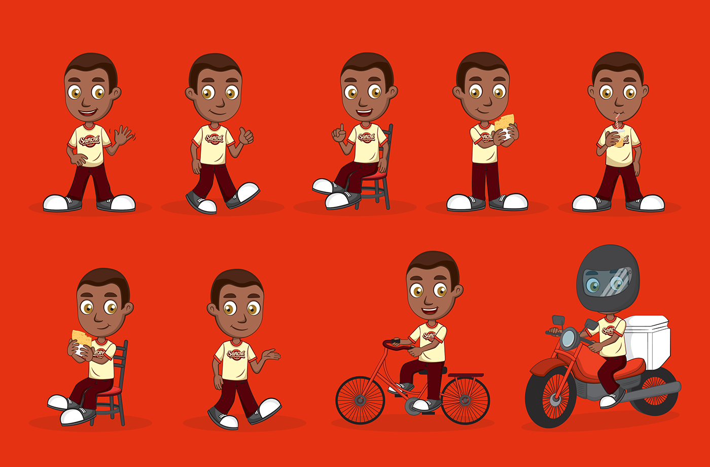
• Mascote
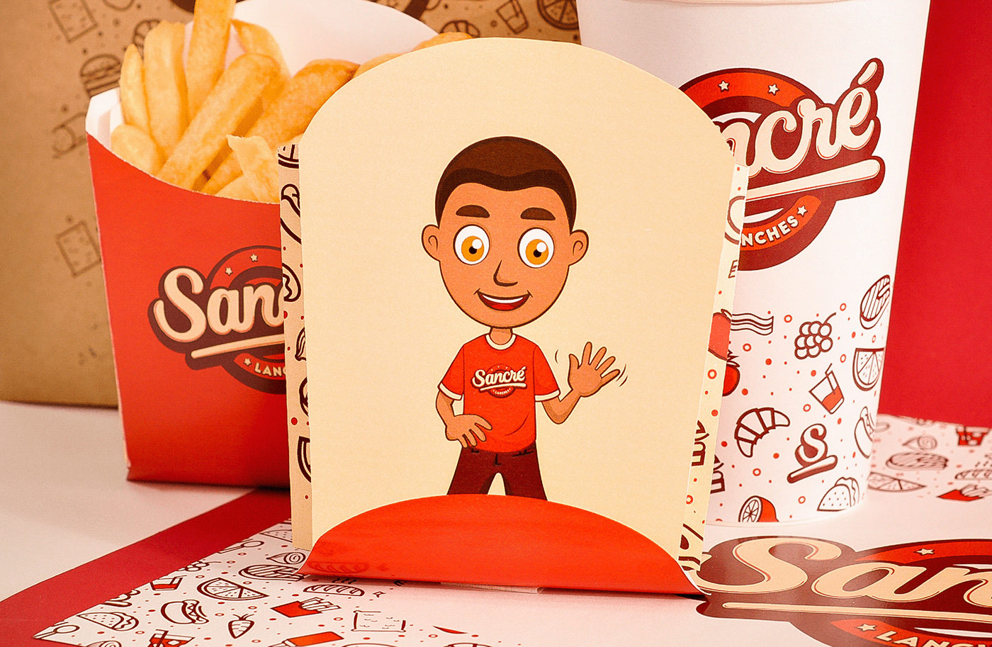
• Embalagens
| 2018
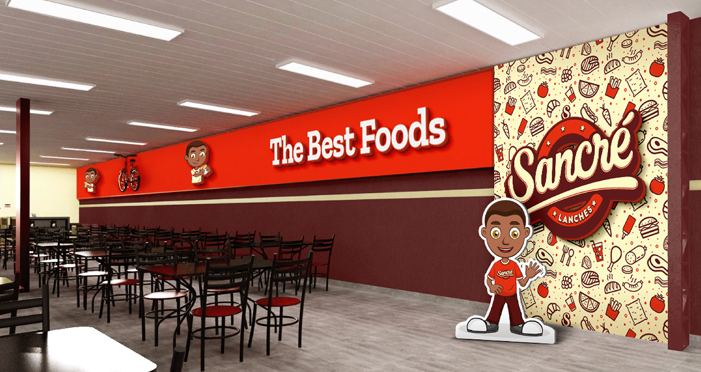
Ambiente agradável para comer com qualidade e aproveitar momentos com a família e amigos. Esse é o DNA da marca Sancré. Com base nisso buscamos representar simpatia e autenticidade na comunicação visual. Sem perder o aspecto de lanchonete fast food.
Ambientar a marca foi a base para que a assimilação do produto fosse feita de forma instantânea. E a definição das cores é primordial nesse quesito. As cores tem grande força em transmitir sensações e por isso devem ser analisadas com sensato cuidado. Para tanto buscamos equilibrar laranja bem vibrante com um amarelo leve e suave.
Ambientar a marca foi a base para que a assimilação do produto fosse feita de forma instantânea. E a definição das cores é primordial nesse quesito. As cores tem grande força em transmitir sensações e por isso devem ser analisadas com sensato cuidado. Para tanto buscamos equilibrar laranja bem vibrante com um amarelo leve e suave.
Pesquisa: Thayane Castanho
Direção Criativa / Design: Leonardo Juliano
Direção de Arte: Leonardo Juliano, Thayane Castanho
Ilustrações: Cynthia Seikiguchi
___
Pleasant environment to eat with quality and enjoy moments with family and friends. This is the DNA of the Sancré brand. Based on this, we seek to represent sympathy and authenticity in visual communication. Without losing the aspect of fast food.
Setting the brand was the basis for the assimilation of the product to be done instantly. And the definition of colors is paramount in this regard. The colors have great strength in transmitting sensations and therefore they must be analyzed with reasonable care. Therefore, we seek to balance a very vibrant orange with a light and soft yellow.