

DGD 275 Vector Illustration Design
(Visual Appearance Hierarchy)

This project was to work to demonstrate knowledge of visual appearance hierarchy through compound shape building structure.
The task was to create an 11x17 travel poster using Adobe Illustrator. The poster had to promote a city, park, or region of the country. Had to use at least 3 of the 4 compound shape modes (unite, minus front, intersect, and exclude) to create complex shapes. The poster had to be created using vector illustration and text only. The photograph used could only be a reference and not part of the end result.
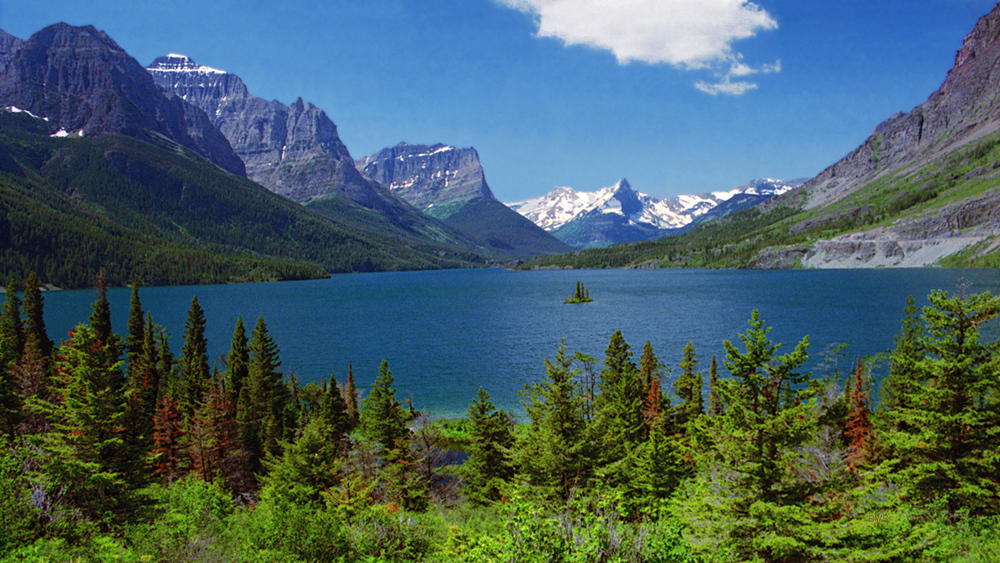
When deciding what I wanted the poster to be, I wanted to find a location that would catch someone’s eye. I have been to Montana and remembered that the Glacier National Park was a place that seemed to stand the test of time, like it was frozen in time.

I started the illustration of the photograph by placing the image in a manner that it would appear that the island was centered in the photograph.

Then I was able to determining what were the bigger items that I could get on the page first. These were the sky and the lake, then the mountains, then the tree lines.
For the sky and the lake I used the square shape tool and a gradient fill for each.
For the left mountain side, I used the square shape and the triangle shape. I combined the two and then used the pen tool to create the outline of the shape that I wanted to remove and then used the path tool to minus the unwanted portion. I used the gradient tool so that the highlight of the mountainside would work well.
For the white mountain caps I used a square shape and triangles to create the main white shape. Then used the pen tool to select the shape that I did not want again. Then I used the pen tool to create the shadows for the white caps.
For the trees on the far side of the lake I used the circle shape and then the unite tool. In order to show more depth in the front, used the gradient tool for the trees and grass. This way there was a layering effect.

Then I found the vector logo for the national parks and added that to the poster. I found the website for the National Park Services and Glacier National Park in Montana (https://www.nps.gov/glac/index.htm).
For the Headline of the poster, I found a font that I liked, however, there were a few things that did not like about the font. Therefore, I converted the headline to outlines, I used the direct selection tool and the curvature tool to change the font. The font was a script font, and I did not want the script swoops in the font.
Final project

Mockup Provided by: https://www.free-mockup.com/downloads/free-poster-display-with-flyers-mockup/
Photograph of Glacier National Park obtained.at:


