PROJECT BY SNASK
Spotify Dok - Branding & Visual Identity
BACKGROUND:
Spotify Dok is a new podcast brand launched by Spotify Sweden that aims to be the go-to destination for documentaries that lie at the forefront of the podcast world. It’s unscripted content will hold the strongest, most captivating stories in Sweden, leaving no listener untouched. It will be the flagship for stories that are either untold or never told like this before.
CASE:
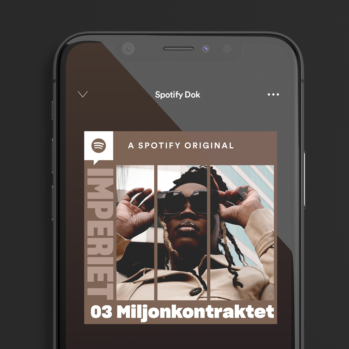
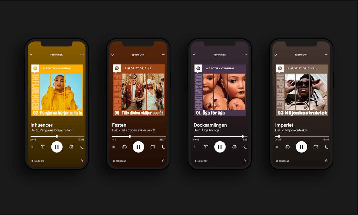
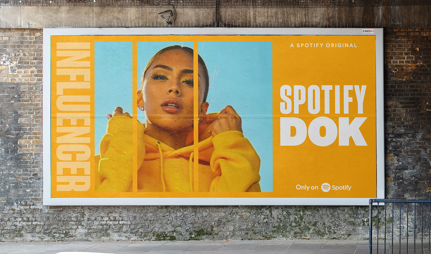
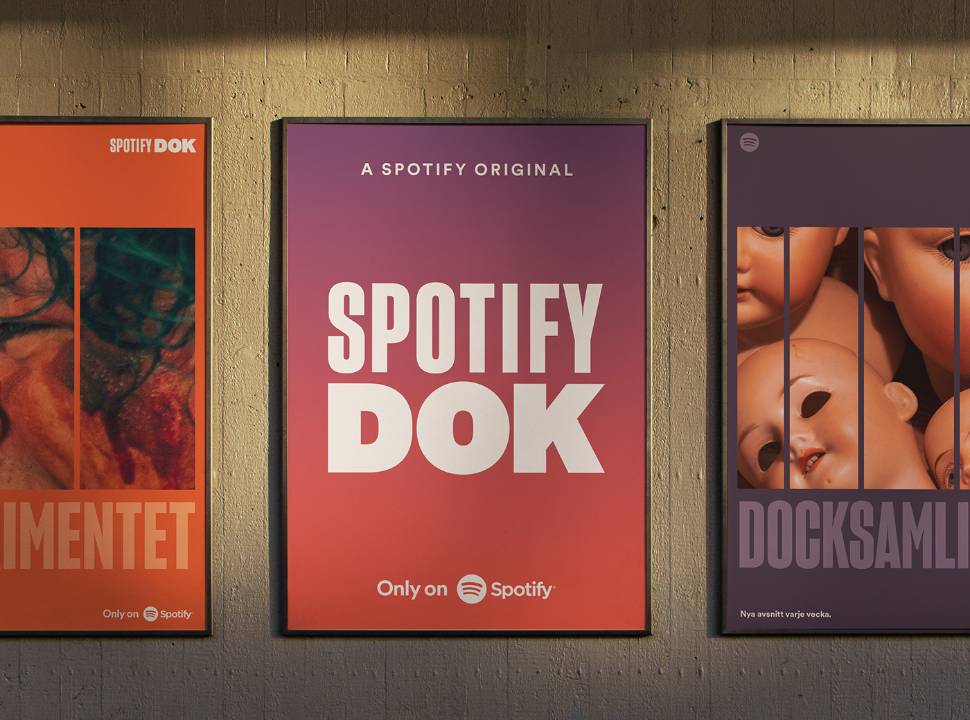
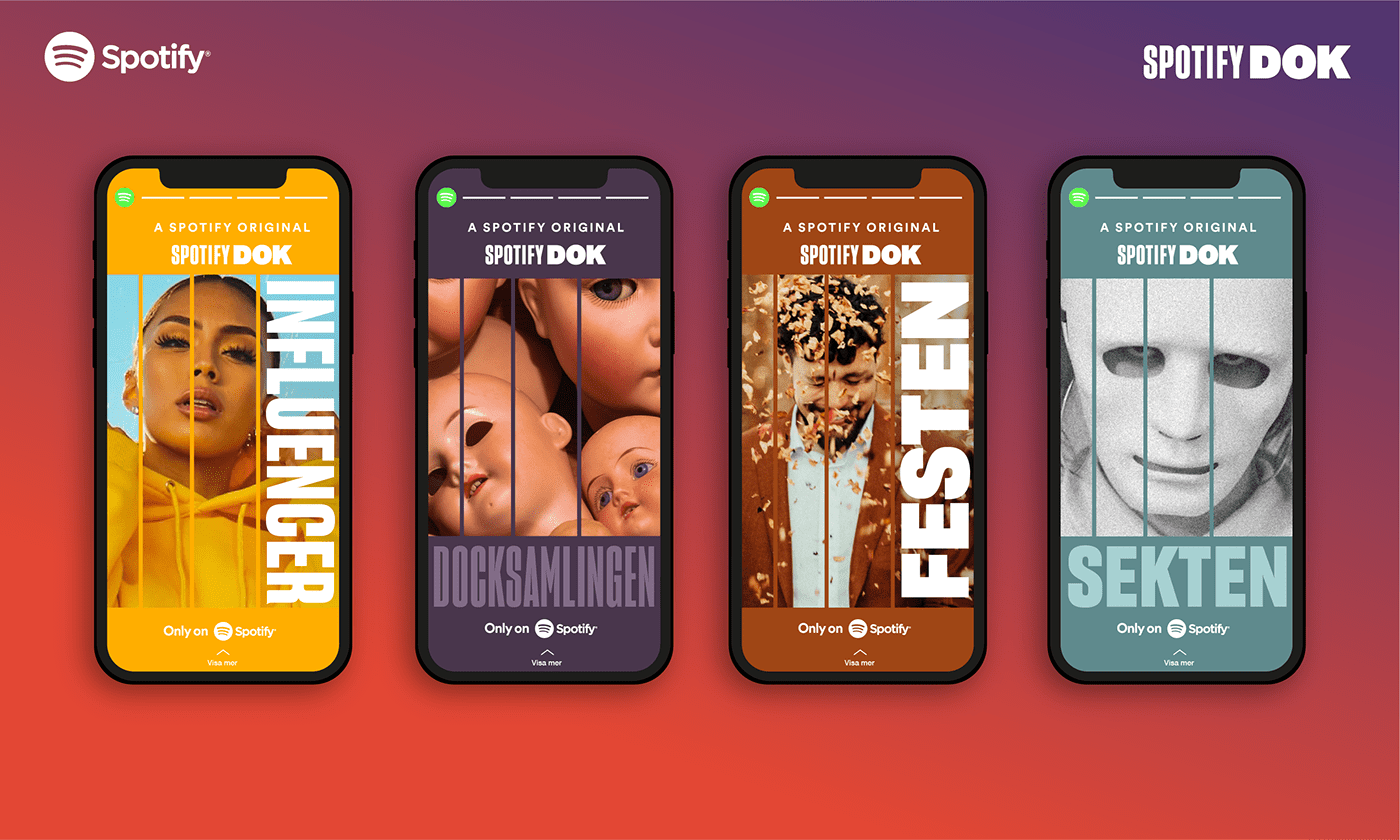
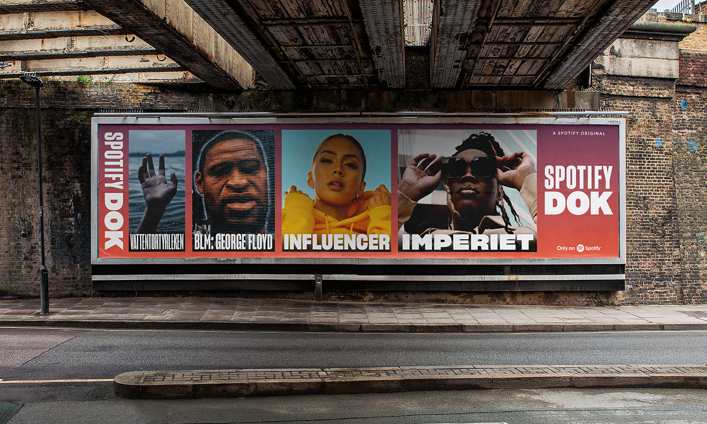
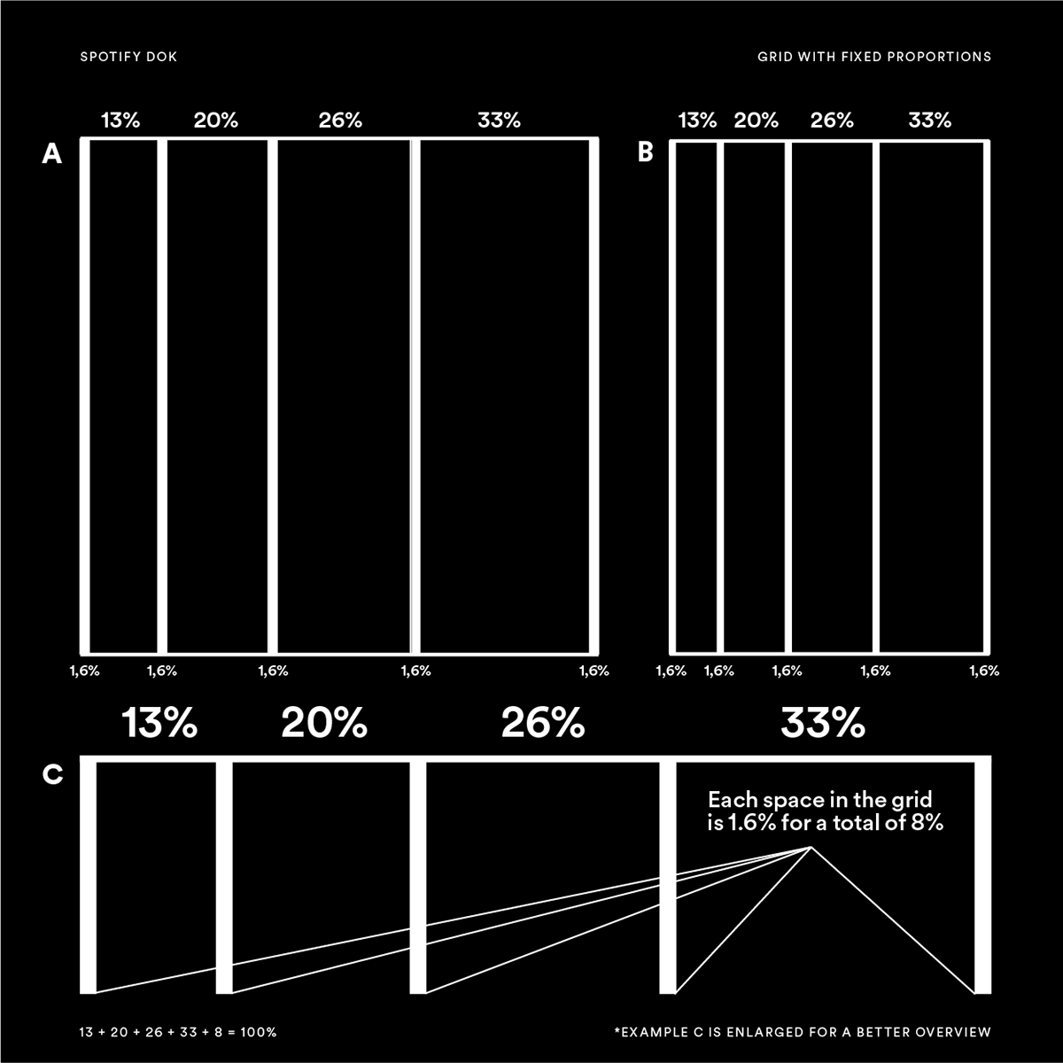
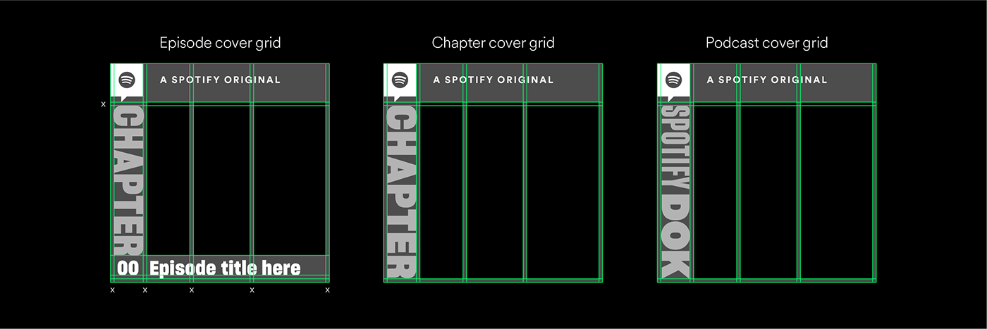
Like most stories, the documentaries told under the Spotify Dok brand tells a story from beginning to end—not necessarily in that order—but ultimately you have to listen to all the episodes to get the whole picture. This inspired us to create a grid that divides the hero image of the documentary into three to four sections, as a metaphor for giving the whole picture, episode by episode. The covers are always split in three sections as the first of the four sections is used for either the Chapter Name or the Spotify Dok logotype, depending if it's for the Chapter Cover, Episode Cover or Podcast Cover.
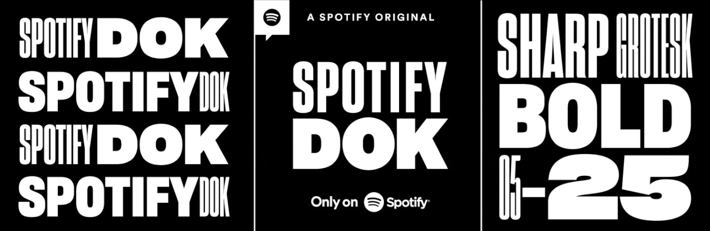
One of the big challenges was to fit all the content on the cover as each Episode Cover would hold the title of the Chapter, the Episode title and Spotify's Conversation icon along with the text ”A Spotify Original”, not to mention the actual image with the grid. Since the titles practically can be at any length, from super short to super long, and everything in between, we wanted flexibility. Sharp Grotesk Bold by Sharp Type gave us the opportunity to keep every title on a single line, without having to change the actual size of the font, as the typeface comes in 20 different widths (05–25). This means that the height will always remain the same and the only thing that will change is the width. Because of this the titles will vary a bit across the different documentaries (chapters) and together with having its own color and photo, the covers for each documentary will have a bit of uniqueness while still being recognized as a documentary under the Spotify Dok brand.


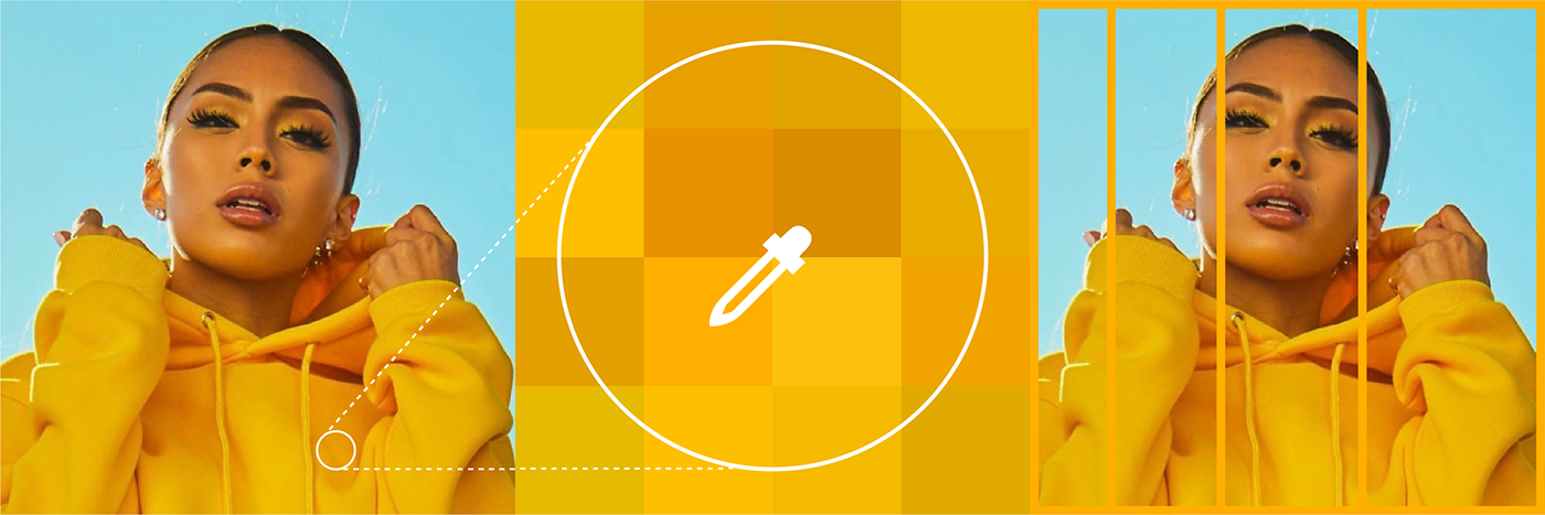
The color of a cover is determined by the image delivered by the producers of each documentary, as one simply pick a color in the photo that works well with the rest of the photo and the grid. To find a good matching color the best way is to pick at pixel level, or choose a color randomly and then adjust it manually. If the photo is black and white, there is a ready-made color palette that can be used. And when promoting several documentaries (chapters) at once, we use the red and purple Spotify Dok gradient.