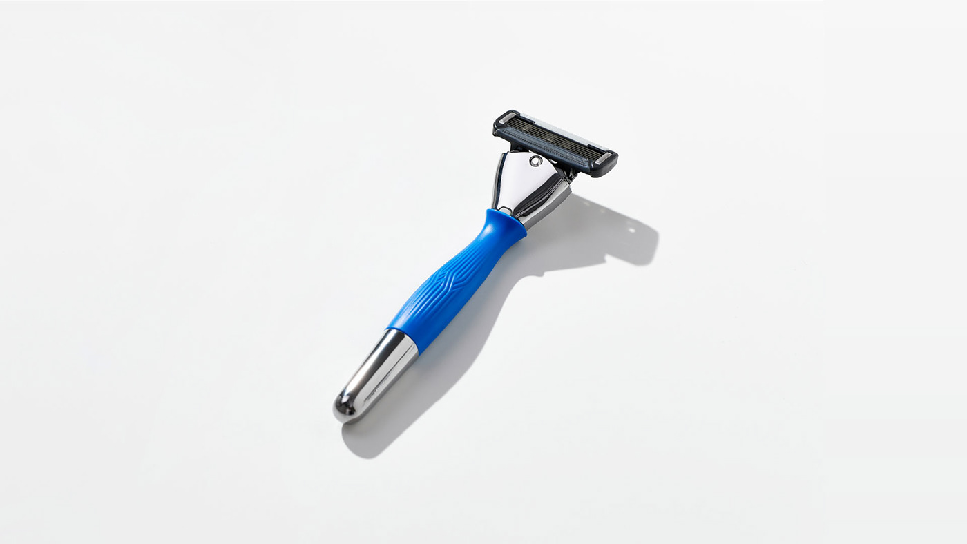
WISELY PRO
-
This is a WISELEY PRO launch design project that compensates for the shortcomings of the existing WISELEY SENS. It is a brand design project for razor blades, which symbolizes higher sharpness and softness, and was created after dozens of customer surveys. In order to show that PRO is a professional and improved product, the overall design concept is simple, but it emphasizes product-focused layout.


COLOR PALETTE
-
WISELEY's main color, blue, and visually intense navy blue, are used as the main color. Gray was used as a color to supplement blue and navy blue.


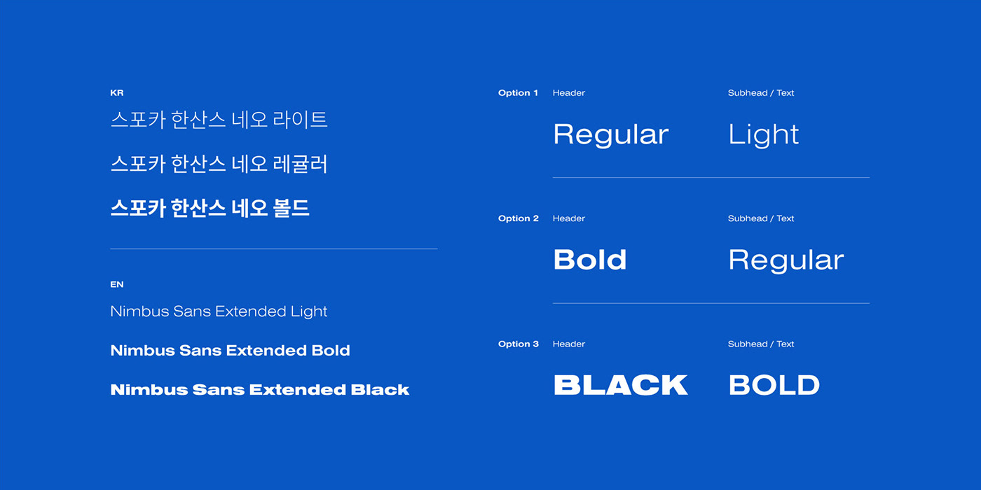
Typography&Layout
-
WISELY's used typeface has great significance in constructing a layout to focus on the product. Also, layout helps maintain brand uniformity by organizing a layout that allows us to focus on the product.It's applied to all materials to provide a consistent brand experience.
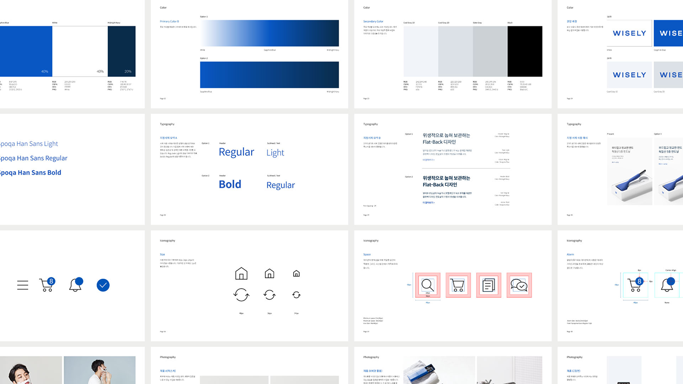


Icon&Illustration
-
Icons and illustrations maintain simplicity and clarity so that they can be used in all Wisely brands in all directions. Create graphics with minimal elements and avoid over-drawing.


Web&Mobile Experience
-
Configure a layout that allows you to focus on new and existing products. at the same time, Designed with the User eXperience in mind.


Image in use
-
Create images according to Weisley's brand guidelines.