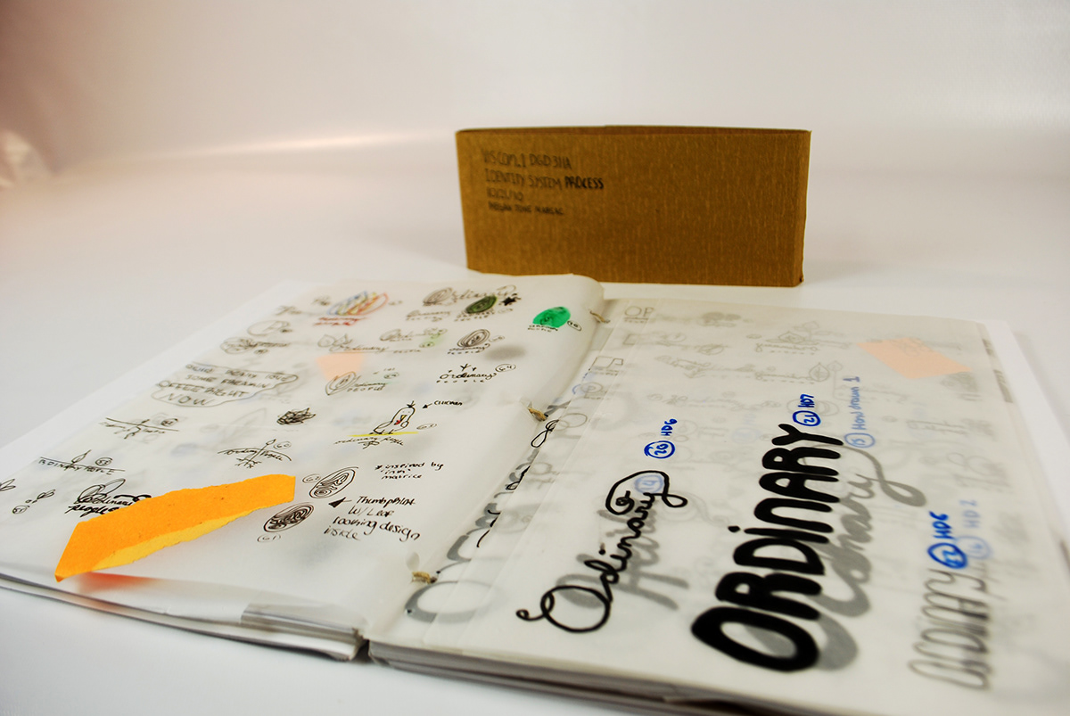
Ordinary people is a fictional non profit organization located in Detroit MI. The goal of OP is to shelter the homeless, and teach them how to farm in an urban setting. The group will then grow farms in the vacant areas of detroit and live off of the food they grow.
I created two different identity systems for the organization. My goal while designing these systems was to make an inexpensive, fun, and relatable system that would be simple to mass produce. I decided that the business cards would be made on found paper, or in other words, recycled paper. The letterheads were printed on an inexpensive material known as newsprint. The main part of the system is the letters OP (ordinary people) which is stamped in layers across the majority of the system. During my process I had read several books on the culture of the homeless, as well as urban farming, and one thing that both of these topics had in common were layers. I saw that there were layers in the social status’ of the men and women living on the street. There were layers of material in the abandoned houses the homeless would stay in for shelter if they had nowhere else to go. The very city that these people were homeless in was constructed of layers upon layers of pipes, drains, dirt, concrete, metal, architecture etc. I saw the theme of layers continue into the world of urban farming. Layers of dirt, seeds, and water is the combination to make the food that will feed the hungry grow. Layers were everywhere and I used that as my inspiration to make a stamp which would be stamped three times over, to represent all those layers. I chose the primary color theme for a couple reasons. When the three colors are layered on top of one another, they are not only legible, but they also create different colors in the places that they meet, which I felt represented the diversity among ordinary people. The idea was that OP could organize a night with the community in which everyone would be able to help stamp all of their letter heads, envelopes, and business cards. This was my solution to expensive printing and tedious stamping by one person, as well as a way to bring the community together, and spread the word about Ordinary People and the work they do.


