


G —
Spotahome
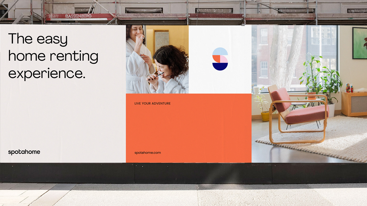
Live your adventure
The arrival of technology in the real estate sector has made it easier for us to search for a home, but the digitalisation and depersonalisation of services has made trust complex, with more and more small print, turning the whole process into a complicated and stressful experience.
It is in this environment that Spotahome was born, an online rental platform that acts as an intermediary between landlords and tenants, with the aim of changing the way things are done in the real estate sector.
Challenge
The challenge we faced was to reposition Spotahome with a differential proposal, in a mimetic market that bases its value on the same concepts. The opportunity to find a space that would help them become their customers' first choice.

Solution
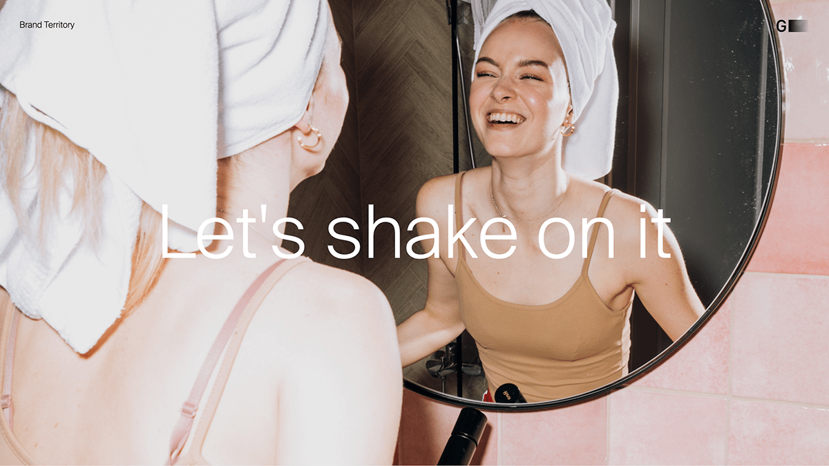
After a thorough analysis of the brand, internal and external, its competition, and its social and cultural situation, we created a positioning territory that would connect its value; its team and technology, with what really matters. Focusing on people, on gaining their trust so that they enjoy their experience, and on technology to achieve it; "Let's shake on it", a territory that comes to shake up the real estate sector.
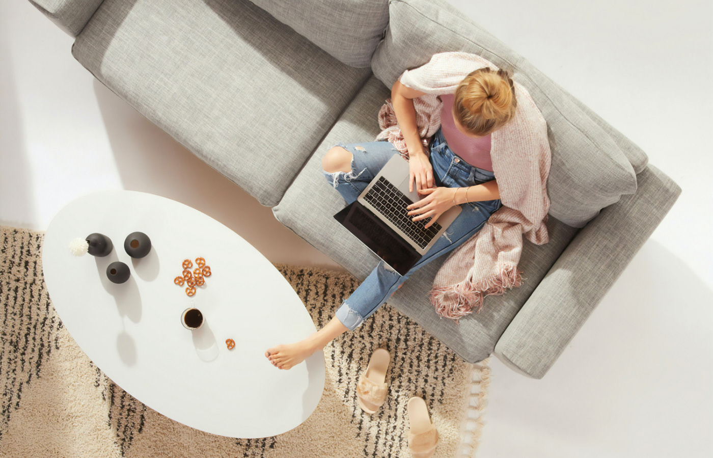
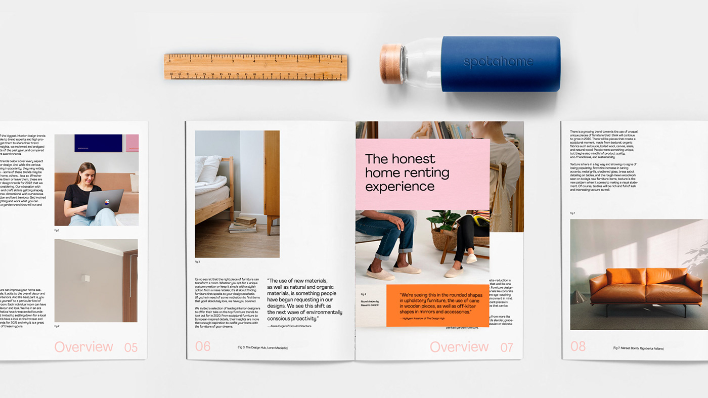
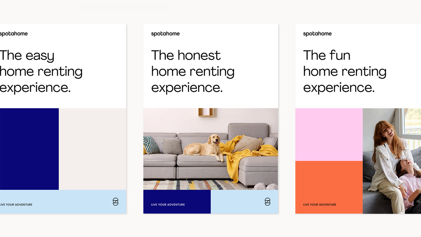
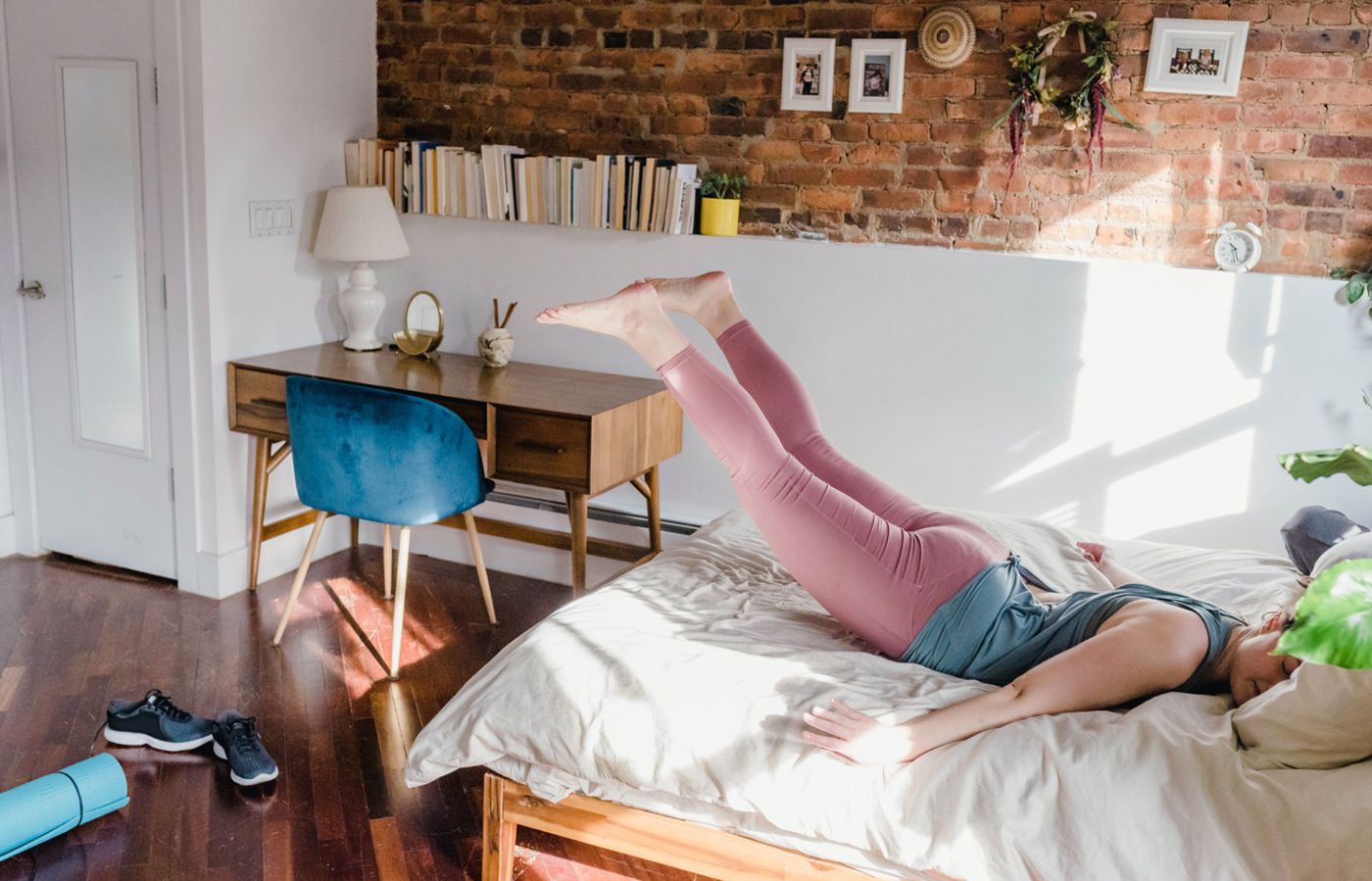
With the mission of consolidating the brand in this positioning territory, we created the value proposition "Live your adventure". Understanding home rentals for what they really are; an exciting, daring and decision-filled path to a new life... because moving a street in search of a bigger kitchen can be quite an adventure for those who live it.
This new perspective filled its name with meaning, it no longer existed only for "spota home", now you could; "spota new opportunity", "spota better place", "spota delicious kitchen", "spotan adventure" ... This gave a reason to be to its name, giving it depth and helping its memorisation, connecting it beyond the descriptor.
Spotahome went from being an online rental platform to the new home rental experience; reliable, easy, and clear, driven by goodwill and powered by technology.


Visual Identity
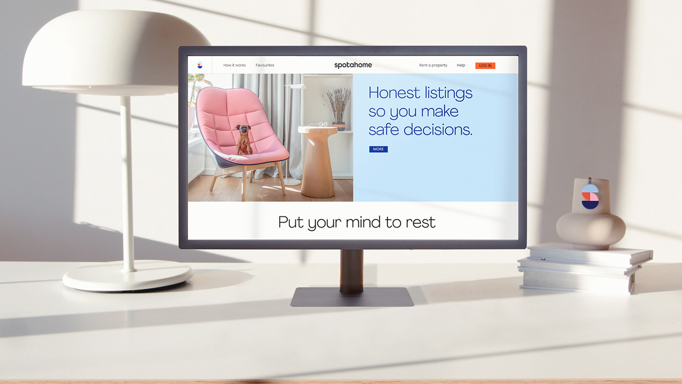
Spotahome's redesign has revolved around their values; reflecting the clarity, honesty, and fun they want to bring to those looking for their new home and moving on to a new life, to the next box.
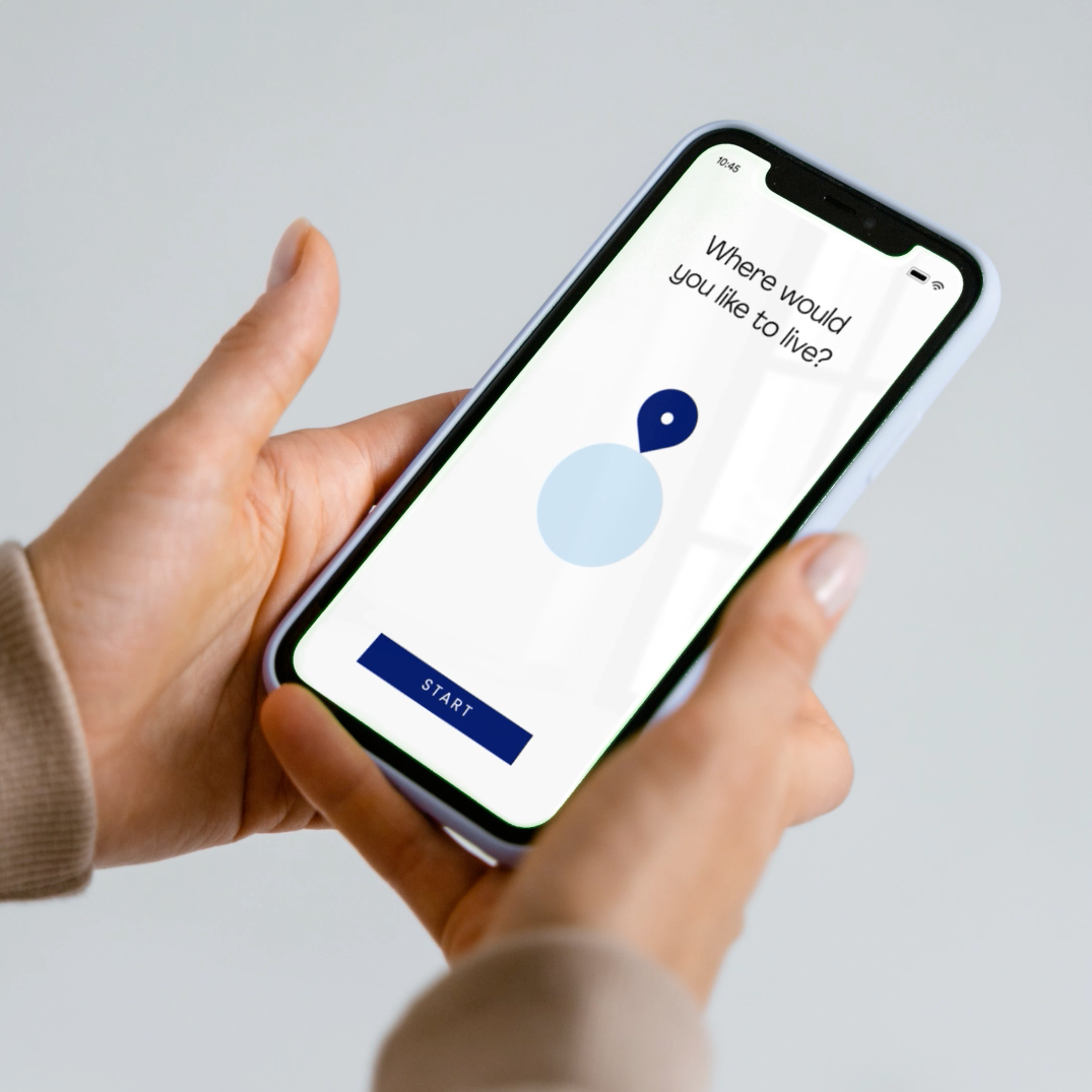
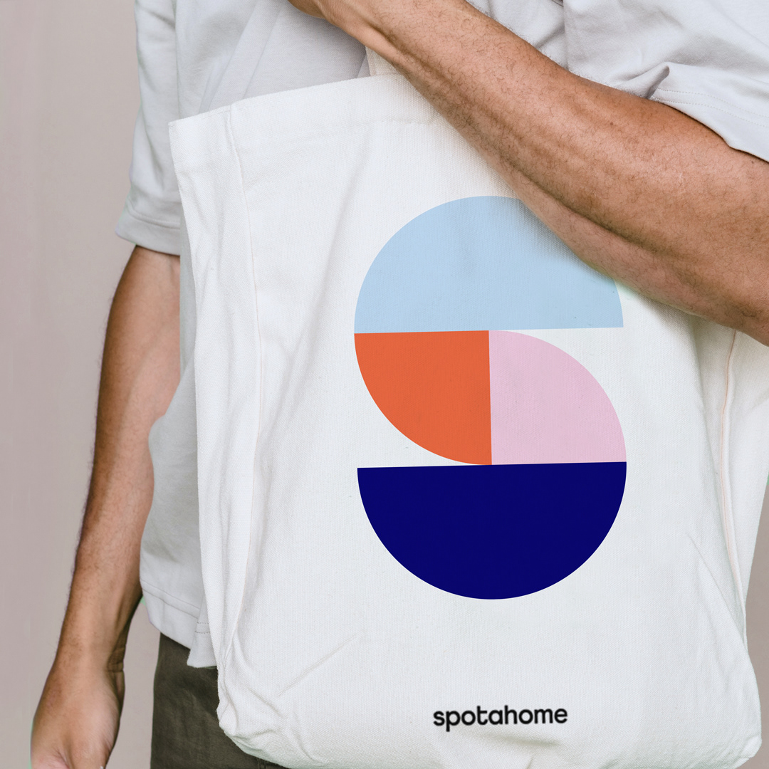
This idea of the box is reflected in the symbol that forms the logo, as a road to travel towards a new place to live. The symbol is also the abstraction of the rooms of a house from a zenithal view. Spaces of opportunities and new experiences to live.
The new design system is inspired by the logo. Generating solid spaces in which every asset is empowered, in a clear, honest, and fun way, maximizing brand recognition and ownership at all touch points.
The colour palette celebrates diversity. Composed of five main colours that combine to create a dynamic and contemporary aesthetic. The colour palette is accompanied by the choice of typography and the creation of illustrations composed of simple shapes, clean lines, and colour. This creates a new visual language for Spotahome that is simple, clear, and approachable.


somosgravita.com
G —


