


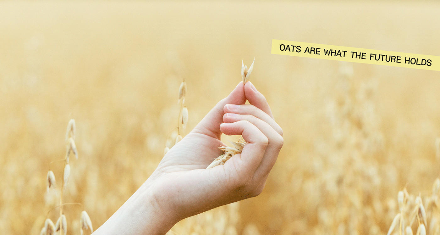
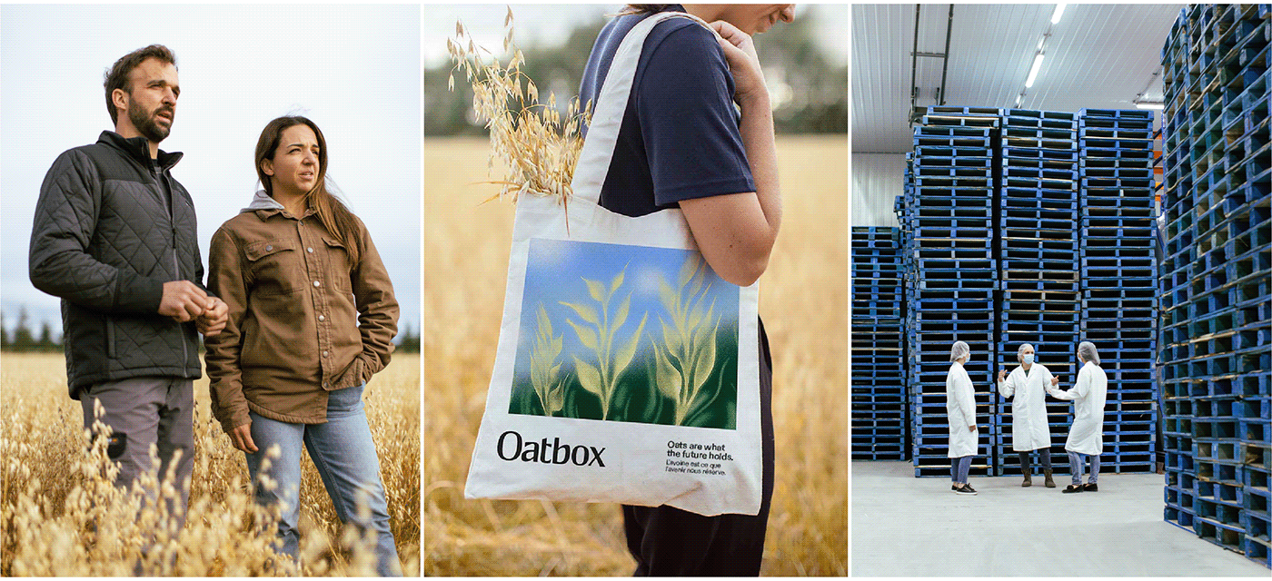
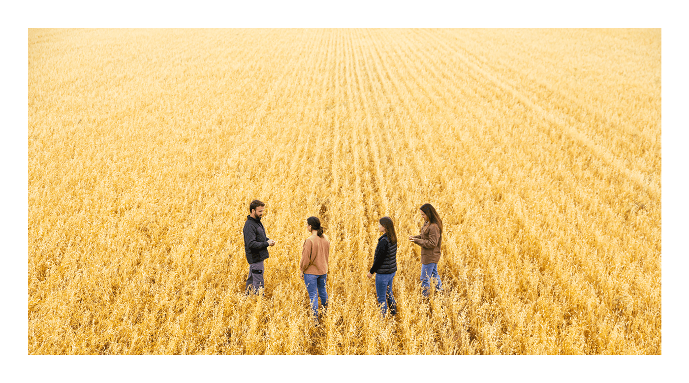
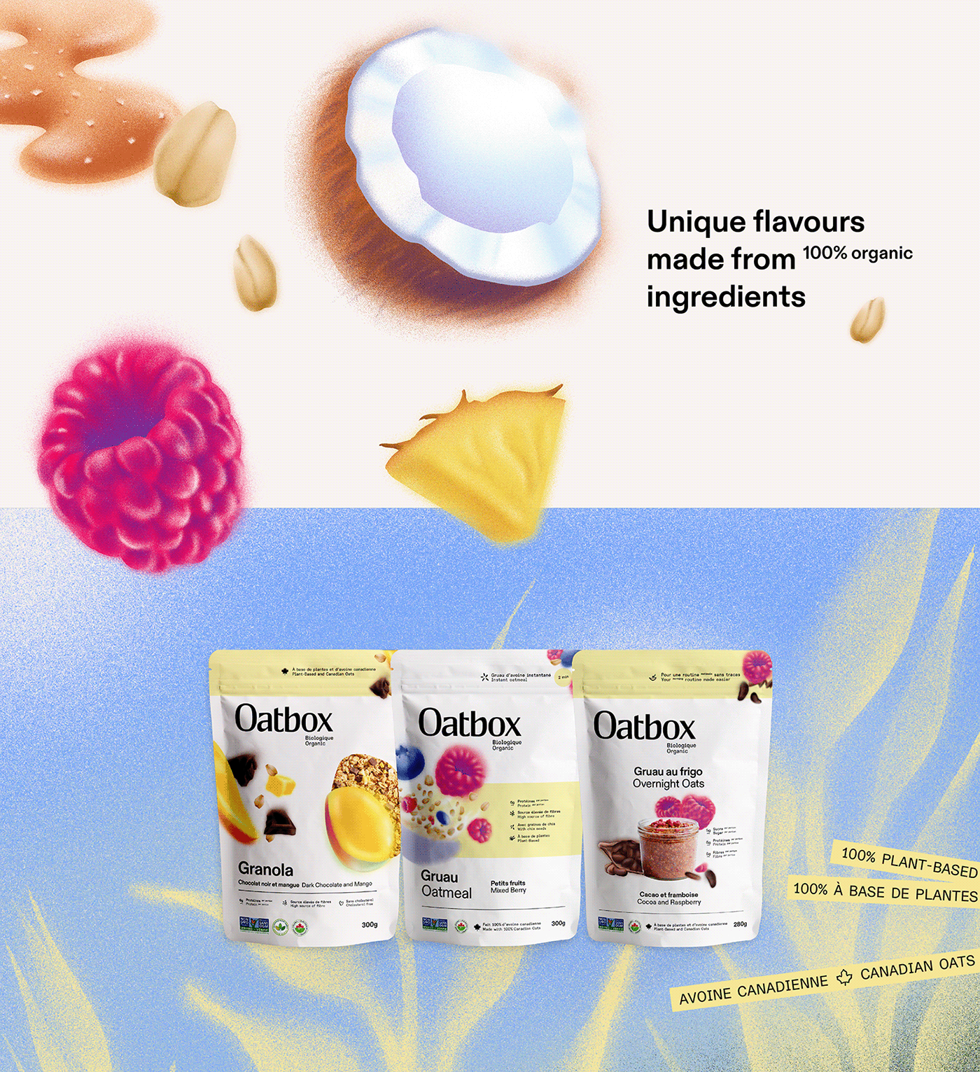
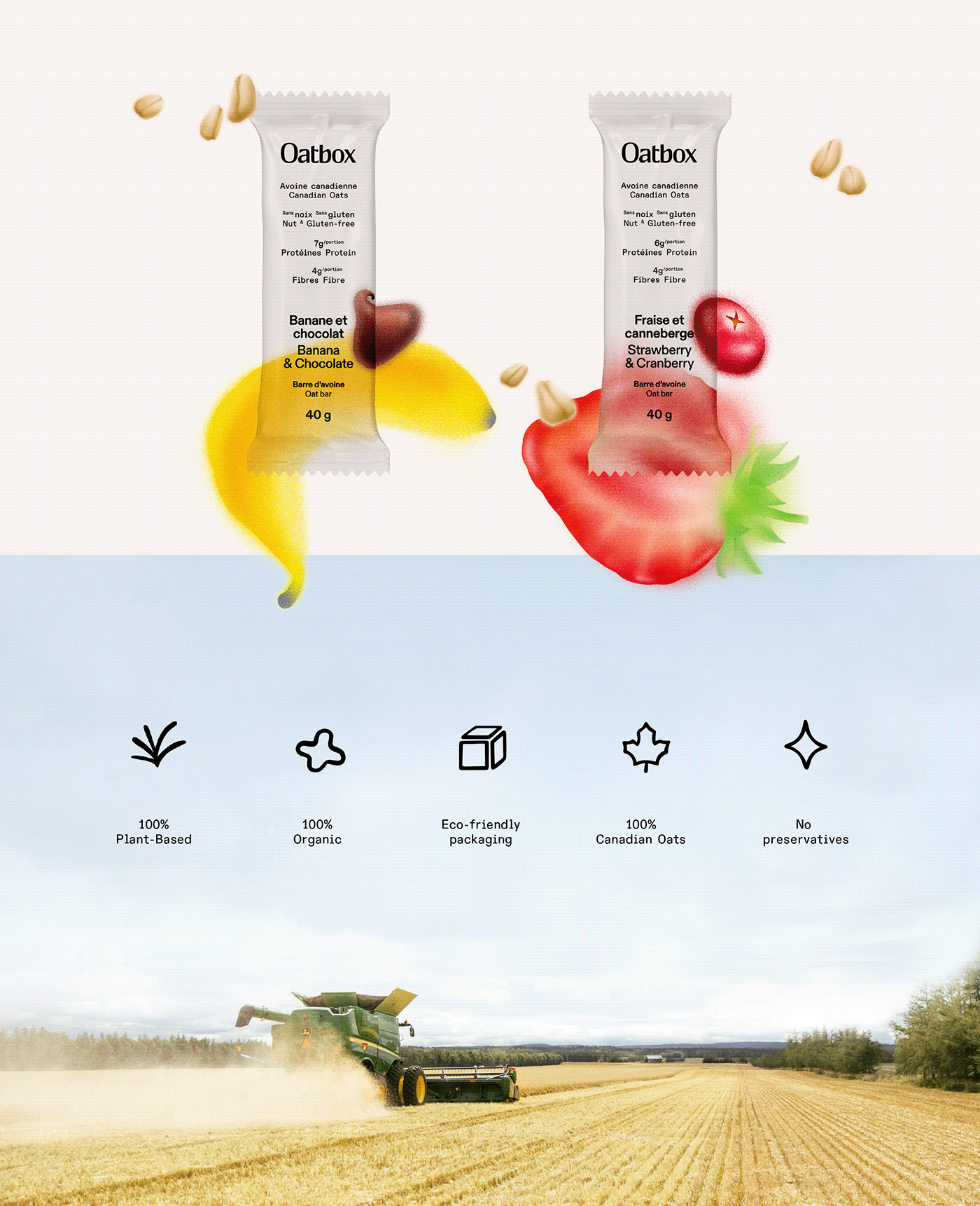
A transformation rooted in organic values
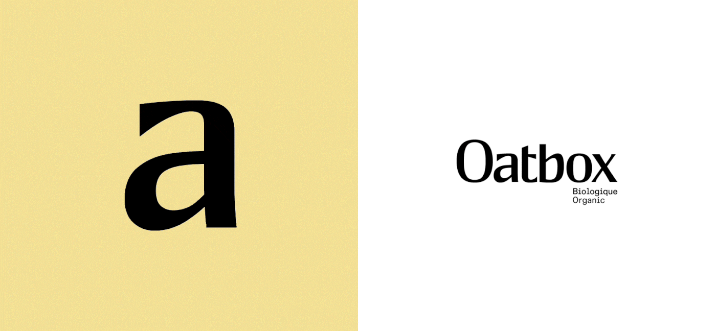
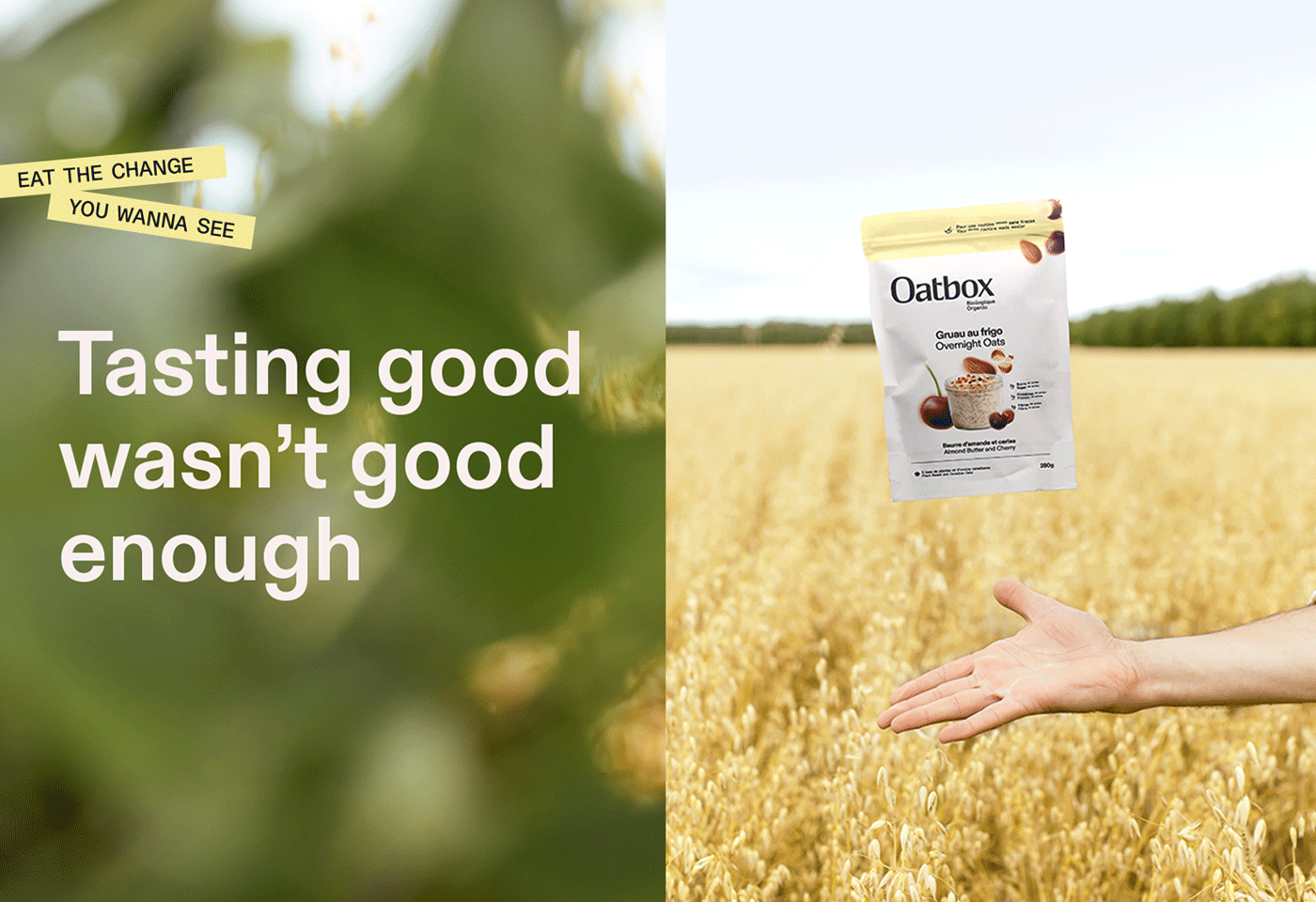
Oatbox's new identity goes all in on oats, balancing the brand's food tech innovations with its love of flavorful and healthful nutrition. At the heart of the platform is a custom-drawn logo: at once modern and timeless, bold yet accessible, it's a differentiating statement that conveys the care and attention to detail brought to everything Oatbox does. An unusual illustration style adds to the perception of Oatbox as a daring player in the category. A new brand color, the Oatbox Yellow, makes it immediately recognizable while conveying the planet-friendly side of oats in a joyful and calming way. The narrative, initially an impersonal presentation of flavours and recipes, now tells the Oatbox story: the way its values, ambitions, and journey reap the benefits of both science and nature.
-
Une transformation enracinée dans des valeurs naturelles
La nouvelle plateforme de marque de Oatbox est centrée sur l'avoine jusque dans les plus petits détails, balançant ses innovations en technologie alimentaire et son amour d’une nutrition saine et savoureuse. C’est pour démontrer l’importance accordée à la minutie que le nouveau logo, à la fois assumé et accessible, a été tracé à la main, alors que des illustrations au style inattendu aident Oatbox à se démarquer dans son industrie. Une nouvelle couleur de marque, le jaune Oatbox, la rend immédiatement reconnaissable tout en communiquant le côté organique et apaisant de l'avoine. Une nouvelle tonalité de marque, toute en confiance et en légèreté, nous permet d'expliquer de grandes ambitions simplement. Le narratif, à l'origine une description impersonnelle de saveurs et de recettes, raconte maintenant l'histoire de Oatbox : ses valeurs, ses ambitions et le chemin qu'elle a parcouru pour arriver à recueillir le meilleur de la science et de la nature.


Agency: REPUBLIK
Client: Oatbox
Creative Director: Marie-Eve Best
Associate Creative Director, Design: Anne-Marie Brouillette
Associate Creative Director, Content: François-Olivier Thibault
Art Direction: Anne-Marie Brouillette
Graphic Design: Julie de la Rocq, Marie-Élaine Grant (Oatbox)
Copywriting: Marie-Eve Best, François-Olivier Thibault
Illustration: Trevor Yardley-Jones
Logotype Design: Pierrick Barféty (Republik), Coopers and Brasses
Web Design: Hugo Paré (Oatbox)
Motion Design: Julie de la Rocq
Photography: Manny Fortin
Producer: Marie-Hélène Leclerc (Republik)
Video Director: Francis Perreault, Zacharie Turgeon
Media: Justine Laurier (Republik)
DOP & Editor: Alexandre Hallé
Music & Sound Design: La Majeure
Strategy: JP Shoiry, Vincent Fortin(Republik), Élodie Parent(Republik), Justine Laurier(Republik)
Client Service: Marie-Hélène Leclerc (Republik)


