


FLYING HOG BBQ
Flying Hog BBQ was created in the small town of Armada, Michigan by one of its most passionate and loyal tenants.
Flying Hog BBQ has been a popular backyard classic in Armada for years. They serve comfort foods along with great smoked local meats. The goal was to keep the brand language fun, bold, and homegrown. We also wanted to honor the owner's late sister with the angelic hog that is the main focal point of the brand.
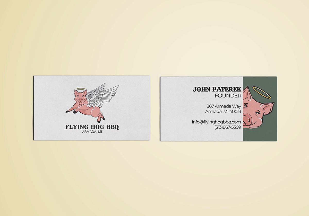


The Flying Hog BBQ is a small, hometown brand that was in need of a logo and overall brand language. Our main theme with the Flying Hog BBQ was fun, bold, and homegrown.
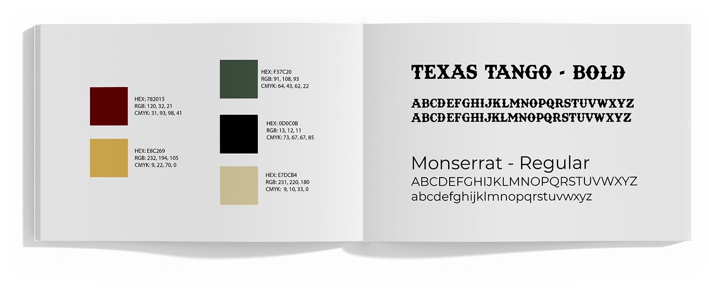
We kept a rustic feel with the Texas Tango font and leveled it out with the sans serif font, Calibri. We also chose 5 main brand colors to allow for a more versatile look while still keeping the overall theme bold and fresh.
With the use of a three different brand marks, Flying Hog BBQ is able to establish a strong brand language and stand out on any packaging, signage, print, or trailer. We wanted to use the oven mitt to be a subtle nod to its home state of Michigan. The crossed spatula and spear represent the location of the shop, which is right in the center of town at the main crossroad.
The Flying Hog logo has also been reworked in a horizontal manner to suit a long trailer or food truck and fit nicely on print designs such as letters, stationary, menus, and more.


