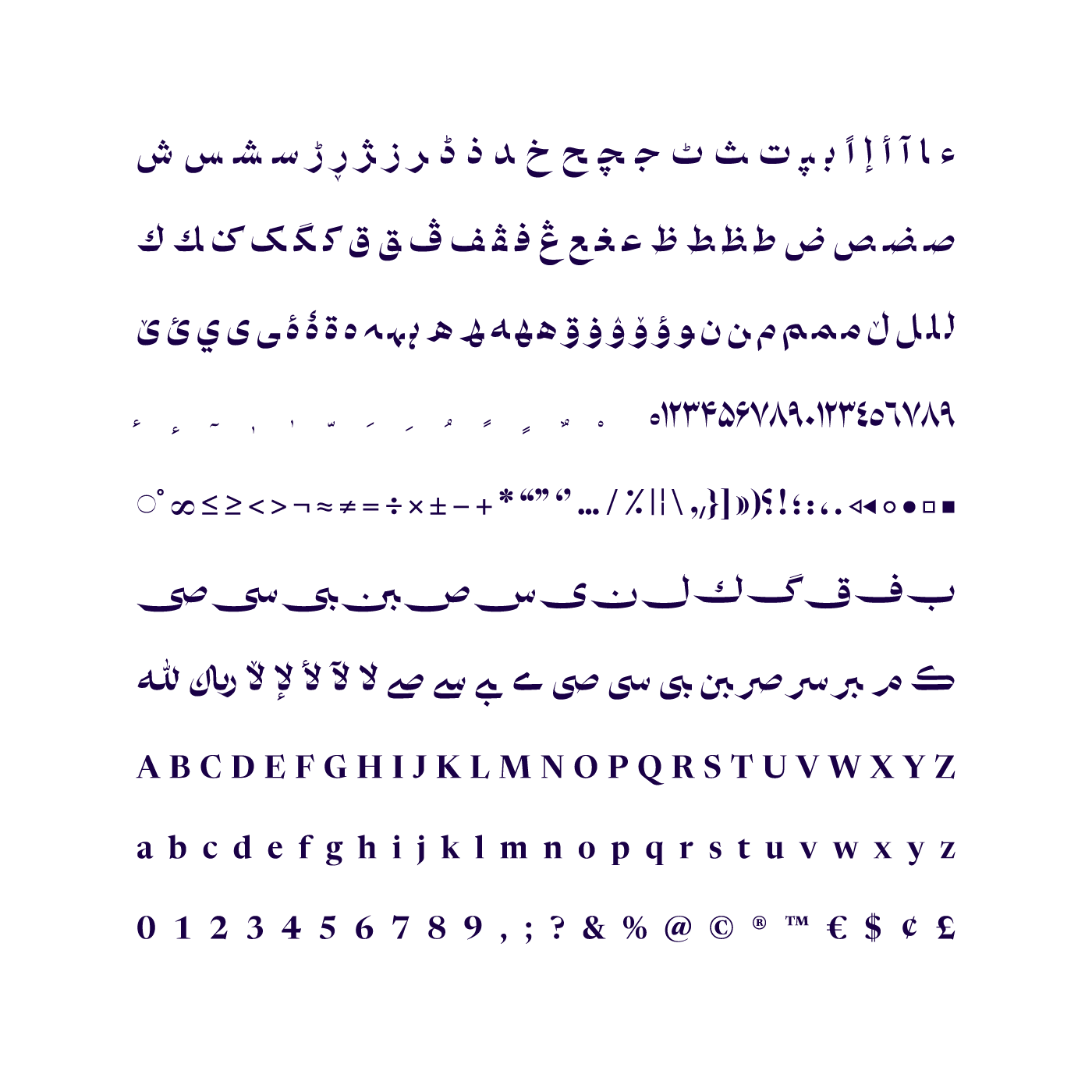
Paykan means spear, arrow, and is the name of one of the highly-used cars in the 80s and 90s in Iran.
Paykan is a serious and boldly confident font on which you can see the impact of Naskh script. The sudden change of direction and too much thickness contrast are the characteristics that make the Paykan font so distinctive and divergent. It has a skeleton full of straight lines and its body has a lot of sharp and keen shapes and it hurts anything that touches it. While using the font, watch out and keep the font away from the children.
Paykan is a fitting font to be used in short texts and headings that have to attract attention instantaneously. You can use this font in fashion-related designs and for luxurious brands. It is also suitable for imported goods due to its accent.
The main model I used for designing Paykan, was Shafigh font. Shafigh’s bold confidence and likable accent made me eager to design a font with the same atmosphere but with much more exaggerations. For Latin language, I used Newsreader font; with applying some changes in proportions and thicknesses.
Paykan font was designed and released in six weights and in variable font by Reza Bakhtiarifard in 2021.
*any problem? contact Fontiran
پیکان فونتی جسور و جدی است که اثر خط نسخ را بهوضوح میتوانید در آن ببینید. تغییر جهت ناگهانی حرکتها و کنتراست ضخامت بسیار افراطی از ویژگیهایی است که فونت پیکان را بسیار خاص و متفاوت کرده است. اسکلتی پر از خطهای صاف دارد و تنهاش پر از فرمهای تیز و بُرنده است و به هرجا بخورد آسیب جدی وارد میکند «هنگام استفاده احتیاط کنید و فونت را از دسترس کودکان دور نگه دارید»
فونت پیکان مناسب استفاده در نوشتههای کوتاه و تیترهایی است که باید در یک آن جلب توجه کند. از این فونت میتوانید در دیزاینهای مرتبط با فشن و برای برندهای لوکس استفاده کنید. همچنین بهخاطر لهجهاش برای محصولات وارداتی هم مناسب است
الگوی اصلی من برای طراحی پیکان فونت شفیق بود. جسارت و لهجهی دوستداشتنی شفیق من را مشتاق کرد تا فونتی با این اتمسفر اما با اغراقهایی بسیار بیشتر طراحی کنم. برای زبان لاتین از فونت اوپنسورس Newsreader استفاده کردم؛ با اعمال تغییراتی در تناسبات و ضخامتها
فونت پیکان در سال ۱۴۰۰ بهدست رضا بختیاری فرد طراحی و در ۶ وزن و نسخهی وریبل عرضه شده است
Motion Designer: Mobin Taheri