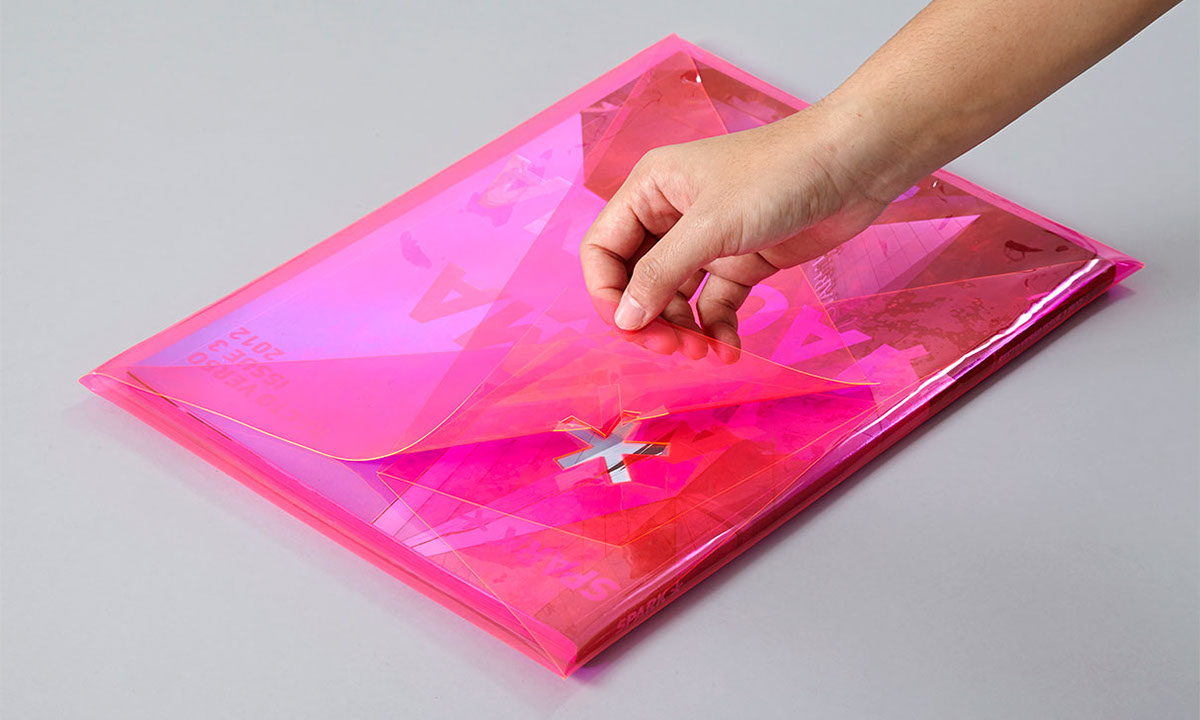
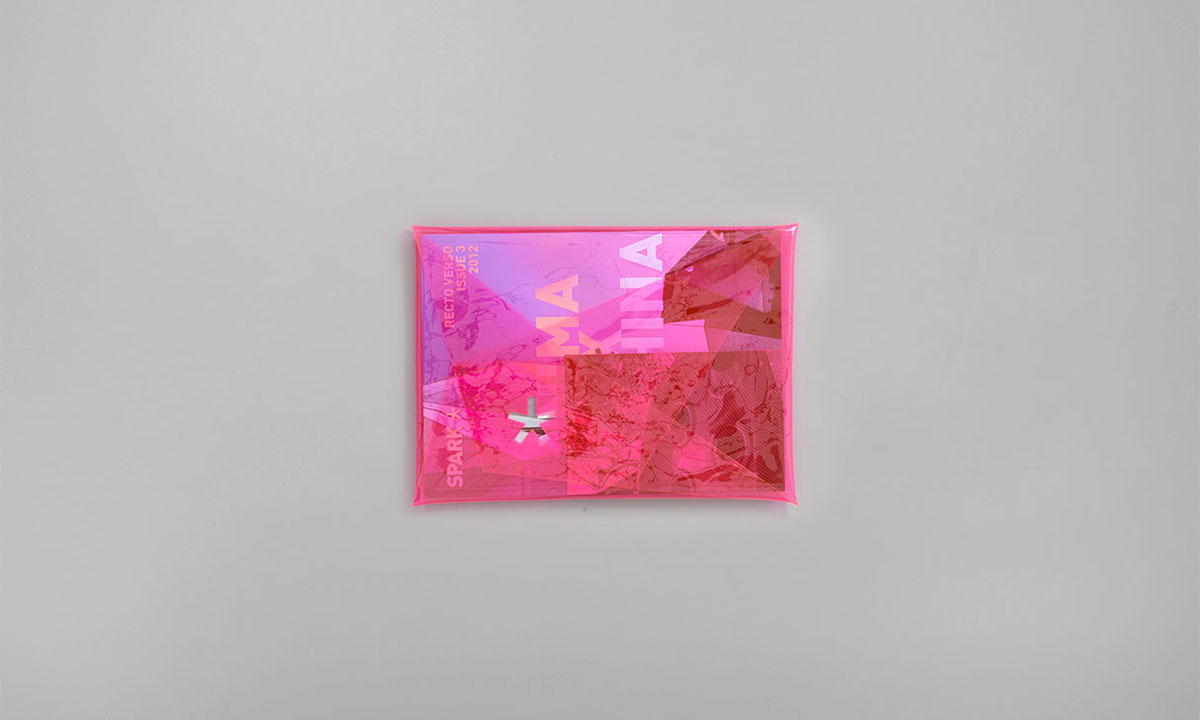
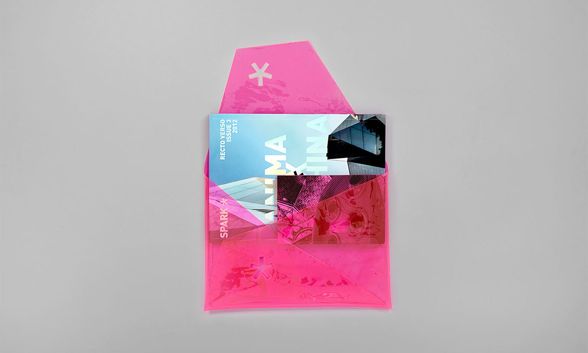
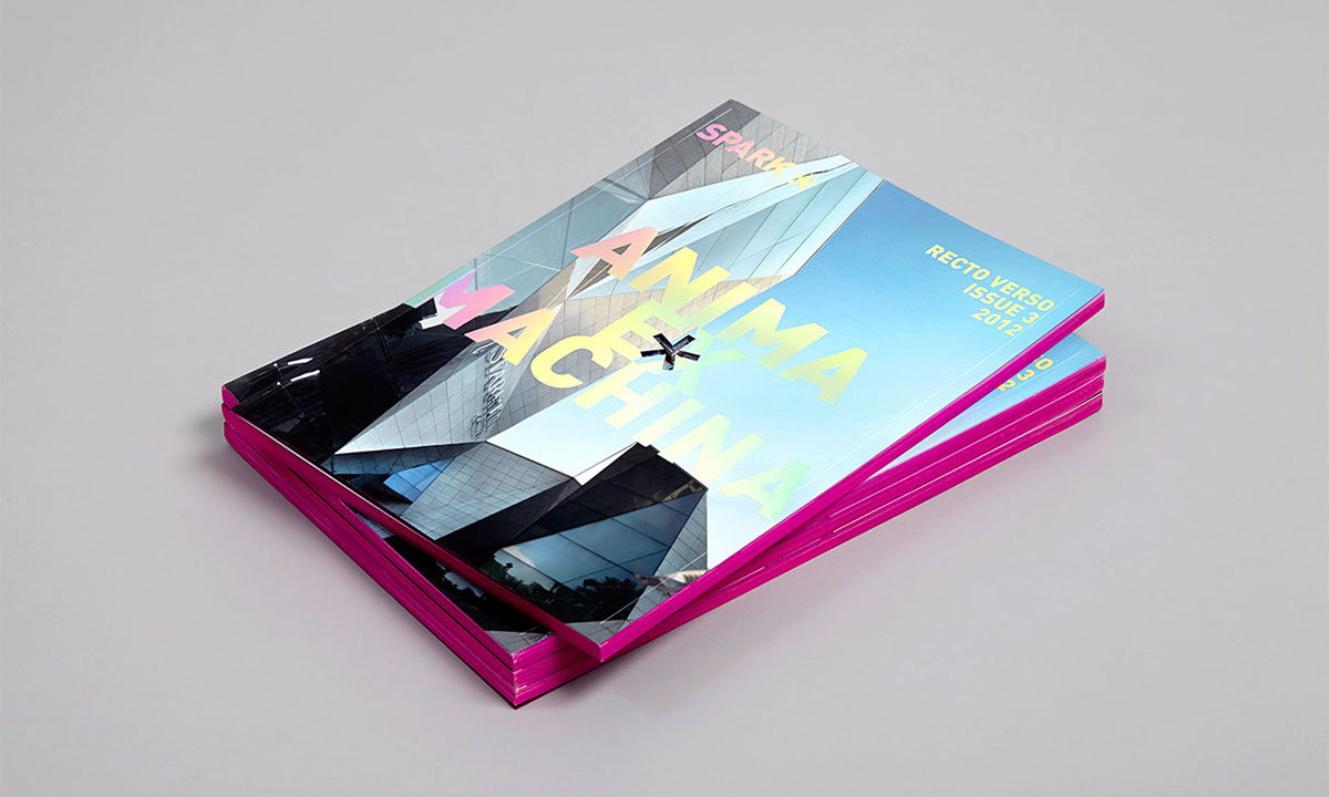
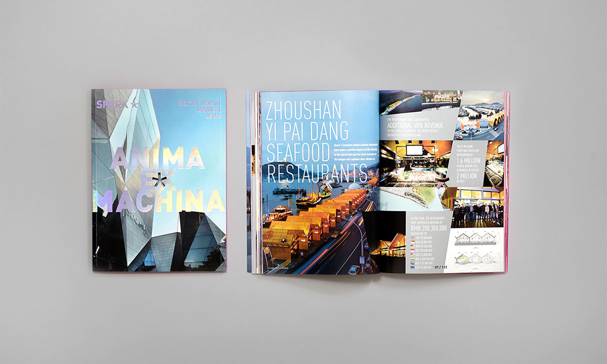
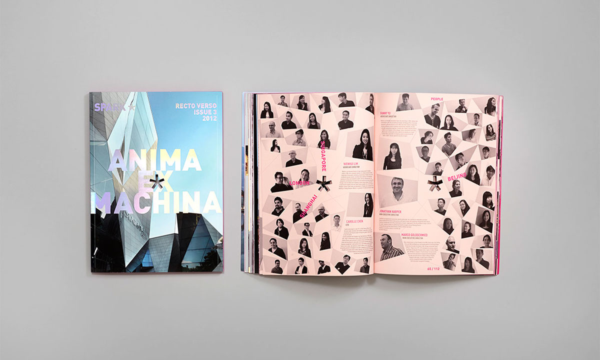
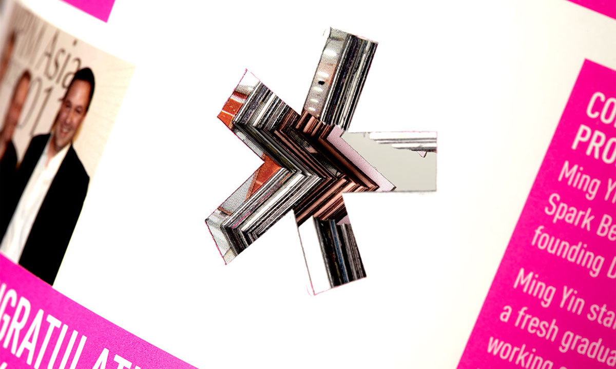
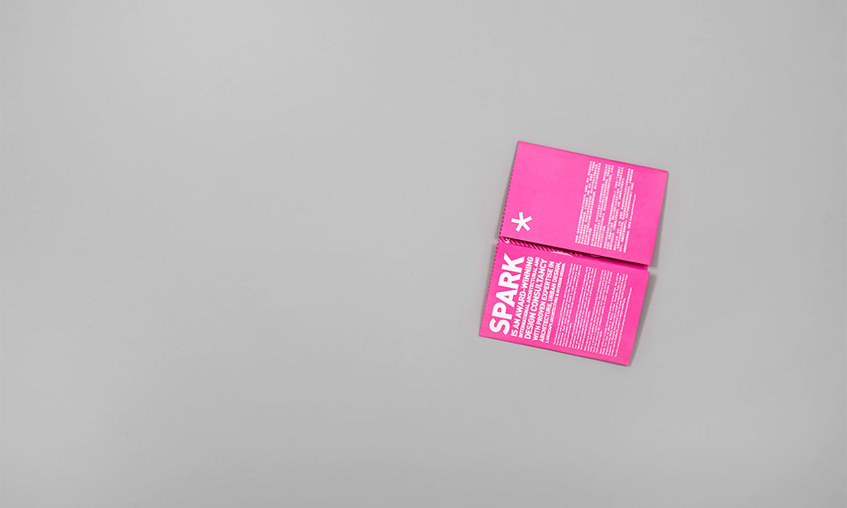
SPARK, an award-winning international architectural and design consultancy, came to us to help consolidate their visual elements, culminating in a customised folder with their projects brochure and a self-published biannual "Recto Verso". We took inspiration from the recurring theme of dimensional-polygons in their projects and formalised an exuberant "system" which was then applied across their printed collaterals. The SPARK asterisk was also given centre stage, whether it's being punched through the centre of the magazine, or providing closure alignment for the folder's panels.