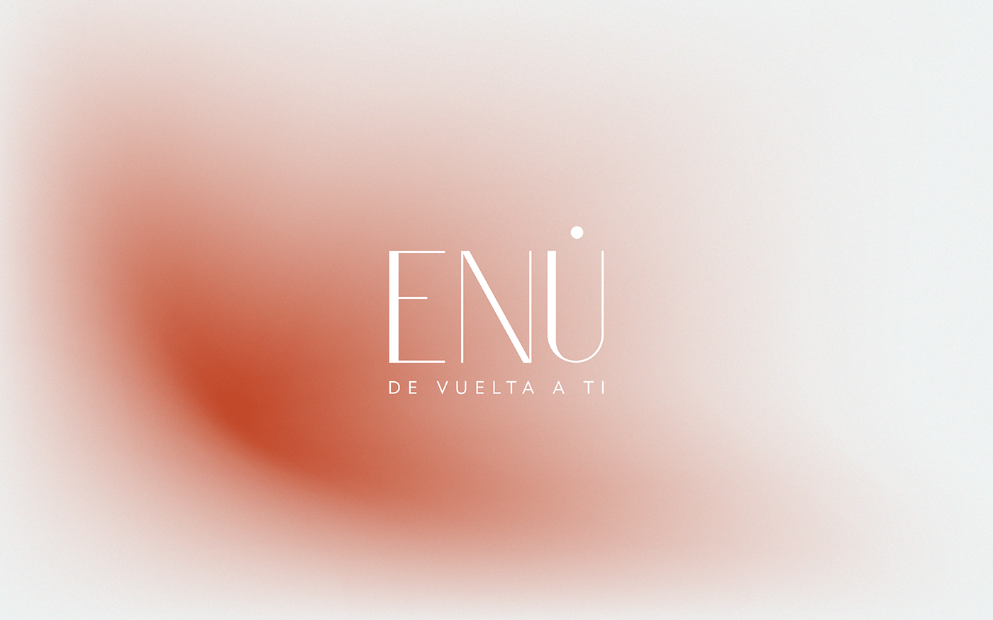


ENÚ
by Mínimo Estudio
A Vuelta en Ú (U-turn) is always allowed if you ever realize you’re going the wrong way down the steam of your life.
Making a U-turn is the wisest and safest way to return to yourself.
Stop for a moment, and come back to yourself.
ENU seeks to inspire people in Latin America to wake up to reality and take action to embrace living from their Being, which becomes highly important in a context of profound inequality, of lack of opportunities, and little to no access to integral and holistic reflection.
This project aims for people to discover that any needed potential to fully live lies within them already through the recognition and strengthening of their habits, values, virtues, talents, and abilities.
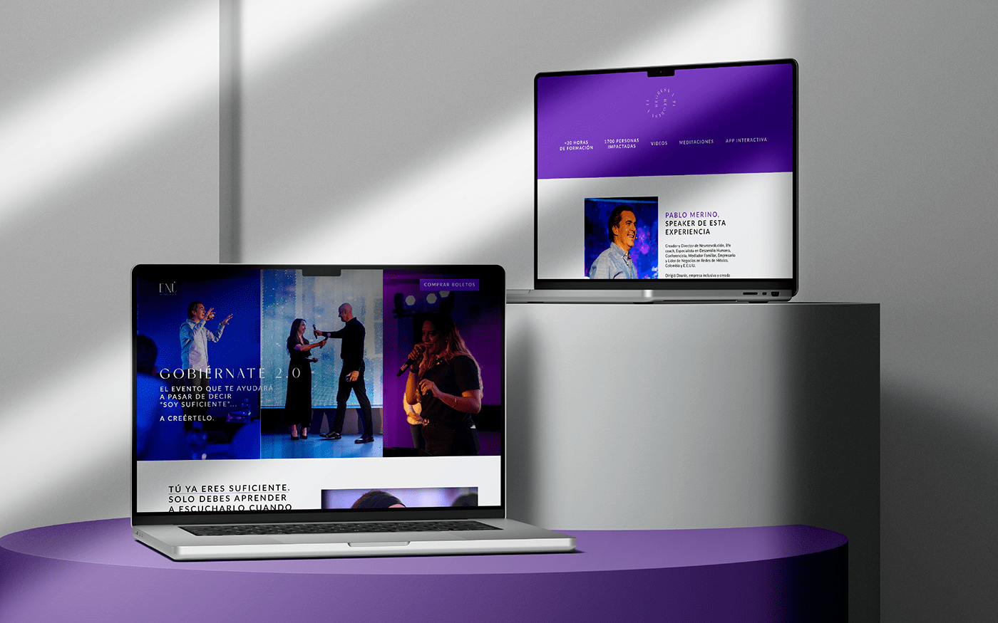
This objective will be possible by creating an integrated learning ecosystem of content, training, and events that will invite people to defy their inner and outer reality.
Learning through ENU is open, and always from the concept of Being.
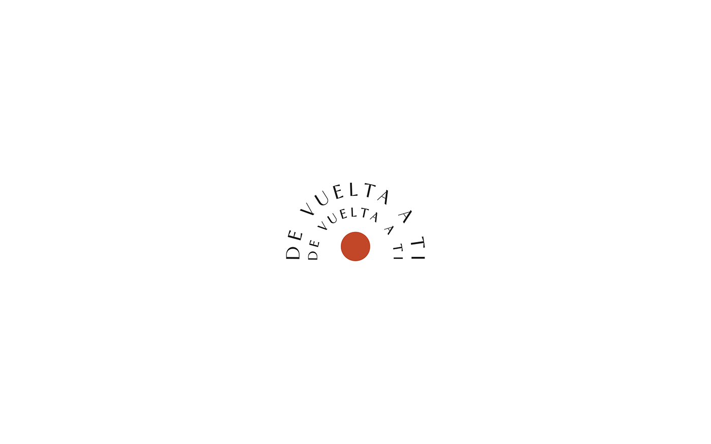
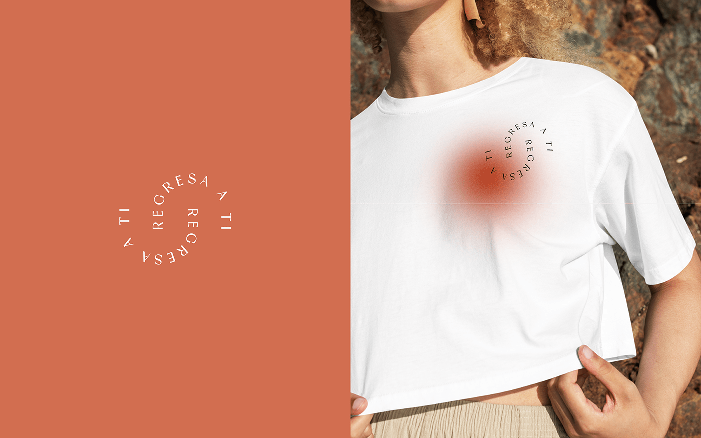
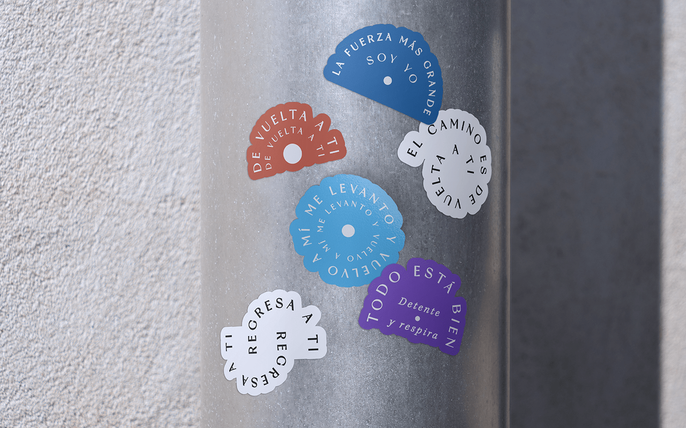
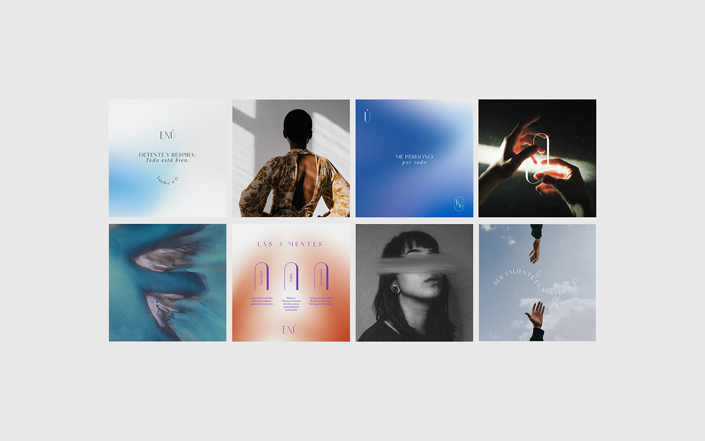
The dot representing the umlaut over the letter “U” alludes to the integral and circular Being, while the letter itself indicates the way back to oneself: the U-turn.
The entire branding development illustrates the different states of consciousness, emotions, and moments of Being through color and shape-changing gradients and the circular, returning strokes that vary weight as they appear through the design.
