


PROJECT BY SNASK:
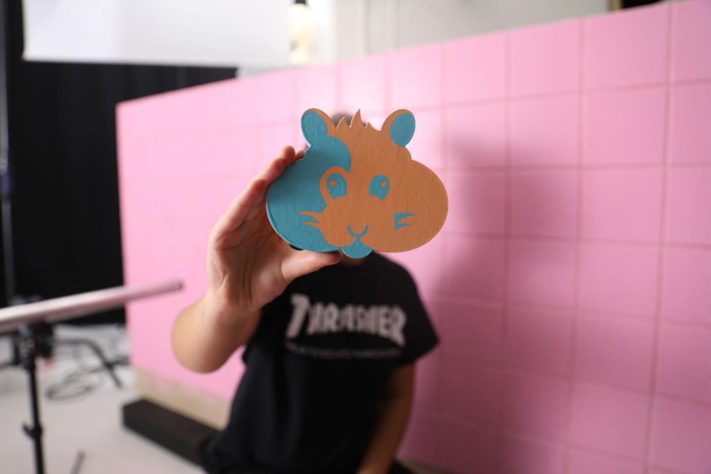
HAMSTER
Concept, Creative direction, Film and Stills
Once upon a time in Berlin, a new typeface was conceived. It was a revelation, a first of its kind - a two-tone colour font with chubby cheeks. How marvelous! It was decided to name the lovechild Hamster.
The designers at Snask quickly fell in love with Hamster as it was the manifestation of everything they valued – playfulness, character, boldness, and color. When asked to tell the world about the miracle, they took it upon themselves to let all type-enthusiasts across the globe get a glimpse of the magnificent creation.
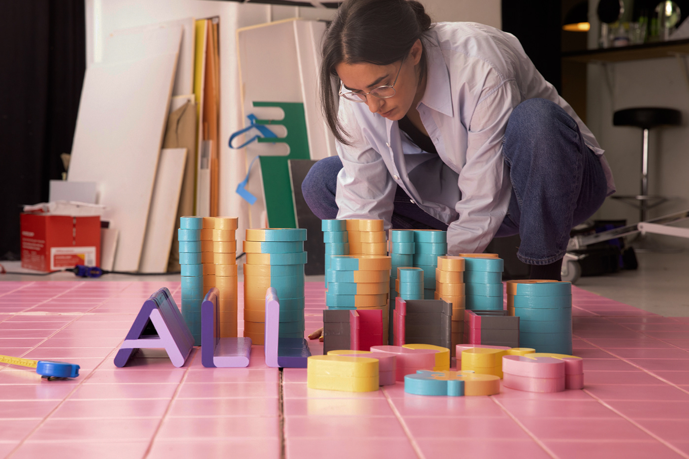
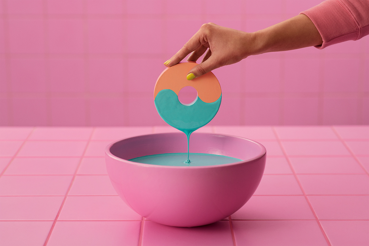
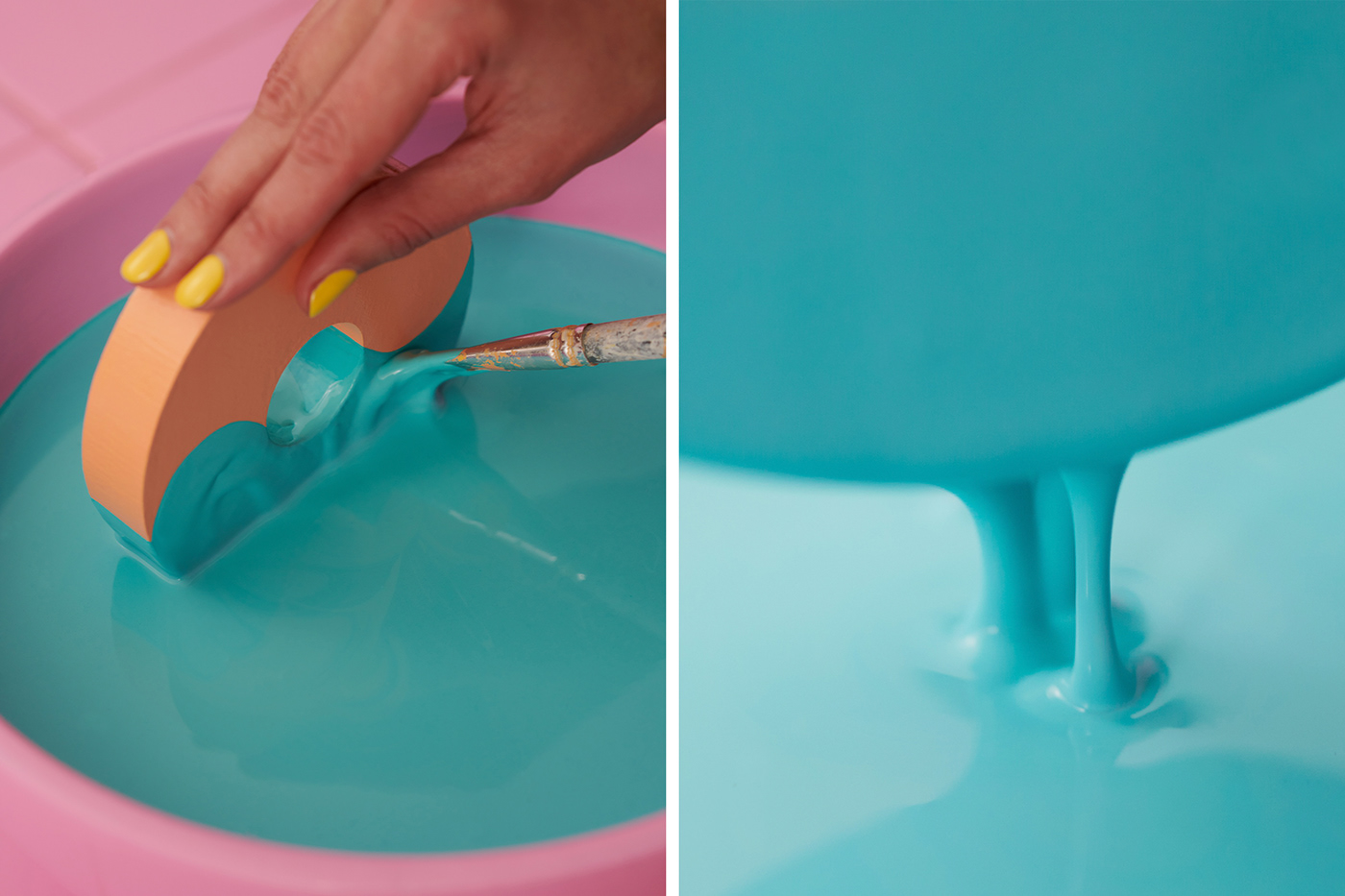
They proceeded with the task in the only manner they knew how to do thigs: with a dedicated focus on craft (bordering on mania), and they brought life to the digital shapes through physical form.
And so, a Hamster workshop was installed. Fourteen human beings put their heads and hands together and decorated 86 laser-cut wooden letters with delicious layers of paint, and carefully stacked them in exquisite typographic formations. “Hoarding all the nuts”, the sculpture read. Because just like the Hamster, any true type-nerd knows how to collect beautiful things. They both work diligently to hoard things – in some cases nuts, in other typefaces, but stacking all the same.
It was busy work and long hours, but for the sake of true love, you can craft for several miles. And so one sunny February day, when the last letter had been dipped in paint, it was finally time to put the letters back into the digital world through photo and film. Hail the Hamster font. Hoard away, fellow nerds.
The End.
CREATIVE CONCEPT & ART DIRECTION: Snask
PHOTOGRAPHY & DOP: Golden Retriever
SOUND & MUSIC: Darwood
CLIENT: Fontwerk
TYPEDESIGNER: Joe Stitzlein
TYPEFACE: HAMSTER