
A Taste of Puerto Rico
Wepa! Coffee is a new company that sells Puerto Rican coffee. Looking to bring the brand to life, the team contacted us to develop a graphic identity and packaging design that would match the quality of their product and capture the flavour of its Puerto Rican origin.
In Puerto Rico, people call themselves Boricua. A unique name that honours their island heritage, Boricua is a state of mind and a way of life. If you’ve ever been to Puerto Rico, you will have heard the expression “Wepa!” It is about as Boricua as it gets. You don’t say it. You YELL it. But what does it mean? Similar to Wow! or Awesome!, Wepa! demonstrates excitement, pride or joy – particularly in patriotic situations, which for Puerto Ricans is all the time!
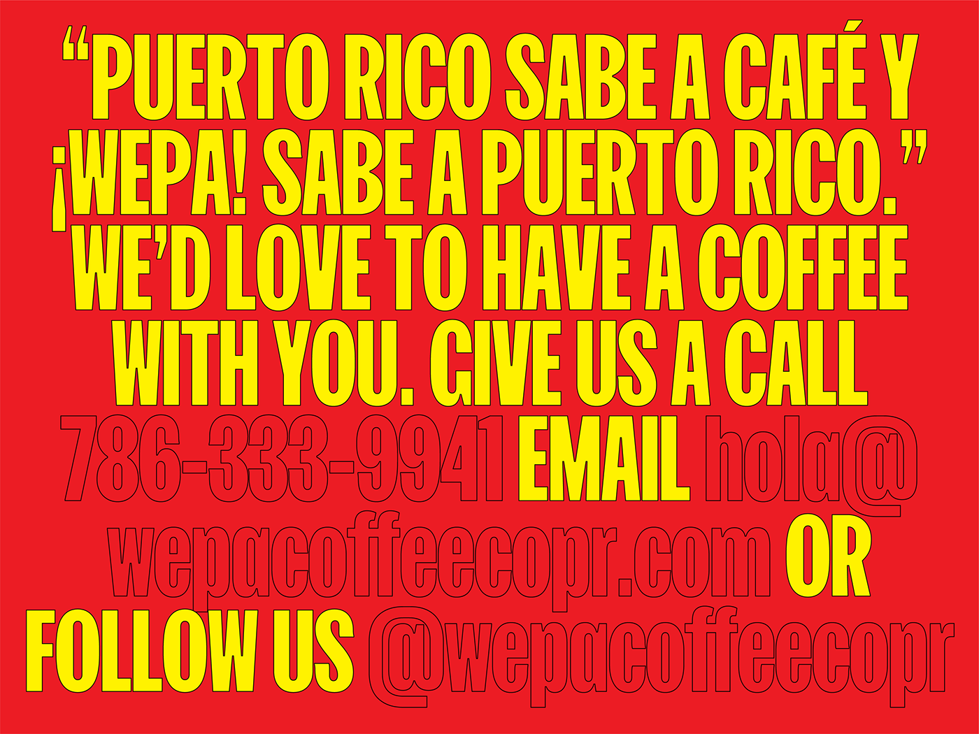
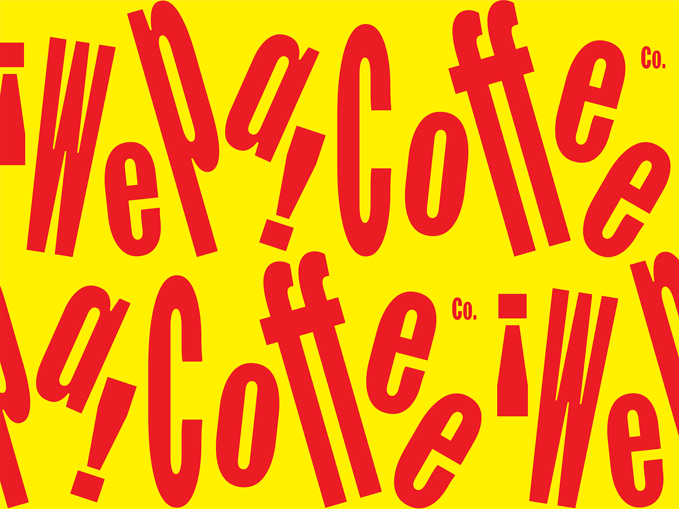
For the graphic identity, we accentuated the meaning of the expression Wepa! by playing with the typographic composition. We didn’t want to resort to using the typical “bocadillo” or speech bubble of comic books, but we wanted to transmit the same feeling – as if someone happy and excited was shouting the words out loud. Arranged in a playful and rhythmic way, “Wepa!” and “Coffee” practically dance off the page.
Complementary colour combos tend to be boldest and our aim was to make a statement, capturing the warmth of the Boricua spirit. We selected a primary yellow and red colour palette inspired by traditional Puerto Rican coffee sachets, a chromatic combination that can be found in many local supermarket products.
.

.


.


.


When people think of Puerto Rico they tend to think of beaches, palm trees and the sea, typical images of the Caribbean. But the island is mostly covered in dense tropical rainforest. For the packaging design, we paid homage to Puerto Rico’s jungle landscape, incorporating a simple graphic pattern created from a repetition of the initial “W” of “Wepa”.

.
