


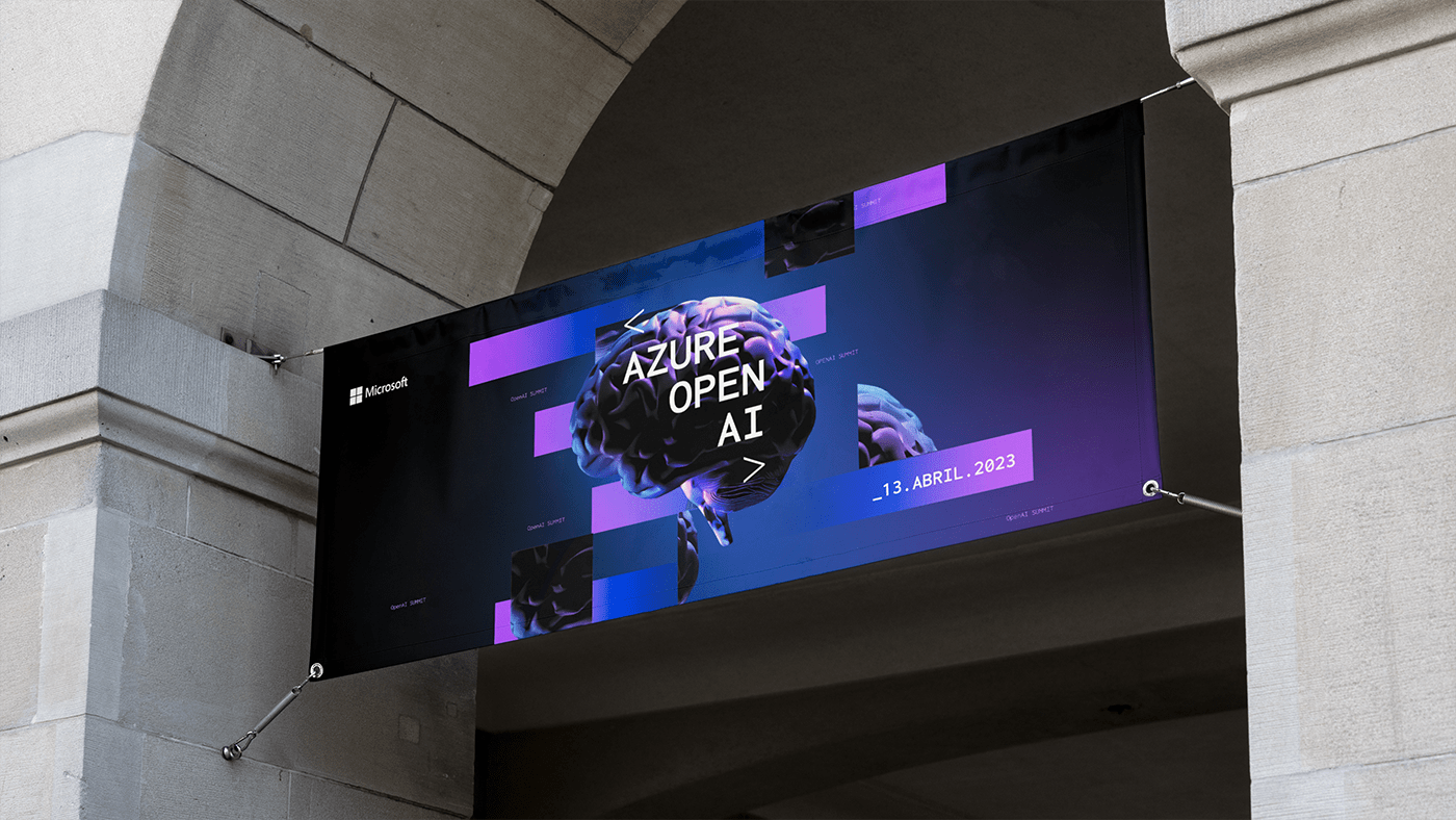
Microsoft AI's aim is to create artificial intelligence that benefits the world and humanity. Something that’s worth talking about in an event that is dedicated to AI. For that, a visual identity was created. And how is this artificial intelligence created? Through code. A lot of code.
So, for this, two angled brackets were used to embed this idea of "code" and a typeface associated with programming was used to reinforce the concept.

Within the Microsoft colour palette, 2 colours were used. The color blue, which has long been associated with technology and the colour purple, strongly associated with artificial intelligence.
To intensify the idea of a digital universe these two colours and the colour black were merged
into a gradient.

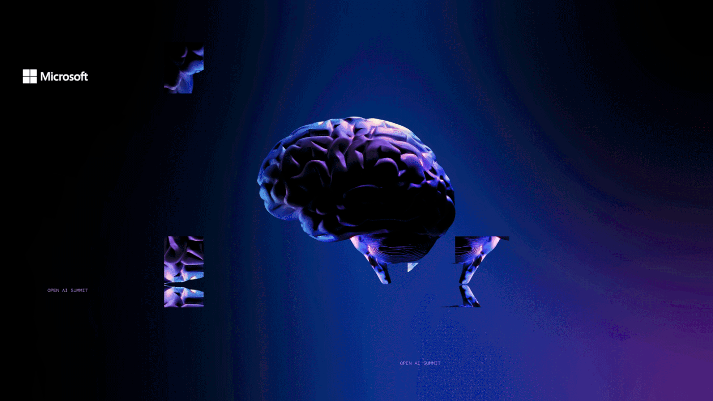
The communication line uses dynamic moving stripes, which represent points and/or pixels navigating back and forth, seeking to perform tasks to give information or answers. The artificial-looking brain is used as the key visual for the event. Furthermore, the various fragments around
the brain enhance the idea of an ever-building, ever-evolving artificial intelligence.


Client: Microsoft Portugal
Creative Director: Anne-Laure Chauvin
Brand Designer: André Góis
All rights reserved to NOSSA™


