EIGA Strategic –––– Brand Design
SHARP LED Lighting – Branding
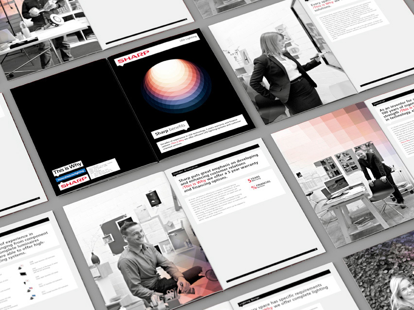
EIGA developed the brand name and visual identity of SHARP’s “LED Lighting“ division.
At the same time, we are expanding the global brand design to incorporate a premium aspect. Sharp’s brand identity is primarily aligned with consumer marketing. For this reason, the main aspect of our task was to develop a design which met the aesthetic expectations of architects and light designers alike, without losing the context of their global corporate identity.
At the same time, we are expanding the global brand design to incorporate a premium aspect. Sharp’s brand identity is primarily aligned with consumer marketing. For this reason, the main aspect of our task was to develop a design which met the aesthetic expectations of architects and light designers alike, without losing the context of their global corporate identity.
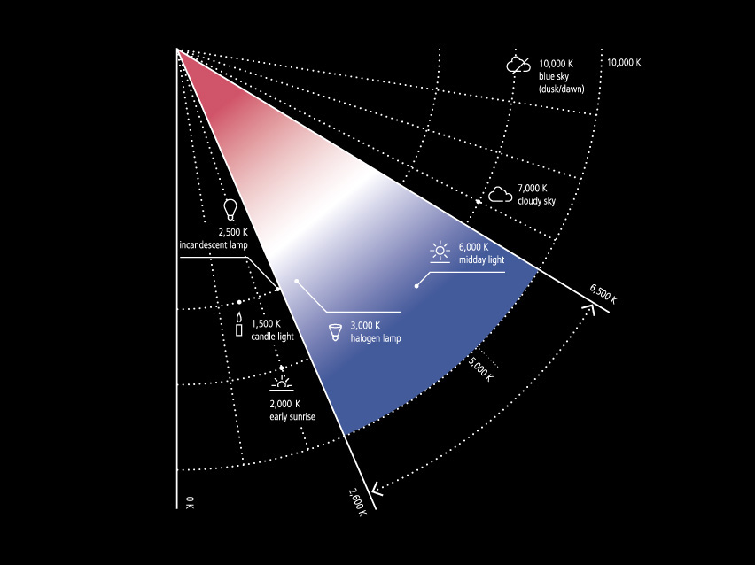
Our solution was a clean, geometric representation of light – a graphical principle that employs clarity and precision to distinguish Sharp products from the competition. The colour scheme is derived from the colour spectrum of an LED light. The entire brand mage is oriented towards the visual tastes of their target group and combines technical and design-oriented elements for a coherent overall image.
more on eiga.de