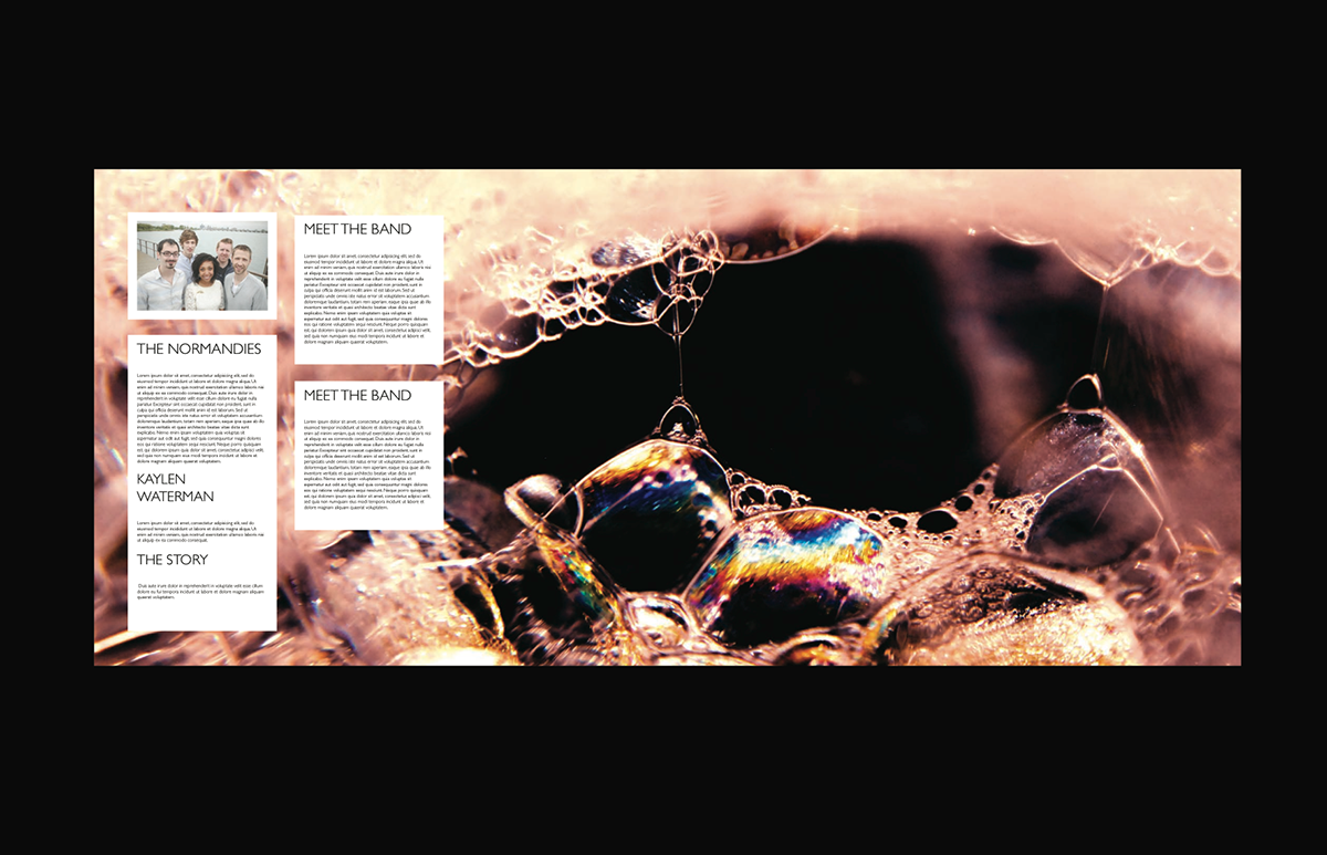
The Normandies are a band of five based in Detroit Michigan
They are named after the infamous battle that occurred the 6th of June in 1944 in Normandy. The band was drawn to this name, this battle, and this history because they were inspired, challenged and moved by the determined sacrifice that all of those men made - that is how The Normandies want to peruse their passion of music and life,
"running out onto that beach with no idea of whether or not I'll make it out alive. Clinging to the sure things I believe in." - Kaylan Waterman lead singer
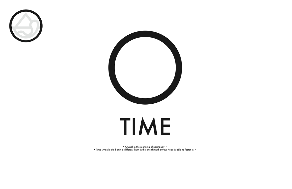
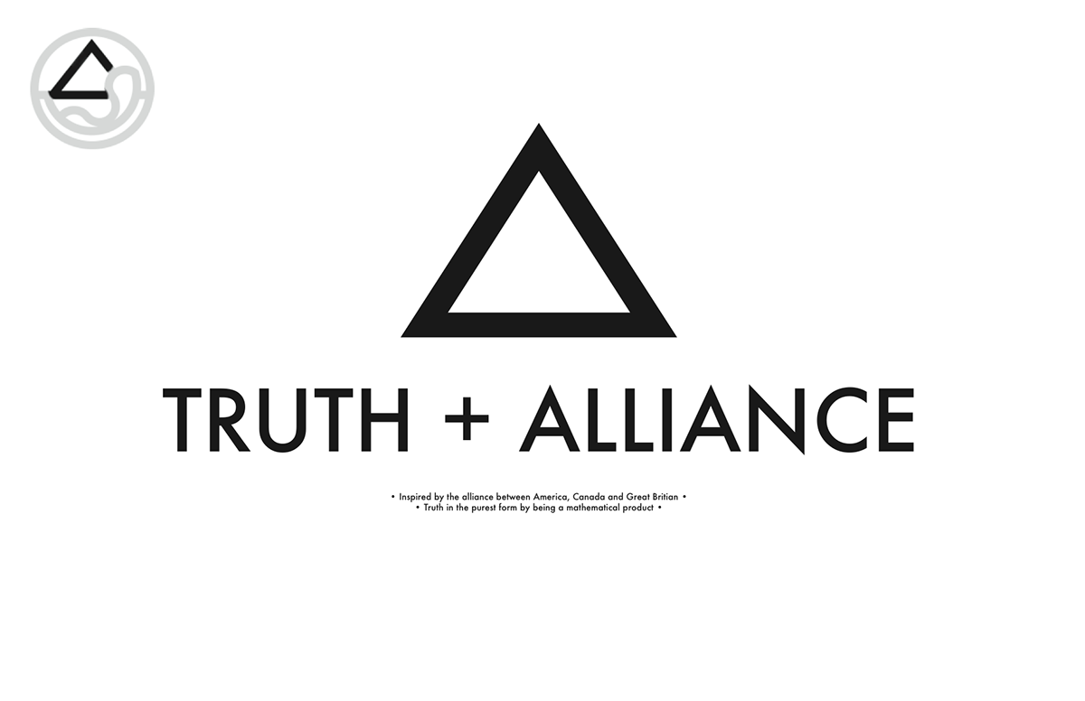
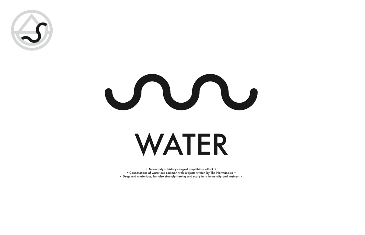
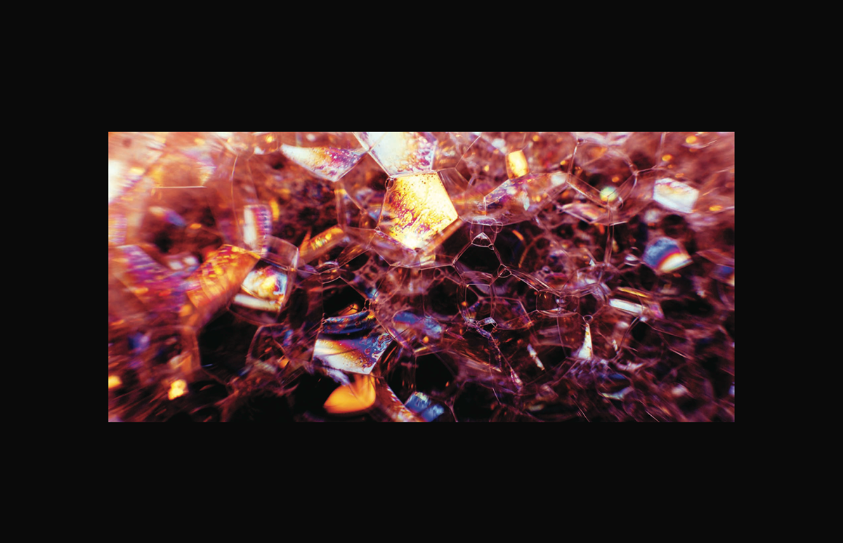
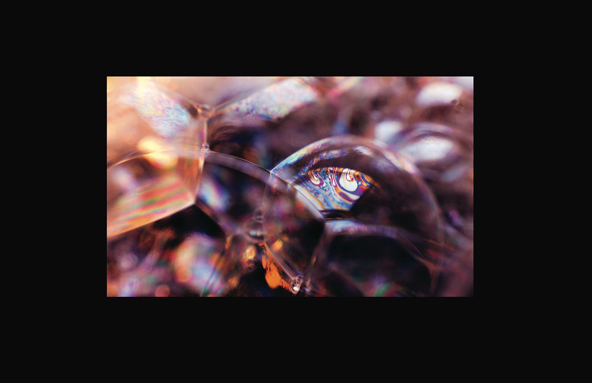
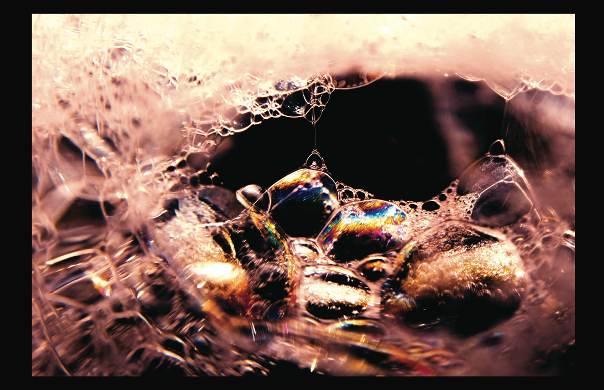
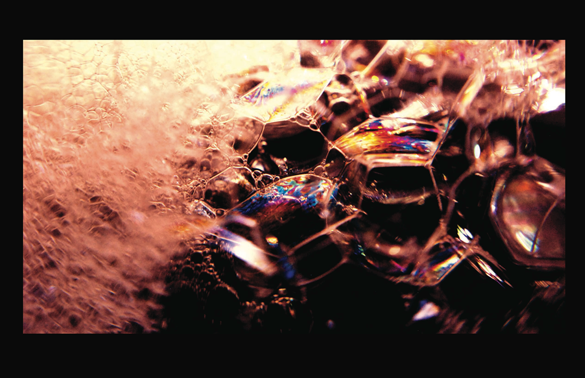
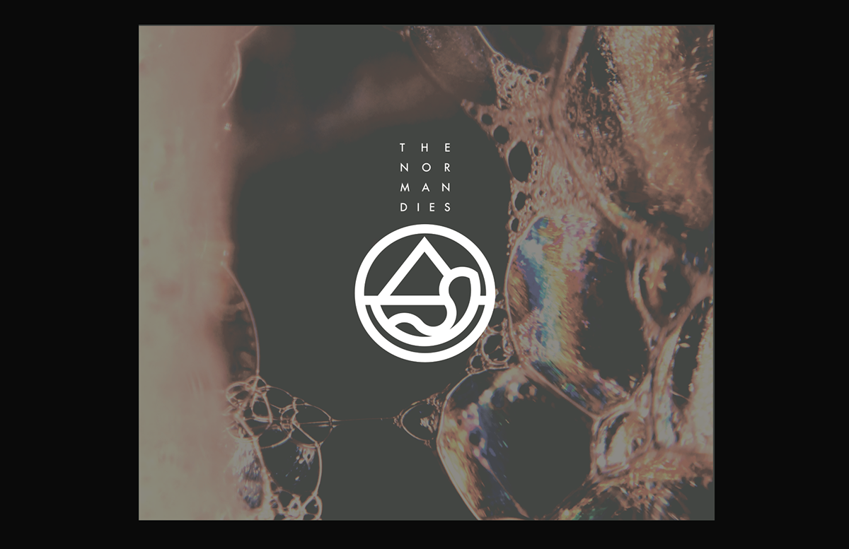
the music they play and the lyrics give a sense of clam, beauty, life, and hope in all. After researching the history behind D-Day and the battle at Normandy, there seems to be some kind of tie holding all the views, and elements of the two things together. The design will communicate all of these ideas in a clear, welcoming, intriguing, mysterious, conceptual and deep way. We were inspired by the facts, Normandy happened in 1944, which was during the Bauhaus design phase - which you will see present in the logo, the geometric shapes and smooth edges. The shapes not only were inspired by the Bauhaus movement of the 40s, but also by several other elements that are apparent to the situation between the bands ideals, the music they create, and the history they associate themselves with. The triangle represents the alliance between America, Canada, and Great Britian (the alies that worked together to plan the attack on Normandy). The half circle and horizontal line represents the sunrise, an unmistakable symbol of hope, as well as a main element in the scene of the battle at Normandy - the attack happened at night, and the battle went on through to sunrise. The Normandies portray the feeling of the calm after the storm.. the gentel sunrise - returning once again never failing no matter what happened in the past, nor what will happen in the future. The wavy line represents water, as well as the abstract photography used as a secondary element to the identity. (more on that later) - the water inspired by the fact that the D-day attack was the largest amphibious attack to have ever occurred, and the oil distorting the water is to remind us that no matter the message delivered by Normandy, there was still hate present. Also as an abstract look, the water during the normandy attack had a lot going on in it at that time, blood, sweat, tears, gun powder, gasoline, oil.. and last but not least the circle, representing time inspired b y the historical connotations and associations tied to the band. The Normandy attack is thought of as "the beginning of the end of the Nazis". Time is also a huge element in the planning of Normandy. Only ten days out of every month were possible for the attack to work, they needed a spring tide - and a full moon for the illumination in the night. We needed to take all of this inspiration and information and turn it into an identity, something that the Normandies can associate with, proudly. We intend to create a smooth blend of several styles, elements, and emotions. We intend to beautifully and completely reflect the music, and the drive of the people creating it.
SYMBOL DESIGN:


PHOTOGRAPHY:

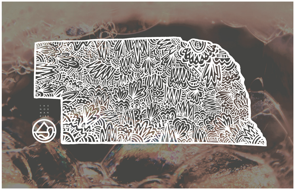
ALBUM COVER (FRONT & INSIDE) -
POSTER DESIGNS: