Mathilde.
We are very proud to announce the release of Mathilde, the first font design collaboration of the german designer Mara Nolze for Sudtipos.
About the design:
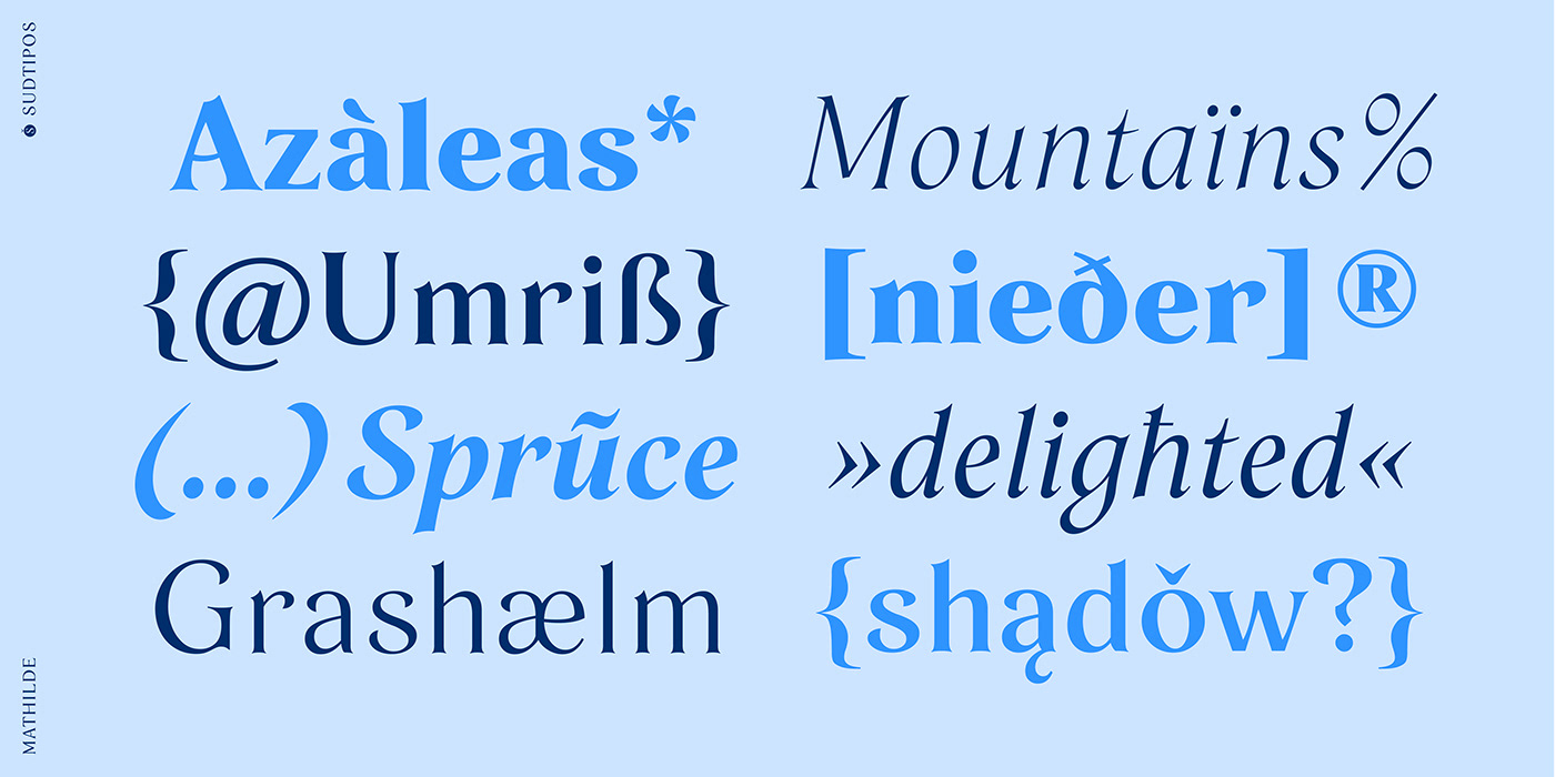
Mathilde is inspired by floral cyanotype experiments and draws a connection to a literary character often associated with roses. With its thorny serifs, the font seamlessly aligns with this comparison.
Mathilde is characterized by a combination of sharp, small elements with graceful, flowing shapes. The dynamic interplay of convex and concave lines, along with slanted stroke terminals and pointed droplet-shaped stroke ends, contribute to the unique aesthetic.
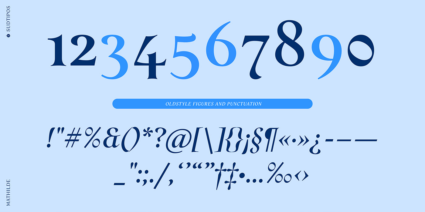
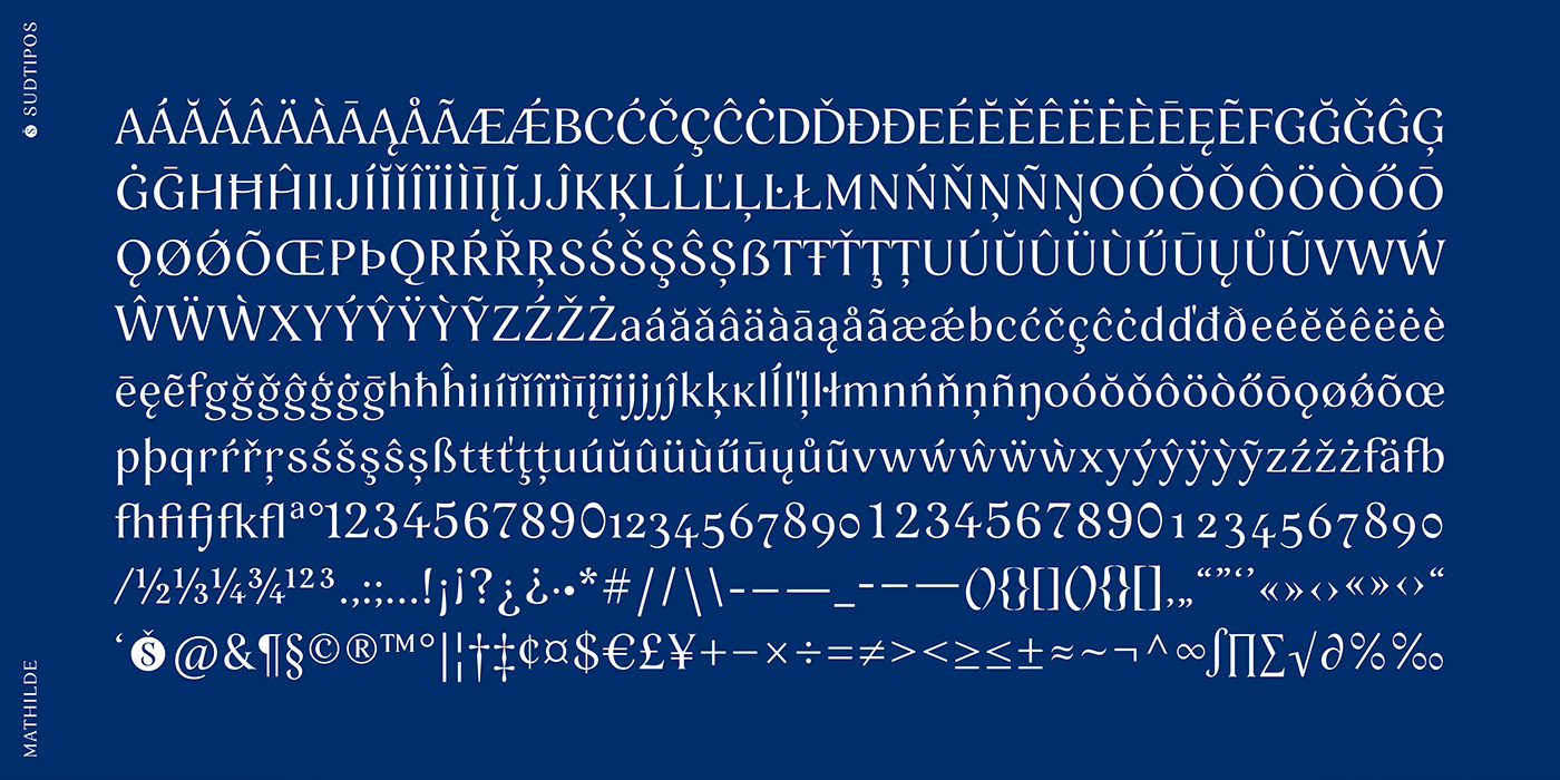
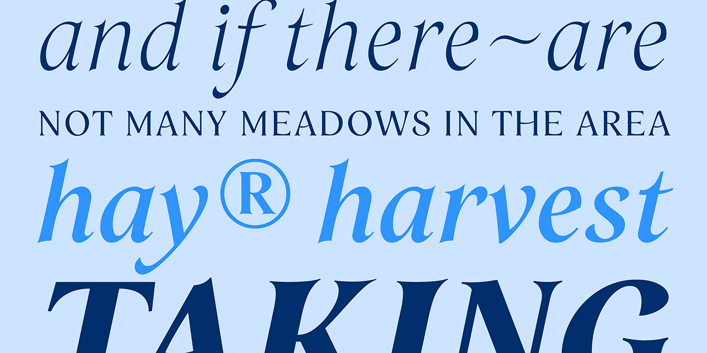
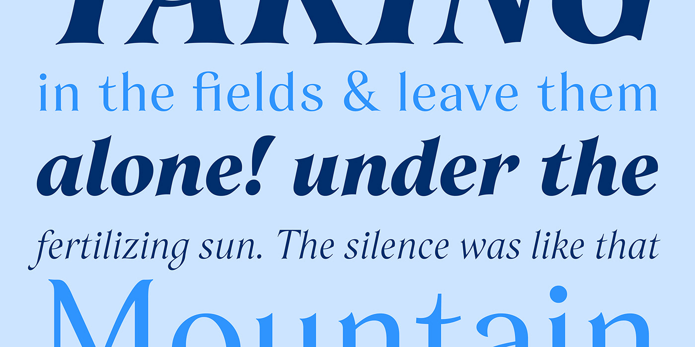
Offering a range of six weights and matching italics, Mathilde covers a wide variety of stylistic preferences.
Offering a range of six weights and matching italics, Mathilde covers a wide variety of stylistic preferences.
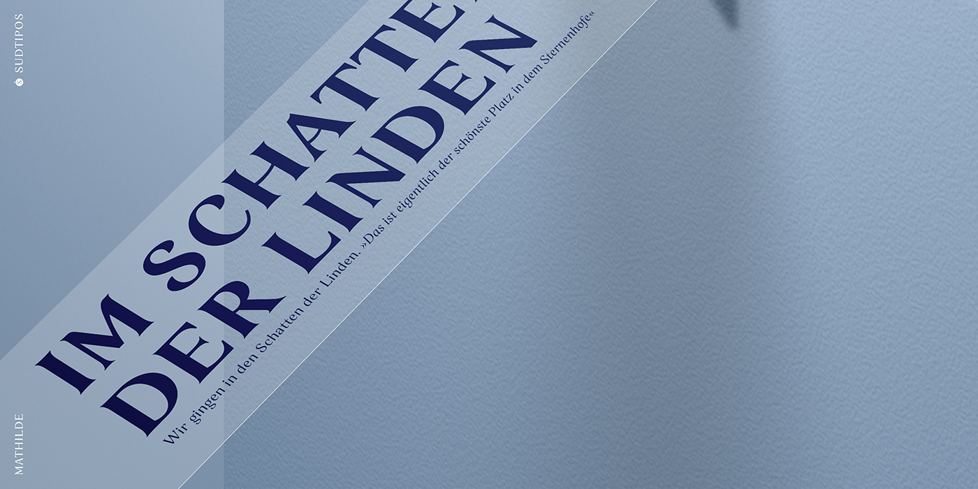
Its details make it particularly compelling for headlines that convey an organic and growing message. Moreover, Mathilde effortlessly transitions into creating a harmonious and flowing appearance in continuous text. Whether employed in editorial design, branding, or packaging, the font infuses any project with an idyllic and sensible energy, adding a delicate touch to the visual narrative.