
Augmented Reality Experience Design:
Good Advice?

Brief
The objective of this project, aimed to combine design principles with augmented reality production techniques, to create an engaging and unique AR experience. As the designer, my role was to develop a concept and design elements. Through ideation, testing, and a combination of digital applications and tools, I was able to achieve this goal.
Challenge
Based on the objectives, I chose to build a concept that presents information and graphics in an engaging, satirical manner. The theme of my experience centers around bad advice, delivered in a way that is often portrayed online and on social media. My goal was to mock “influencers” that claim to share “must-have” advice, that, in reality, is inherently bad advice. With mental health and self-image on a constant rise, I felt as though this how-to in reverse, could aim to relate to young adults, but stating the obvious what NOT to do, and also get a laugh to two. To achieve this, the design of my elements is based on 90’s/2000’s infomercials and magazines; notorious for misinformation, and products that don’t improve people's lives. The information is presented as interactive pop-ups, to play into the point of receiving information and life “advice” against our will.
Role: AR Experience, Vector Illustration, Visual Design
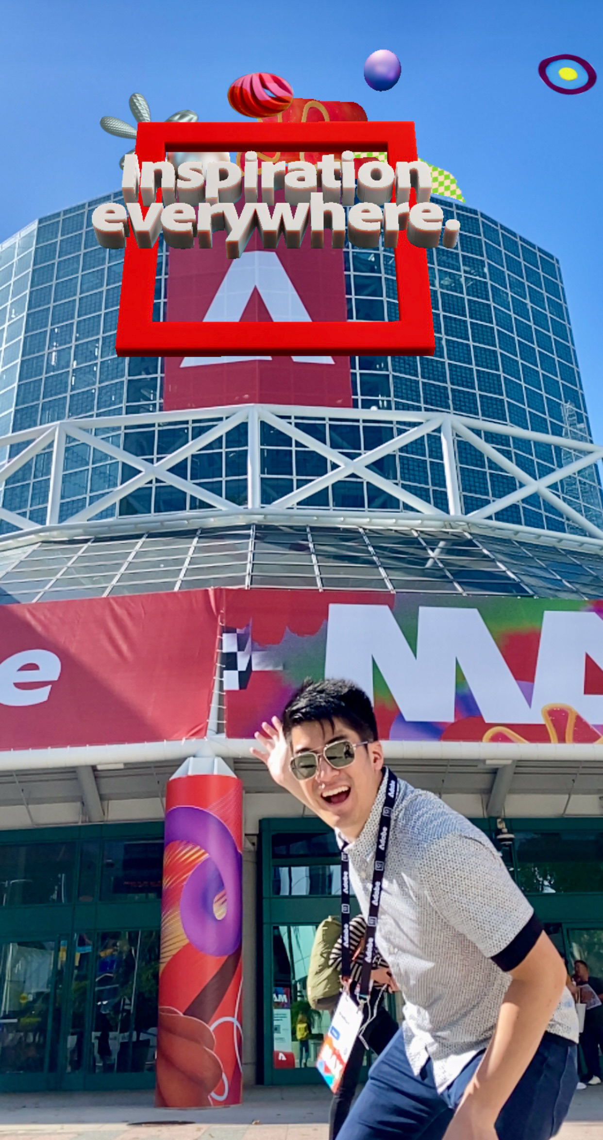
Tools: Adobe Illustrator, Adobe Aero
Purpose: Class Project
Designers: Solo Designer


Sticker Design
For the sticker design, I wanted to use elements that I felt resembled the aesthetic I wanted to capture. In doing this, I used bold shapes, bright colors, and different textures to add dimension and interest. The text and complimentary graphics play off of one another, telling the viewer what the mood of the experience is going to be. As my concept is sarcastic and means to not be serious, I chose the attention-getter of, “Tired of the same ol’ you?”. As if to mock the reader, this entices the person viewing the sticker to scan the QR code and see what is in store.

Location
The target audience of my concept, is college students and young adults, so I felt it was appropriate to place the stickers around campus in unsuspecting spots. I focused on high-traffic areas around my college campus, where I knew a lot of people walked through each day. One spot included a line of parking signs, that already featured several stickers.


AR Walkthrough
Research
The majority of my research involved finding the right aesthetics and graphics to accompany my content. I also searched articles that talked about mental health, bad influencing, and the effects of both. Drawing a lot of inspiration from specific apps, games, and interfaces, I used these to build my concept.


Sketches
For my design sketches, I wanted to focus the most on the content being presented, and what the information would be. As the design of my sticker is pretty lively, I knew that my AR graphics would resemble the elements in it, which I found to be rather frictionless to design.


Prototyping
Through the process of building my content in Adobe Aero, constant previews and QR code testing were essential, to make sure the experience would run smoothly for viewers. Below is what that process looked like in Adobe Aero.
Reflection
Overall I am very satisfied with the result of my AR design, and feel as though it captures what I envisioned my original idea would be. As this was a new application and tools I’ve never used, there was a bit of a learning curve, that I’m proud to have got around, to now feel confident using Adobe Aero. This project has made me think a lot more about the realm of design in digital spaces, and the intersection between informative design and technology.


