Carswell Corporate Identity
Branding
Branding
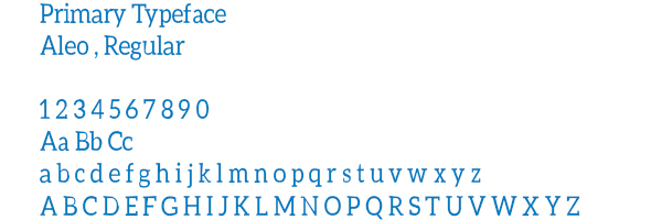
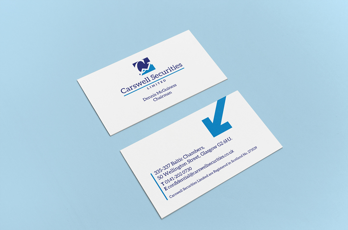
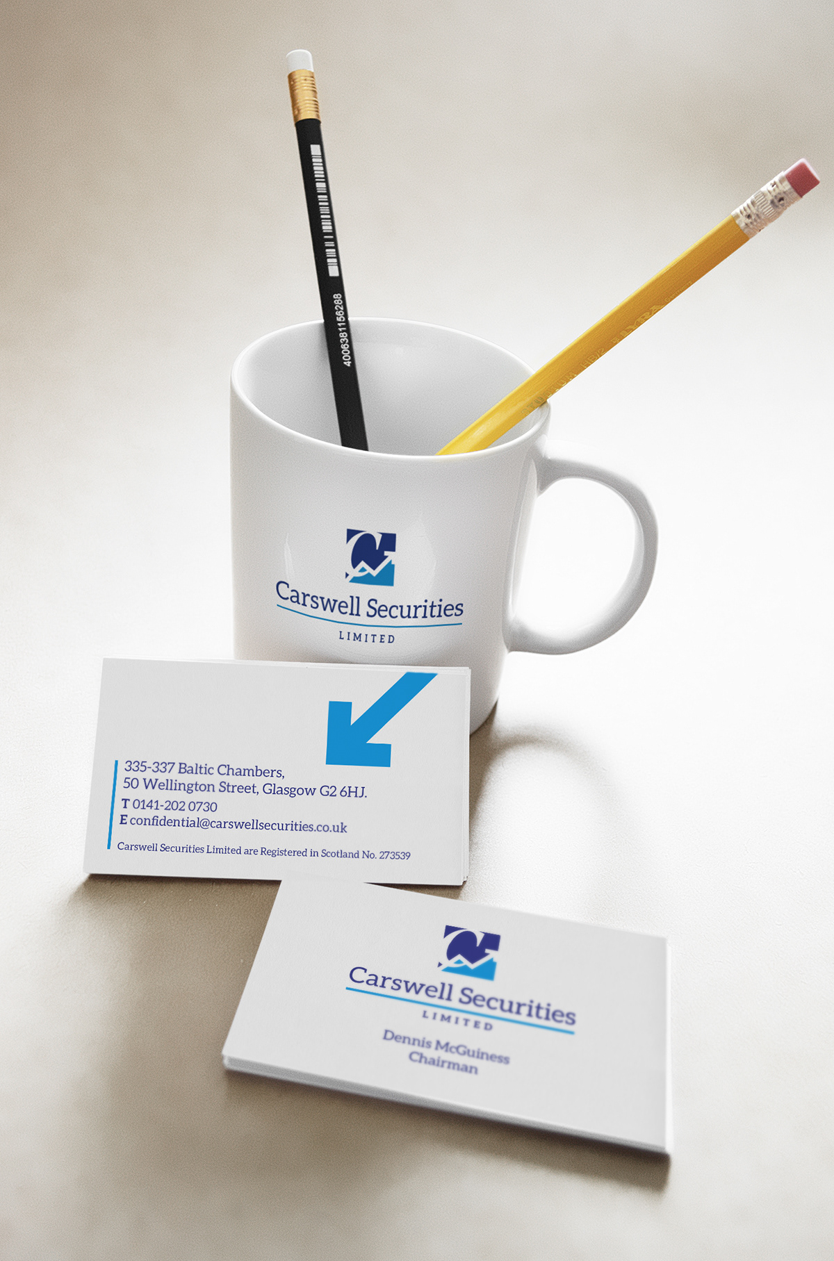
The objective of the brief was to create an identity for a stockbroking/stock exchange company. I designed the logo with that in mind with the use of the arrow going up and down symbolising rise and falls in the market. I used a serif typeface as I felt that gave it a more industrial look which I what they were looking for. I chose two shades of blue to make the logo stand out and give it a proffessional look.
Contact me: jasonj14795@googlemail.com


Thanks for Viewing!
feedback on my work would be much appreciated
contact me: jasonj14795@googlemail.com
Follow me: twitter

