Communication Design Gallery
Created by: Jeff Shoket - Communicaton Design Consultant
Created by: Jeff Shoket - Communicaton Design Consultant
In these short briefs, I share my talent by showcasing some pieces of my graphic design portfolio, describing my thought processes in detail on how I developed these projects to completion. I want to help those interested in my work understand how I conceptualized the designs from nothing to finished works of communication. I invite you to review my gallery, call me for my advice, or leave comments.
I look forward to helping you solve your communication design problems…
I look forward to helping you solve your communication design problems…
Best regards, Jeff Shoket

Client: Position Pro SEO - National Marketing Firm (Local Search Engine Optimization Services)
Usage: Collateral Print & Web
Project Detail Brief: The project involved producing a streamlined corporate identity for a search engine optimization enterprise. The parameters were to design an easily recognizable icon that emphasized movement and strength, at the same time making the design flexible to conform to different locations throughout the U.S. that represent the firm in their local marketplace. The black chrome was a feature incorporate into the design giving the logo a rich look and feel, at the same time not making it flashy or flat and boring, but more retail and tangible to the viewer…
Web Reference: http://spokaneproseo.com

Client: Mahesh Patel Real Estate Broker - Orange County, California
Usage: Collateral Print, Web & Mobile Devices
Project Detail Brief: My client approached me needing a reworking of his business branding. He requested branding that his current and new customers would recognize him instantly in the marketplace. His current branding for his business was weak and was not working for him, it did not deliver or emphasize his personality and strength as realtor. The design needed a complete reinvention of the current design into a more business type of representation for him as a real estate broker. Originally the design did not convey any sense of story or quality to the viewer, not compelling any type of brand recognition. I worked with the clients interests and desires and fashioned them into a more stand-alone representation of who and what he represents to his client base and himself. The circle form of the logo unifies the design giving it the quality of an ancient icon, at the same time the bottom falls away to allow the viewer to feel comfortable with the design, not closed off, but welcomed. I incorporated the sun and reflection to indicate a new day and new possibilities, giving the design a inviting tone. The letter forms representing my clients entails represent traditional and strong foundations in his business and relationships, which are the basis of creating this branded identity. The color orange is also used strategically since it conveys a strong personality and character which completes this branded logo design. This branded identity is meant to be enduring and timeless, to continue perpetually, to build upon itself in creating a brand for my client as he continues to use it throughout his business environment…

Client: Retail DVD Product & Distribution Company
Usage: Retail Packaging & Web
Project Detail Brief: At the request of my client to develop a recognizable icon for a new product feature on their packaging. It needed to be highly visible, clean and recognizable to the customer in the retail environment. Its purpose is to introduce and market to the customer the contents are produced at a higher standard, and would comply with new standards of media players. Conveying quality and uniformity consistent with the branding of the packaging that it was produced with… I took the inverse of a cameras lens aperture and stylized it for a background base to seat the icon design on it. To convey HD quality I used the grey gradient fill from white to black with no banding, indicating a higher resolution and quality. The unifying of the HD letter forms binding them together brings the acronym into one unit of the design inclosed in a strong red color completing the icon. Functioning as a stand alone piece of the marketing for the product packaging it describes a recognizable quality and delivers the message as it was designed to…
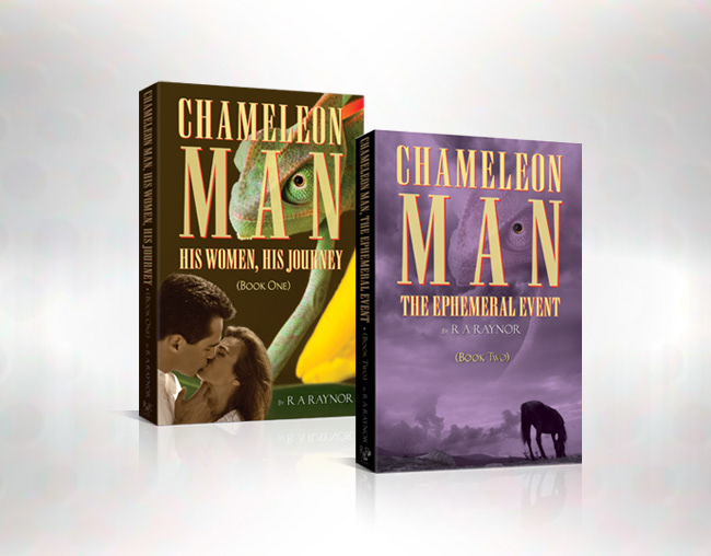
Client: Roy Raynor Author - Publisher and Distributor (Romance Novels)
Usage: Collateral, Product & Web
Project Detail Brief: A self-published author commissioned me to design the two covers for their first entry into the publishing world. Their desires in the details representing the storyline were very specific in imagery and content. The imagery needed to be timeless and enduring to lead the viewer into the story. The titling had to be of a specific time period as well, emphasizing its history to the characters of these books. Based on this information I created multiple covers that were romanic in style, and mysterious in nature, giving them a classy pulp novel appeal to interest the viewer. They loved what I had designed for them on all the samples I created. They were hard-pressed to make a decision, so we mixed and matched content, coming up with a final design for the covers. At the same time I created a very simple branded logo design for their new publishing company & books, that represents them in the marketplace…
Web Reference: http://www.rarpublisher.com/
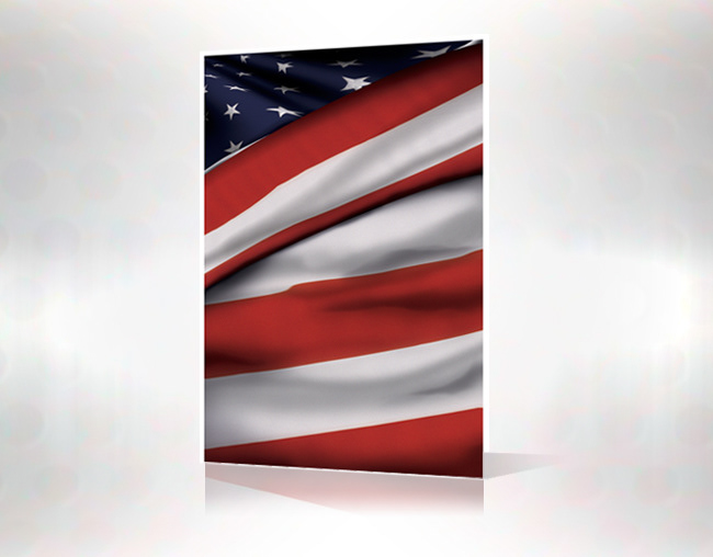
Concept Piece: Editorial & Advertising
Project Detail Brief: I created this illustration of an American Flag folded in a 3D format to show my strengths as an illustrator as well as my abilities, knowledge and usage of specific applications in digital. No outside resources were used in the creation of this piece, all elements were generated from scratch within the digital environment…

Client: NBC/Universal “Las Vegas - S3/E8” - Television & Movie Broadcast Media Company
Usage: Keyart Prop Poster Design, Video and Duratrans Display
Project Detail Brief: I was contracted by the shows art director to produce a compelling design based on supplied material; create a 16' foot and a 4' foot banner for the TV series “Las Vegas”. The overall theme of the poster was to convey the beauty of the Indian subcontinent with its richness of culture and history. The main focal point was this massive dark blue sapphire ringed with diamonds. I was given a limited quantity of flat photographic imagery to work with and little art direction to go on. I began to manipulated the image content to my clients requirements, as well as rework some of the original concept with their permission. I created several designs for this project, of which one was chosen. They were very impressed and happy with the final results… If you watch the episode you will see the poster in the background throughout the show.
Watch the Episode: http://www.megavideo.com/?v=Q4FBSR15
READ: Once you are on the site click on the button in the middle of the video player, it will bring up a new window - Delete this new window! Go back to the original window and click on the button in the middle of the window, give it a second to start. The show will begin to play… Enjoy!
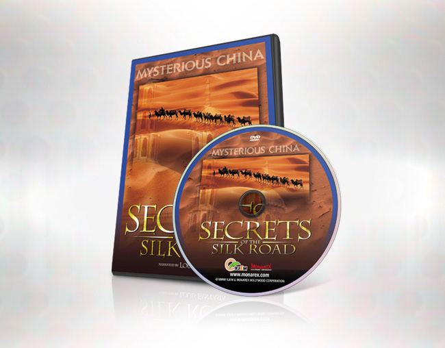
Client: Monarex Hollywood Corporation - Documentary Film Production & Distribution Company
Usage: Retail Packaging & Web
Project Detail Brief: My client a documentary film maker employed me to create the keyart packaging for their new movie “Secrets of the Silk Road”. The production company was mostly concerned with the artwork being of quality sold in the retail environment online or in a brick & mortar store, such as the “Discovery Channel Store, or Amazon.com”. I had a focused conversation with the director and producer about the content of the movie so I would have a better grounded base to start my design with. With as much information as I was going to receive from my client I developed the desert theme and ancient architecture concepts, interpreting the vast distances across the Asian continent suggested in the keyart design. The design focused on maintaining a mysterious and ancient tone, best represented in the style of lettering for the movie titling for the keyart. Blue being a primary color complement the orange sand quality of the keyart as well as it being an ancient dye (indigo) traded on the silk road. The producer and production company were most impressed with the final artwork and felt very confident that the movie would sell quite well once in the stores and the web…
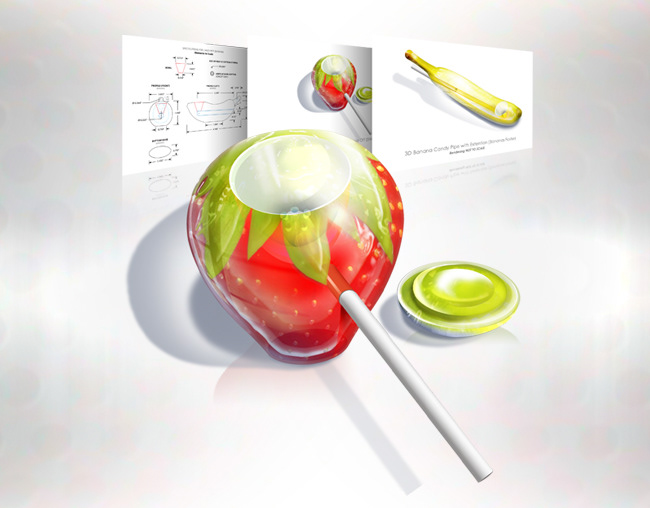
Client: Hott Products - Novelty Product Manufacture and Distributor
Usage: Retail (Edible) Consumer Product & Retail Packaging
Project Detail Brief: My client a novelty product manufacture and distributor, commissioned me to develop preliminary concepts and renderings for multiple versions of smoking pipes that resembled fruit. The project Started out as real fruit on my desk. I photographed the individual pieces of fruit: strawberry, banana, apple and orange. I then began to transform the images into what they would ultimately would become. Originally developed to be cast as porcelain, my client changed direction with the project and decided to make the product as edible candy, like lolly pop. Since a lot of their product lines involved candy, this was a viable course of action to go in. So I changed gears and reworked the concepts into renderings that represented edible products. I also engineered a two piece snap-together tube for the pipes. I was provided dimensions to stay within for manufacturing, and shipping purposes. I created exacting schematic drawings in 2D, and photo-realistic 3D renderings for fabrication of the production pieces. As a multimedia piece it was very different, because of the steps involved in transforming a raw photograph into multiple concepts that did not exist in reality was challenging, creating the engineering diagrams to precise measurements, and developing the functional features of the product that made them unique in the marketplace. The products never went to market, and only exist on the drawing board for now…
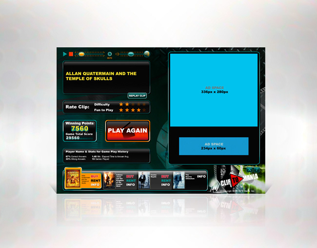
Client: ByDomino.com - Web Base Developer & Programmer
Usage: Web Application
Project Detail Brief: My client, a close colleague, approached me, and asked would I be interested in designing a user interface for an online game that he was working on. Because this project would show some of my other skill as a designer, I jumped at the opportunity and said “Yes”. This particular project required a confident understanding of what was needed for the game to work and its functional features before I created one piece of the concept artwork. From those details I quickly started creating the imagery and functionality of the game components as if I were a small child playing in a sand box full of new toys. The design needed to be cinematic in theme and tone, at the same time mysterious, enticing the viewer to be curious about playing the game. The main focus of this user interface was not the game, but the advertising and marketing space to the right. The users play area was to subordinate visually to the advertising space, but divided equally, allowing equal weight to each. The user would play the game, in turn the advertising would continue to change during the game interaction, generating revenue. This was a refreshing and fun project to design because of the amount of detail required, freedom I was given to create, and the ease at which all the elements came together to make it a functioning interface. The online experience of playing the game is very entertaining, at the same time having my artwork be interactive is most satisfying. The client is continuing to get complements and is getting approval from the movie studios to go forward with more d[new link]evelopment…
Web Link to Game Page: http://www.filmaholics.com
Game 1 LINK
Game 2 LINK
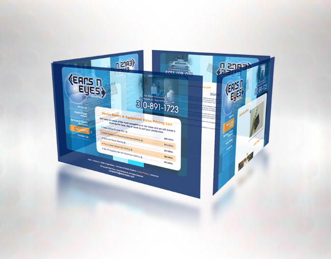
Client: “Ears n Eyes Mediaworks” - Sound Engineering & Video Production Studio - Torrance, California
Usage: Business Web Marketing
Project Detail Brief: The client recently had their branding design completed and asked if I would develop for them a business website that they in turn would manage and maintain once it was complete. The business specializes in professional audio engineering & video production services, sets, props, fabrication and lighting as well as space. My first step was to have a meeting of the minds with my client, to spend some time interviewing the owner about their business, getting to know who he was, and what he truly wanted as a website experience for his customers. After returning to my studio I took the opportunity to put my fresh ideas and designs into the computer as fast as I could develop them. The project involved developing a website that was to deliver a web presence for the business online, marketing their specific products and services being offered in their local marketplace. The design parameters for the website were simple, develop a site that put their multifaceted business services as top priority, at the same time interpret the personality and creativity aspects of the studio as a whole. Keeping the design simple and uncluttered allowed the information to be delivered quickly, at the same time providing the potential client with valuable information about the business and what they have to offer. The final product lends itself to a comfortable homey environment with a technical flare, of which my client was very confident and happy. The resulting website delivered his personality and down to earth way of doing business…
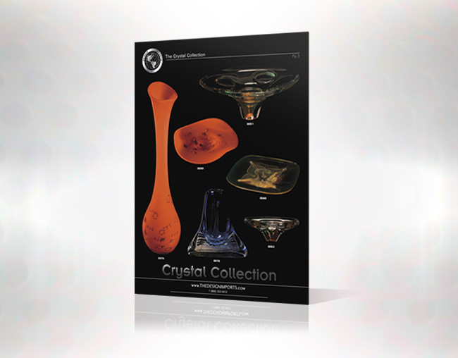
Client: Design Imports Inc. - Importer and Distributor of Fine Glassware & Home Decor Fashion Accessories
Usage: Collateral Print, Digital Authoring & Web
Project Detail Brief: My client, an importer of eastern European glassware hired me to design and develop a marketing catalog of his most recent pieces that he would be selling at the LA Mart in downtown Los Angeles. My client knew this project demanded precision, and only wanted the best quality that could be achieved for the marketing of the products. A very unique project in itself, requiring a lot of finesse and attention to detail. The imagery had to be exacting and deliver the content precisely the way the client wanted. Photographing and lighting the objects on a black background is challenging in it self maintaining the color luminosity, translucency and transparency factors for each piece. When done correctly there is this perfect synergy of a crystal glass glowing on a shrouded black background waiting to be transformed into the marketing piece it was created. Each product had to be precisely lifted from their backgrounds, preparing them for layout with other products in the catalog. When completed a very elegant design emerged, with a rich black background matching the objects original content. The headings and glass pieces for each collection were produced with a blind varnish over the black surface emphasizing the products stylish glassy features. My client was thrilled with the outcome and was very pleased with the printed piece, it delivered in quality and sales for him…
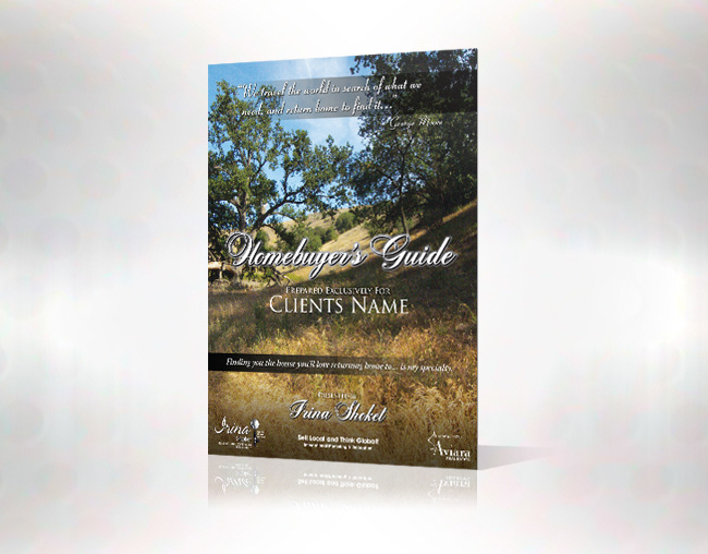
Client: Aviara Real Estate - Conejo Valley/Thousand Oaks, California
Usage: Collateral Print
Project Detail Brief: My client needed a presentation collateral piece with vision that would capture the essence of the environment they are selling to their customers, they came to me to help them develop that vision in a marketing piece. I designed this print piece with two visions in mind, one entice the viewer to the region, and secondly present the high quality of the services that they would be receiving from the real estate agent. Showcasing the best features of the area, I took some time to photograph the local surrounding open spaces, keeping in mind the strengths that make the region very desirable to those who live, or wish to live in the Conejo Valley. The lighting and shadows of the oaks on the fields of golden grass subdue the viewer into the piece, while the elegance of typography usage delivers a sense of quality service to be expected, this is the essences and the substance of what I wanted to achieve for the design. I very much enjoyed producing the photography and designing the presentation for my client. A beautiful piece that serves the client and their potential customers very well in the spirit of the properties they promote…
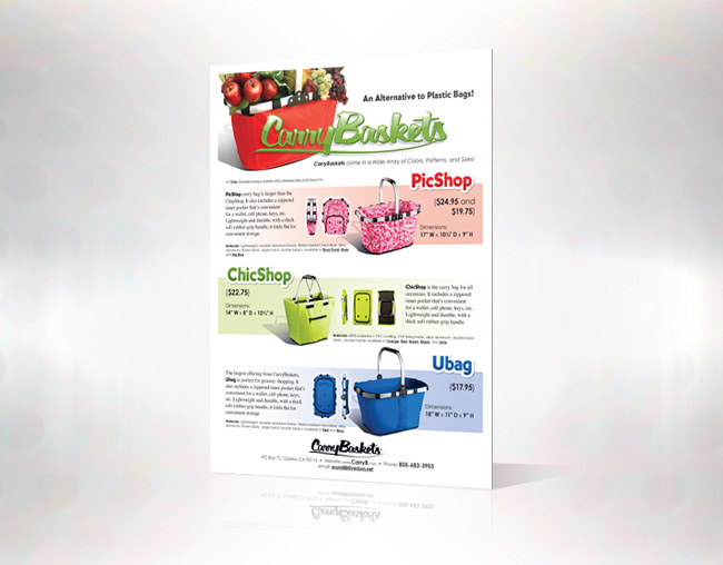
Client: Retail & Web Marketing (Earth Friendly) Utility Products Company
Usage: Collateral Print & Web
Project Detail Briefs: The client requested a marketing piece for their new business venture to sell canvas grocery baskets on the internet, and door to door. Requiring uniformity on this project I had a blank canvas to start with. They needed a branded look for their new business to give them a more polished look and feel to their new business… I took up the challenge and created a logo masthead that communicated that they were in the business of greening the planet, at the same time the collateral piece needed to be stylish and retail oriented. Uniformity came in the form of developing a look and feel for each product, setting a unique tone for the layout overall that would indicate to the viewer a cohesive design and perceived value for the brand. The product photography needed to be massaged to bring each more inline with the retail aspects of the design. After all elements were brought together the client requested the final design in several formats (print & web), and all components delivered separately for a new website they were building elsewhere. The uniqueness and simplicity of the design serves my client well, presenting the products information cleanly to their customers, at the same time creating a brand for them that they can build upon…

