The Town Mouse
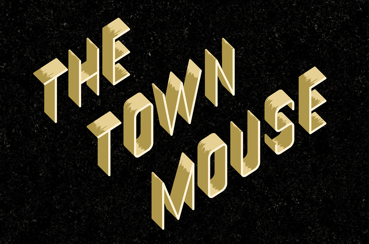
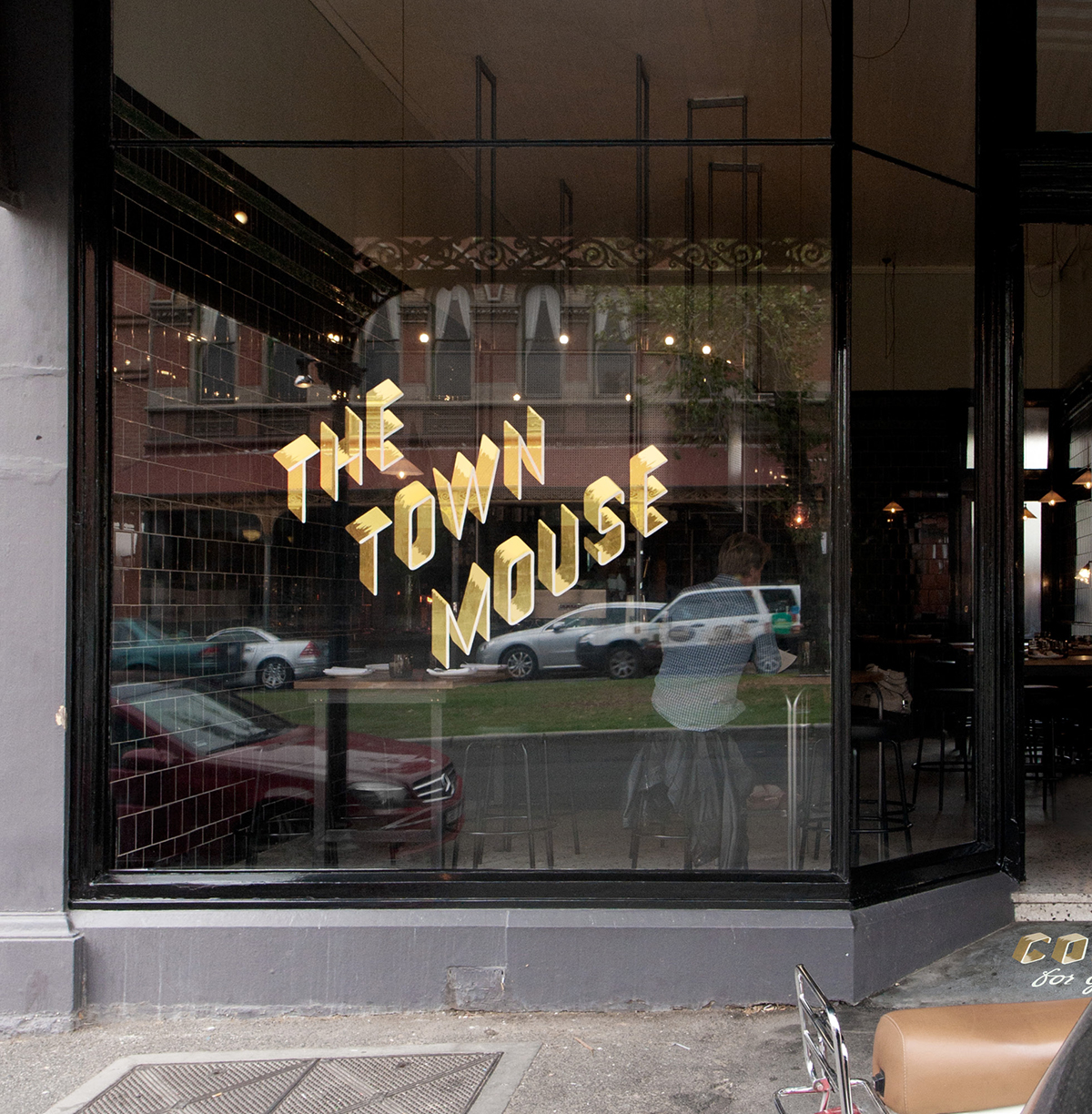
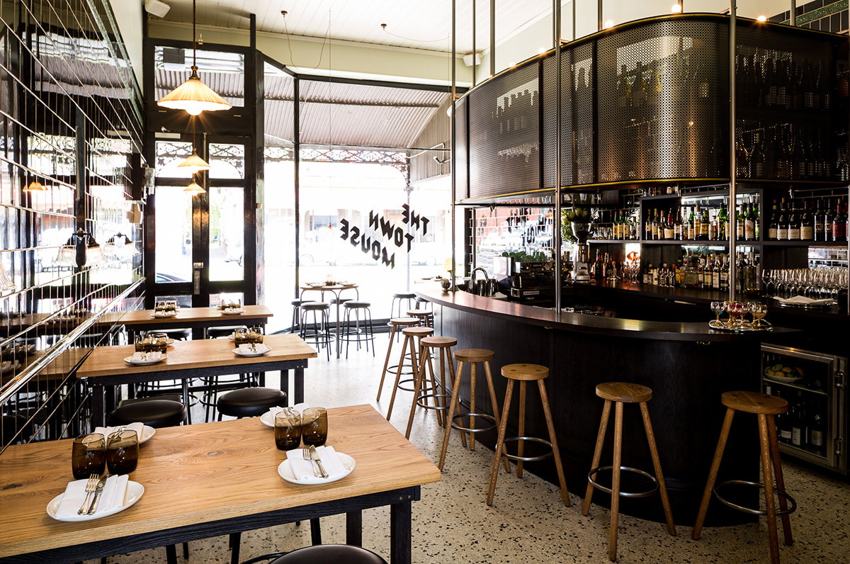
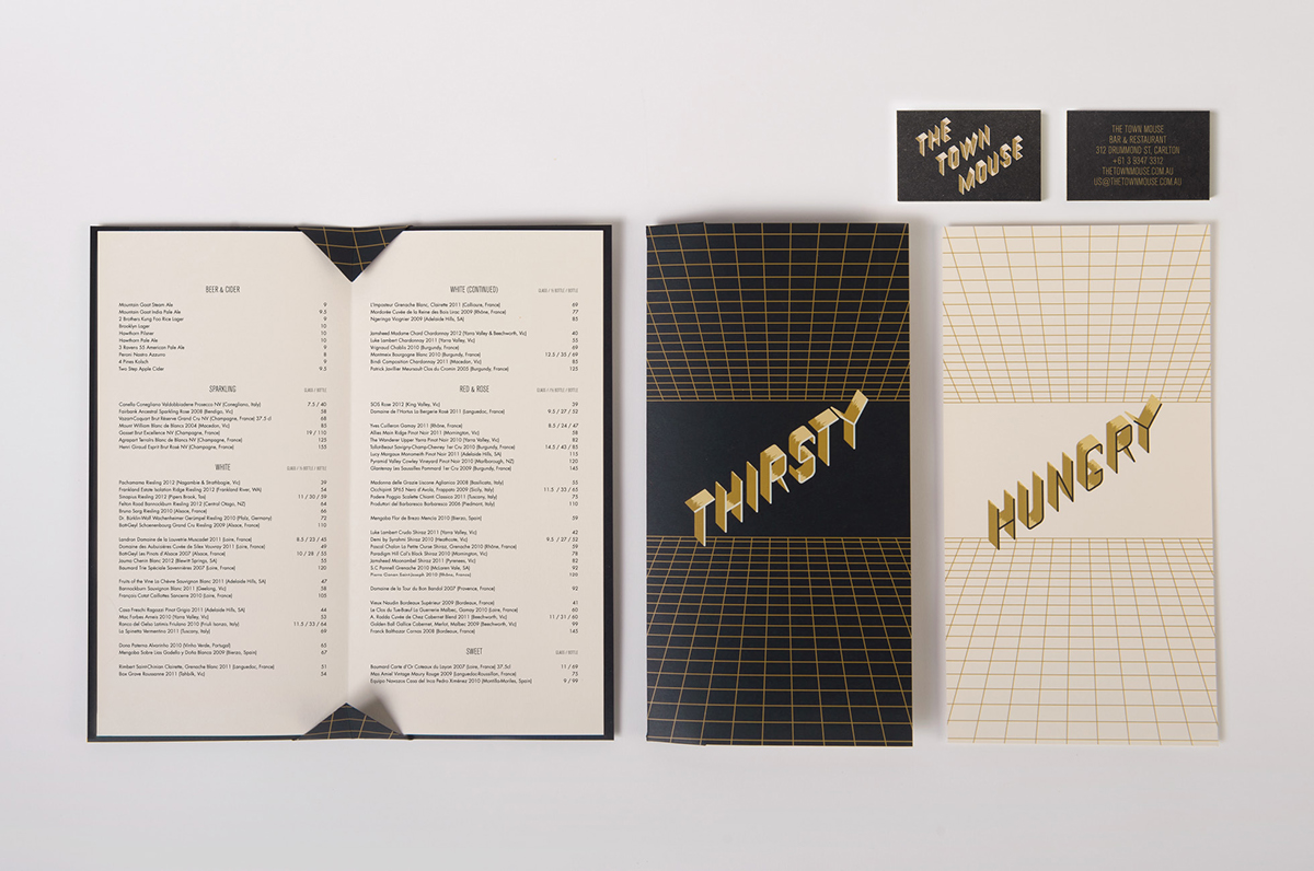
In a neighbourly setting a behind Lygon Street in Melbourne, this new bar/restaurant sets out to feel as like it was opened in any decade. We deliberately eschewed fable references of ‘The Town Mouse and the Country Mouse’ in favour of a less literal approach. Inspired by the town grid our custom drawn typography is based on an isometric birds eye view of buildings. Skyscrapers are also referenced in the menu designs where perspectives are toyed with. Through the details of our execution painterly highlights hark back to a bygone era of hand-crafted signage adding warmth, while the jaunty angle of the typography and glow-in-the-dark business cards allude to the party atmosphere in the bar. The signpainted doorstep, and windows gilded in shades of gold leaf, will wear with age and grow in character — and we’re sure The Town Mouse will do the same.
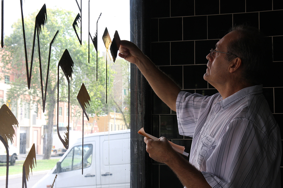
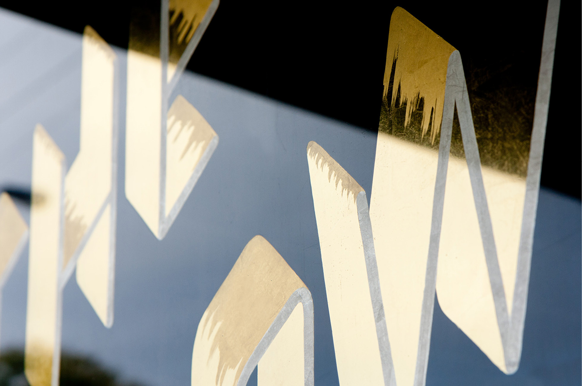

First doorstep features hand sign painted graphics
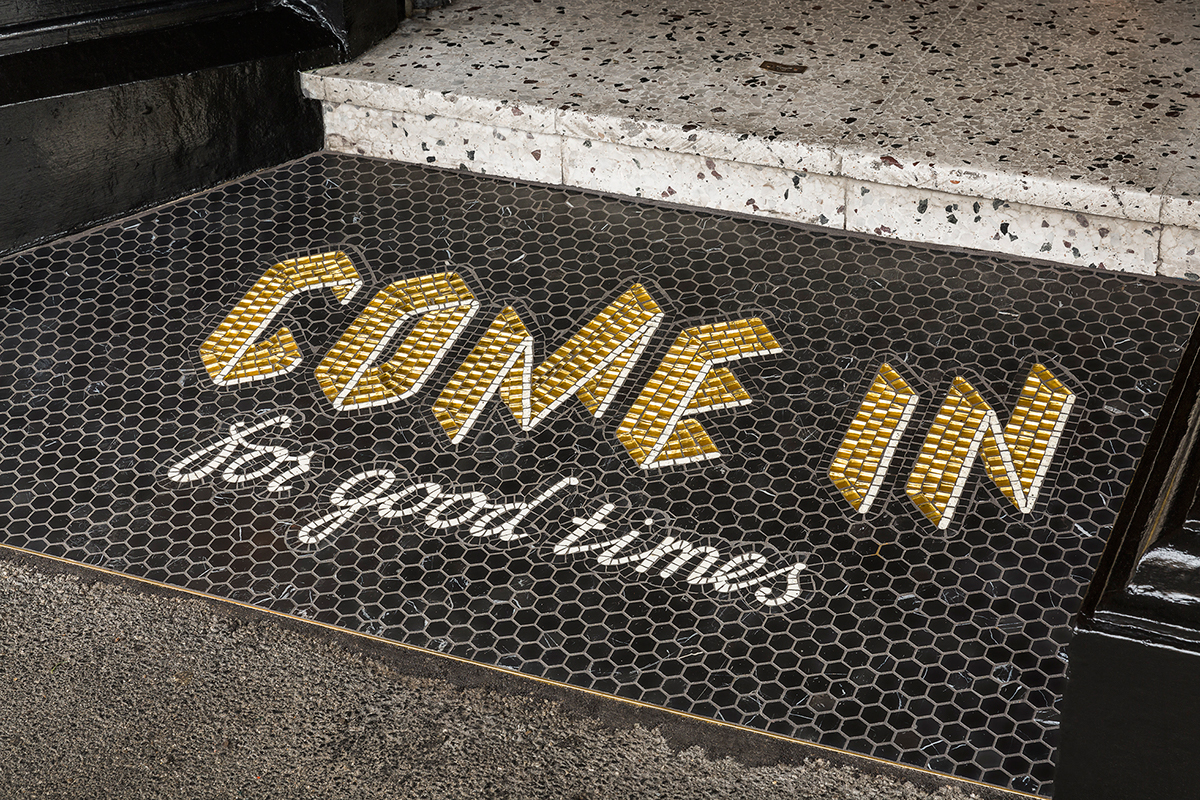
Second iteration of the doorstep features more permanent mosaic tile typography
Photography by Sarah Anderson
Photography by Sarah Anderson
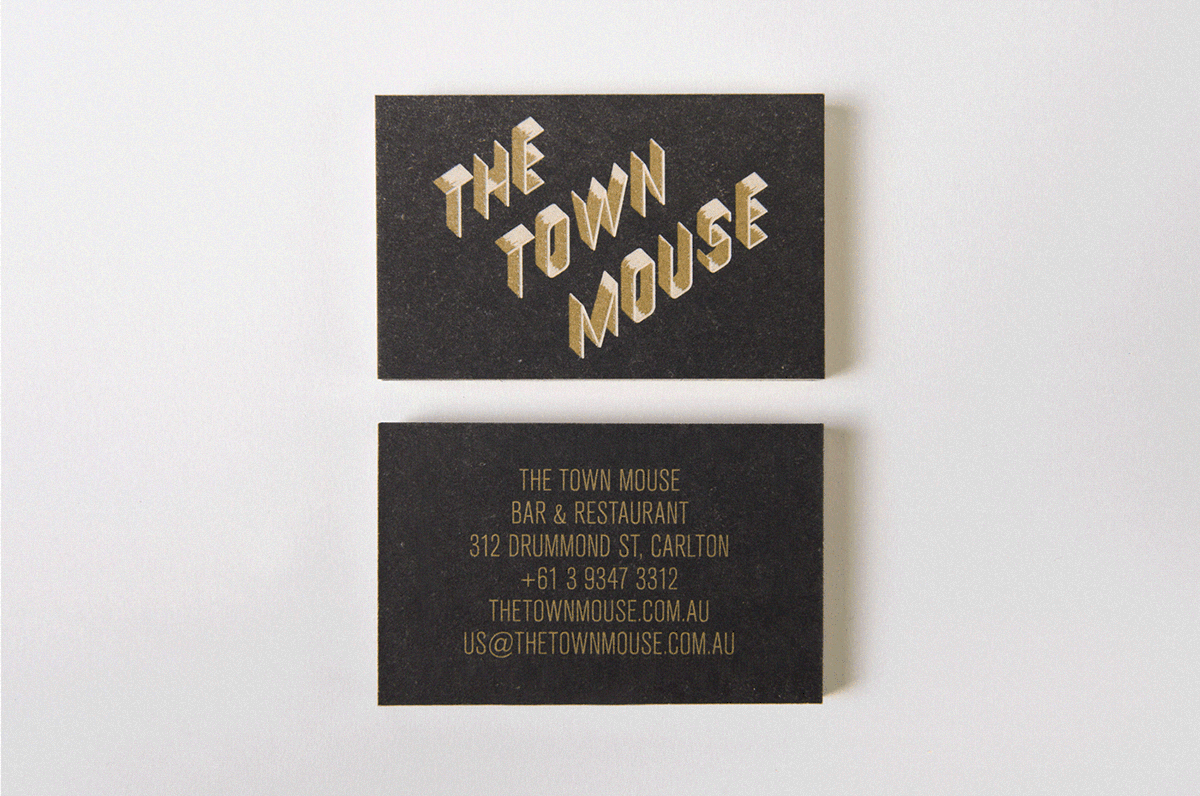
Glow in the dark business cards


Credits
Gold leaf gilding by Bruce Jackson of Gold Reverre. Menu frame created in collaboration with Ryan Ward of United Measures. Photography by Shane Loorham and Sarah Anderson.


