English: VALENCIA BLUES FESTIVAL POSTER.
Thanks to FUNK TIME, my personal project of illustration, posters with musical themes, where I have been investigating both in technique and ways of approaching through illustration to the musical genre, the people of the Blues Festival of Valencia called me to take charge of me of this year's poster.
I have to say that from the first moment I made special illusion, because it is a commission that comes because the client has seen my work and comes directly from what I do and from the ideas I have, I love music and make posters, to make a poster is a hard work, first of all it has to be attractive, very readable, if it is that at a glance you already know of what goes, what and where. Then you can get closer to looking at the details, but it has to be straightforward.
In this case, the blues posters are usually with a rather old and vintage aesthetic, are motley and full of letters and information, almost illegible.
My way of understanding the cartel made me opt for the opposite, trying to make a poster very visual and striking.
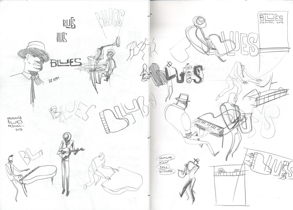
As an illustrator, I always try to give you a good idea to give a plus to the image, when I came to the idea of "Piano / B of Blues" I knew I had something good, then I was playing with putting characters / Musicians around playing, but in the end I had enough, the "B" had so much power alone that he did not need anything else.
The normal in almost everything in our life are the horizontal and vertical lines, so when we see a diagonal, gives us a sense of movement, attracting our attention to the moment, the intrinsic diagonals of the piano itself, I was already in the composition so I worked With color shapes following those directions. I liked the idea that the lyrics of the headliner group where the projected shadow of the piano itself, which integrated it even more as illustration. Afterwards he was playing the puzzle with letters and logos, changes and more changes.
Finally, in spite of being a poster with very pure and straight forms, I wanted to make it old and textured, and I scanned an old paper from a notebook and I gave it a bit of plot.
I hope you like it and enjoy it as much as I do.
Xélon xlf
+info: valenciabluesfestival.com
Español: POSTER para el FESTIVAL de BLUES de Valencia.
Gracias a FUNK TIME, mi proyecto personal de ilustración de carteles con temática musical, donde he ido investigando tanto en técnica como en formas de aproximarme a través de ilustración al género musical, los responsables del Festival de Blues de Valencia me llamaron para que me encargase del cartel de este año.
Tengo que decir que desde el primer momento me hizo especial ilusión, pues no deja de ser un encargo que viene porque el cliente ha visto trabajos míos y viene directamente por lo que yo hago y por las ideas que tengo, además me encanta la música y la cartelería, hacer un cartel es un trabajo concienzudo, ante todo tiene que ser atractivo, muy legible, si puede ser que de un vistazo ya sepas de qué va, qué, dónde y quién. Después ya te puedes acercar a mirar los detalles, pero tiene que ser directo.
En este caso, los carteles de blues suelen ser con una estética bastante añeja y vintage, son abigarrados y repletos de letras e información, casi ilegibles.
Mi manera de entender la cartelería hizo que me decantase por lo opuesto, intentando hacer un cartel muy visual y llamativo.
Como ilustrador siempre intento darle vueltas a la cabeza para dar con una buena idea que le dé un plus a la imagen, cuando llegué a la idea del "Piano/B de Blues" supe que tenía algo bueno, después estuve jugando con poner personajes/músicos alrededor tocando, pero al final me sobraban, la "B" tenía tanta potencia por sí sola que no le hacía falta nada más.
Lo normal en casi todo en nuestra vida son las líneas horizontales y verticales, por eso cuando vemos una diagonal, nos da sensación de movimiento, atrayendo nuestra atención al momento, las diagonales intrínsecas del propio piano, me mandaban ya en la composición así que trabajé con formas de color siguiendo esas direcciones. Me gustó la idea de que las letras del grupo cabeza de cartel fuera la sombra proyectada del propio piano, lo que lo integraba más aún como ilustración.
Después ya fue jugar al rompecabezas con las letras y los logos, cambios y más cambios, pequeños ajustes, horas y horas.
Por último a pesar de ser un cartel con formas muy puras y rectas, quería darle un punto añejo y con textura, y escaneé un viejo papel de una libreta y le día un poco de trama.
Espero que os guste y que lo disfrutéis tanto como yo.
Xélon xlf
+info: valenciabluesfestival.com


Sketches / Bocetos