

☆☆ Now available as a fine art print - click ☞ HERE ☜ ☆☆
This design for a map of Spain (my adopted home country since 2014) incorporates design aesthetics that were prevalent in cartography from the early modern period up until the early 20th century, particularly the use of colour, type and decorative embellishments. It combines a detailed, antique-style map with drawings of notable buildings in cities around the country.
I began the design in October 2015 and continued to work on it in my spare time over the following eighteen months. Its composition, with city scenes displayed in boxes at the left and right hand sides along with decorative elements such as shields (escudos in Spanish) representing each autonomous community, the decorative border and the title cartouche are all influenced by 17th century decorative atlas maps, particularly those of the Dutch cartographer Joan Blaeu (1596-1673). The whole design was drawn using Illustrator, with the exception of the city scenes, which are pen-on-paper drawings that were scanned and coloured in Photoshop, and the shaded relief of the mountain ranges, also painted in Photoshop. I researched the population statistics for each province and developed a heirarchy of symbols and text label sizes to represent the populations of each settlement; the typefaces used are Brandon Grotesque and Kursivschrift.
Note on language: The primary language used across the map is standard Spanish or Castilian, with alternative names in regional languages written below or alongside in parentheses, e.g. Lérida (Lleida). I decided on this approach for all names - regional, provincial, urban and geographical - in order to maintain consistency across the design, despite the fact that in certain regions (Asturias, the Balearic Islands, the Basque Country, Catalonia, Galicia and the Valencian community) the regional language takes precedence over Castillian.
Click here to view the map at high resolution


A mock-up of the map printed on a sheet measuring 70 x 50 cm and framed.
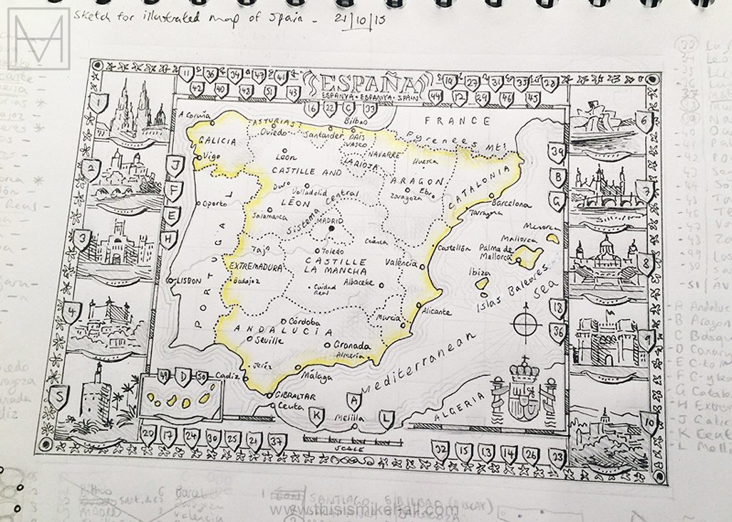
My original concept sketch (October 2015). The composition with coats of arms (Spanish: escudos) and illustrations set into the decorative border was inspired by antique maps which were typically illustrated with scenes of cities located on the map; see examples by Blaeu, Hondius, De Wit et al.

Detail of the title cartouche. To reflect the multilingual nature of Spanish society, the name 'Spain' is written in Castilian Spanish (España), Catalan (Espanya), Basque (Espainia) and English


Illustrations that appear along the left and right edges of the map, clockwise from top left: the Universidad Laboral in Gijón, Asturias; the cathedral in Santiago de Compostela, Galicia; the Plaza Mayor in Salamanca, and the cathedral in Burgos, both in Castille and León.

Illustrations that appear along the left and right edges of the map, clockwise from top left: the Prado Museum in Madrid; the Alcázar in Toledo, Castille-La Mancha; the Torre del Oro in Seville, Andalucia; and the Roman Ampitheatre in Mérida, Extremadura.

Illustrations that appear along the left and right edges of the map, clockwise from top left: the Alhambra in Granada, Andalucia; the cathedral in Murcia; the cathedral in Palma, Majorca; and the Torres de Serranos in Valencia.

Illustrations that appear along the left and right edges of the map, clockwise from top left: the bridge of St. Paul in Cuenca, Castille-La Mancha; the Basilica of Our Lady of the Pillar in Zaragoza, Aragón; the Basilica of the Sagrada Familia in Barcelona, Catalonia; and a view of San Sebastian-Donostia, in the Basque Country.

A composite image of all nineteen coats of arms or escudos that decorate the map. There is one for every administrative and autonomous region in the country, including the cities of Ceuta and Melilla on the north African coast.
Mapping resources
Collins Bartholomew, Google Maps, Grupo Anaya, OpenStreetMap, National Geographic Society, Scilands GmbH, Vidiani.com
Other data resources
Classora, Renfe, Wikiloc, Wikipedia


