


Concept:
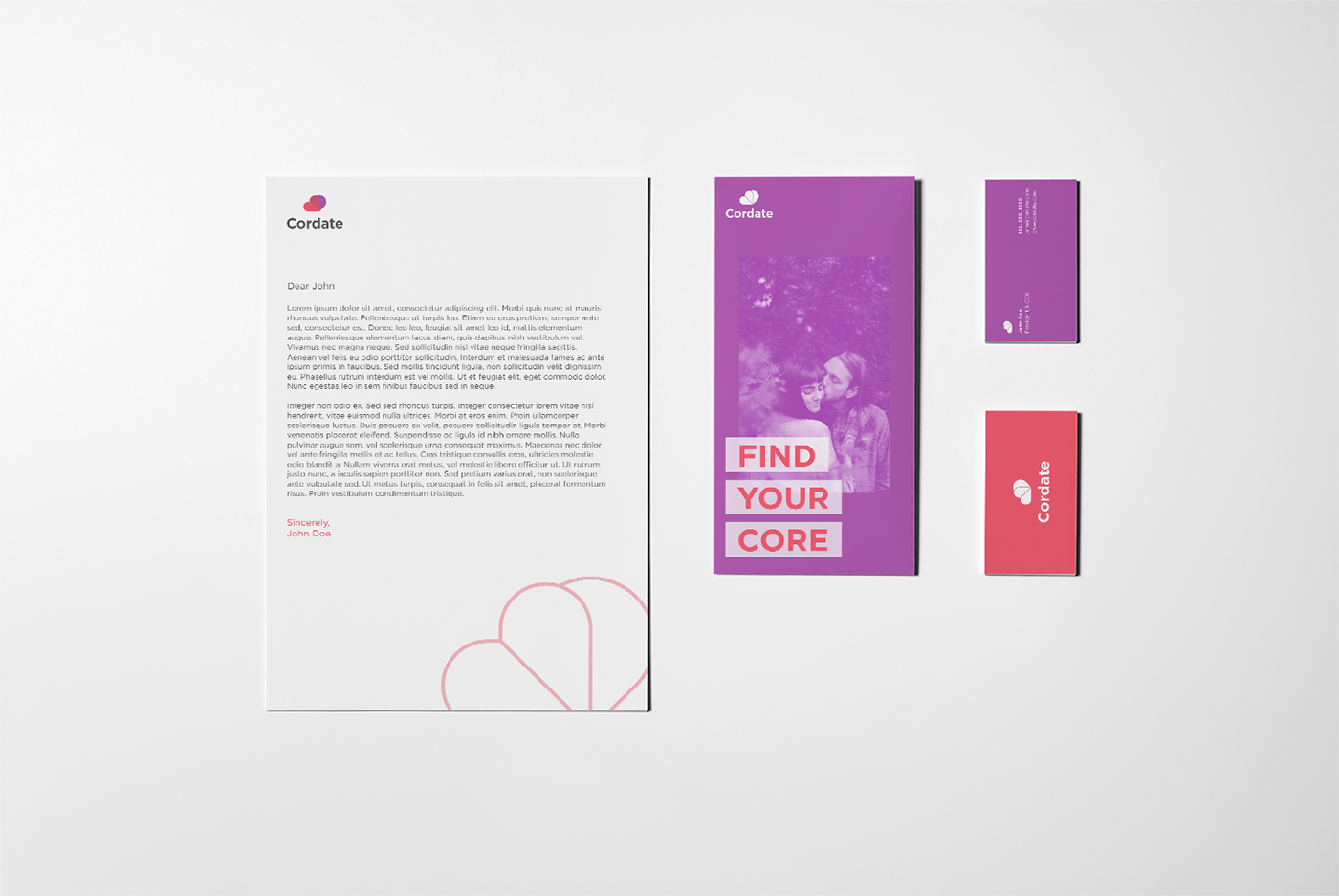
Cordate is a conceptual side project driven by a creative brief that was built by LogoCore, a creative studio that provides visual identity courses. The app is driven by minimal and direct communication between matches that must go through a series of secure filters to be a part of the platform and community(a slight deviation from the brief). For the assignment, I created the visual identity system as well as the UI and UX for the app itself.
Cordate is a conceptual side project driven by a creative brief that was built by LogoCore, a creative studio that provides visual identity courses. The app is driven by minimal and direct communication between matches that must go through a series of secure filters to be a part of the platform and community(a slight deviation from the brief). For the assignment, I created the visual identity system as well as the UI and UX for the app itself.

The Logomark:
The mark itself is intended to represent a few concepts:
1. The combination of C+D
2. The concept of two hearts coming together as one
The mark itself is intended to represent a few concepts:
1. The combination of C+D
2. The concept of two hearts coming together as one
3. The concept of choice via "flipping" through various profiles

Challenges:
The goal for both the identity and the app itself is to create a trustworthy yet friendly feel and atmosphere. As a result, the color palette and typography were specifically chosen to balance the feeling of security with the sense of playfulness and friendliness. The app needed to have a very direct and simple user experience, therefore, I decided to take a minimal and typographic approach to the user interface system that would lead users through a specific and easy to understand user experience. I attempted to minimize the features and choices in the overall user experience as well with the reason being to create a safe and easy to understand environment for the users.
The goal for both the identity and the app itself is to create a trustworthy yet friendly feel and atmosphere. As a result, the color palette and typography were specifically chosen to balance the feeling of security with the sense of playfulness and friendliness. The app needed to have a very direct and simple user experience, therefore, I decided to take a minimal and typographic approach to the user interface system that would lead users through a specific and easy to understand user experience. I attempted to minimize the features and choices in the overall user experience as well with the reason being to create a safe and easy to understand environment for the users.


Conclusion:
I enjoyed experimenting with my UI & Identity design process by exploring minimal and typographically focuses user interfaces and simple yet direct elements of a visual identity system. I look forward to pushing these approaches further in future projects.
I enjoyed experimenting with my UI & Identity design process by exploring minimal and typographically focuses user interfaces and simple yet direct elements of a visual identity system. I look forward to pushing these approaches further in future projects.


