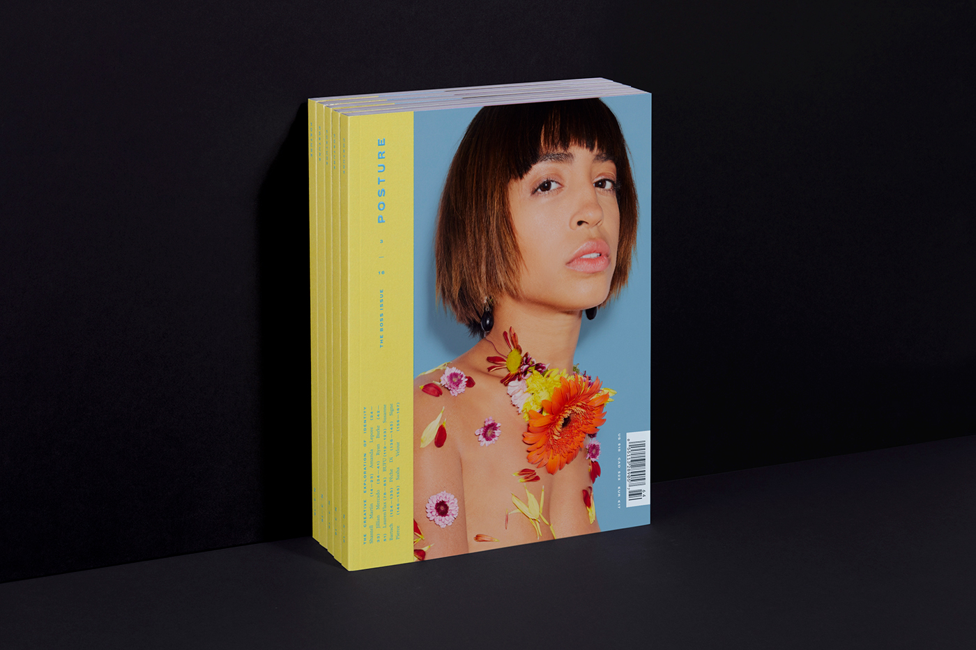
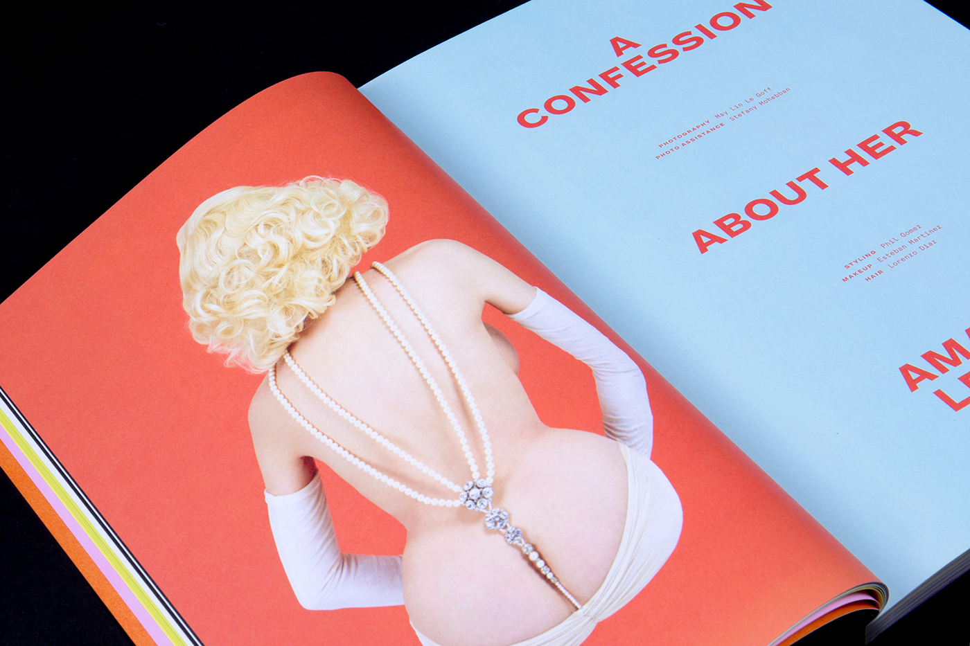
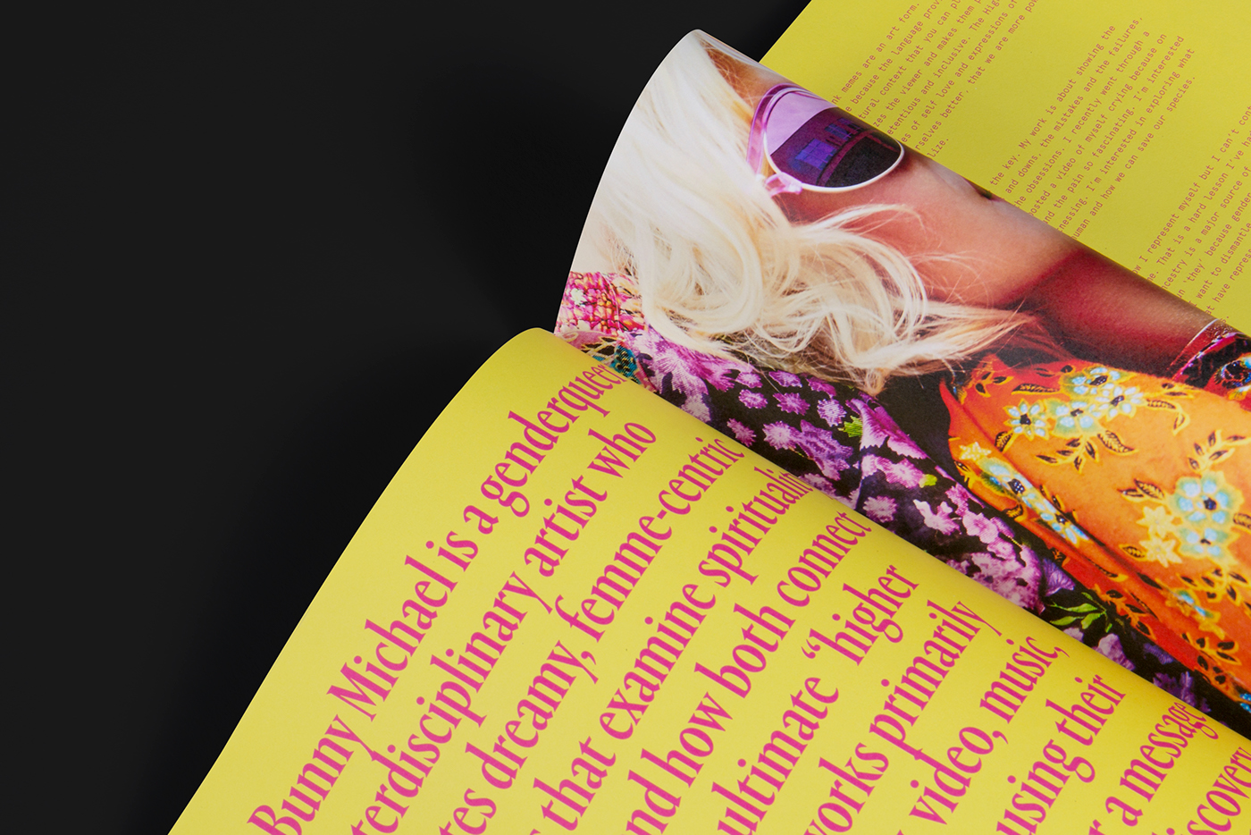
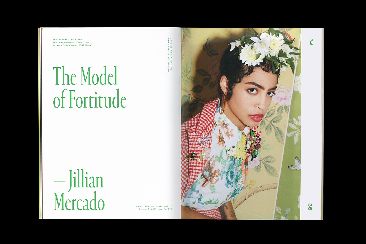
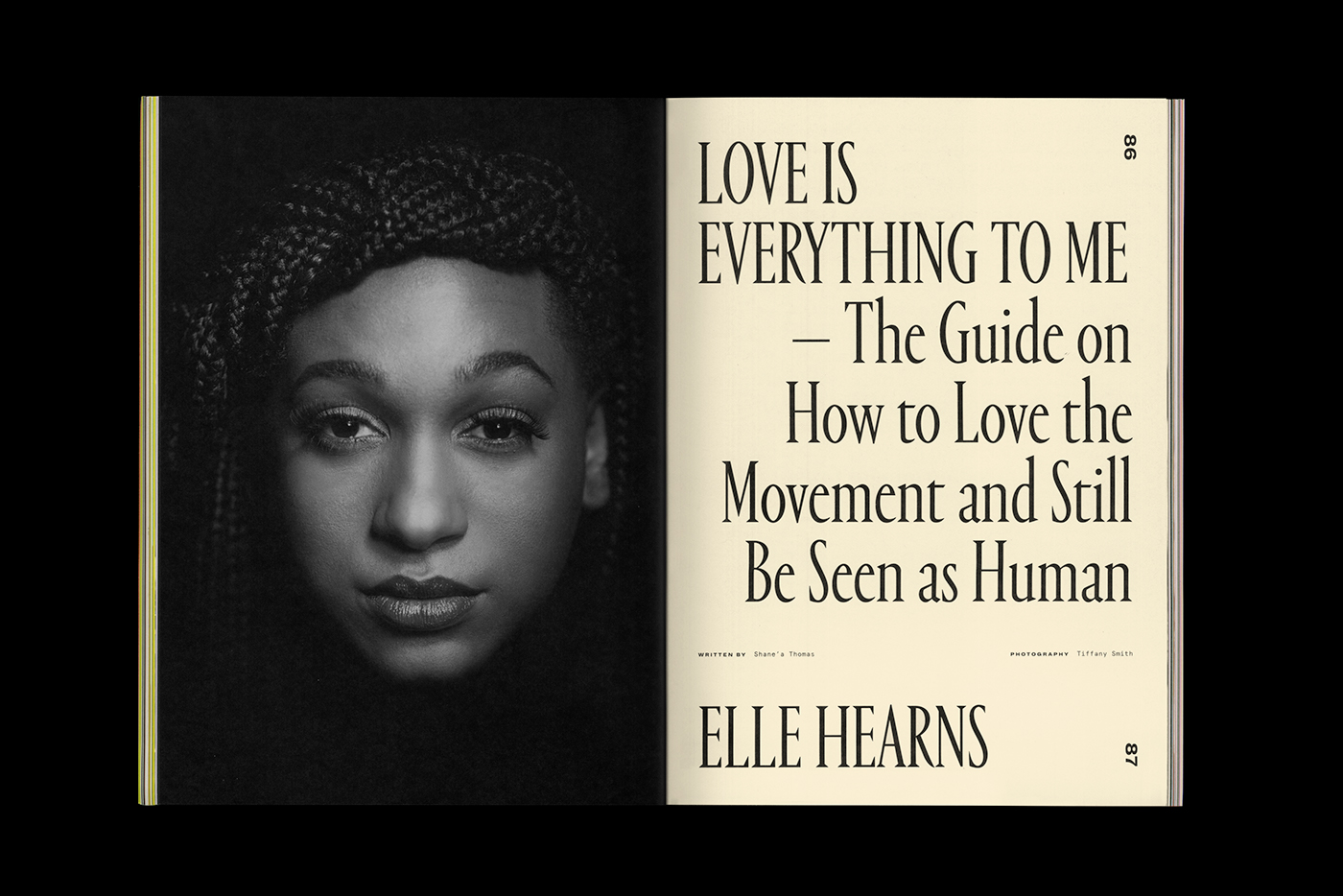
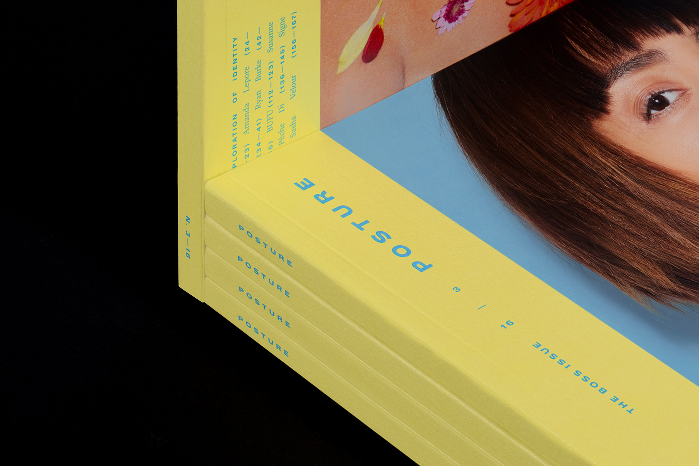
Posture is a biannual print publication dedicated to identity: it gives a platform to marginalized voices and communities, exploring gender, sexuality, race and feminism through art and fashion. As a basis for the rebrand was Posture’s tagline: the creative exploration of identity. The task was to redesign Posture as a publication that wouldn’t look stiff or restrained, but still come across as a cohesive experience: a bold and fun magazine with grown-up sophistication. The topics and photography across the magazine are all stories of individual identities, and therefore stylistically broad – how can each stand on their own, while clearly living within the same covers?
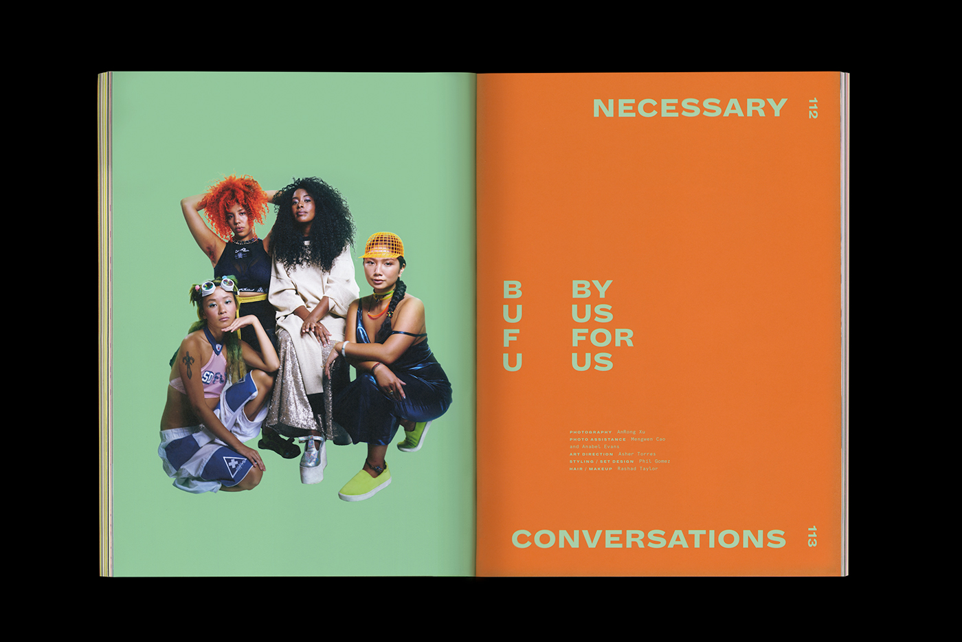
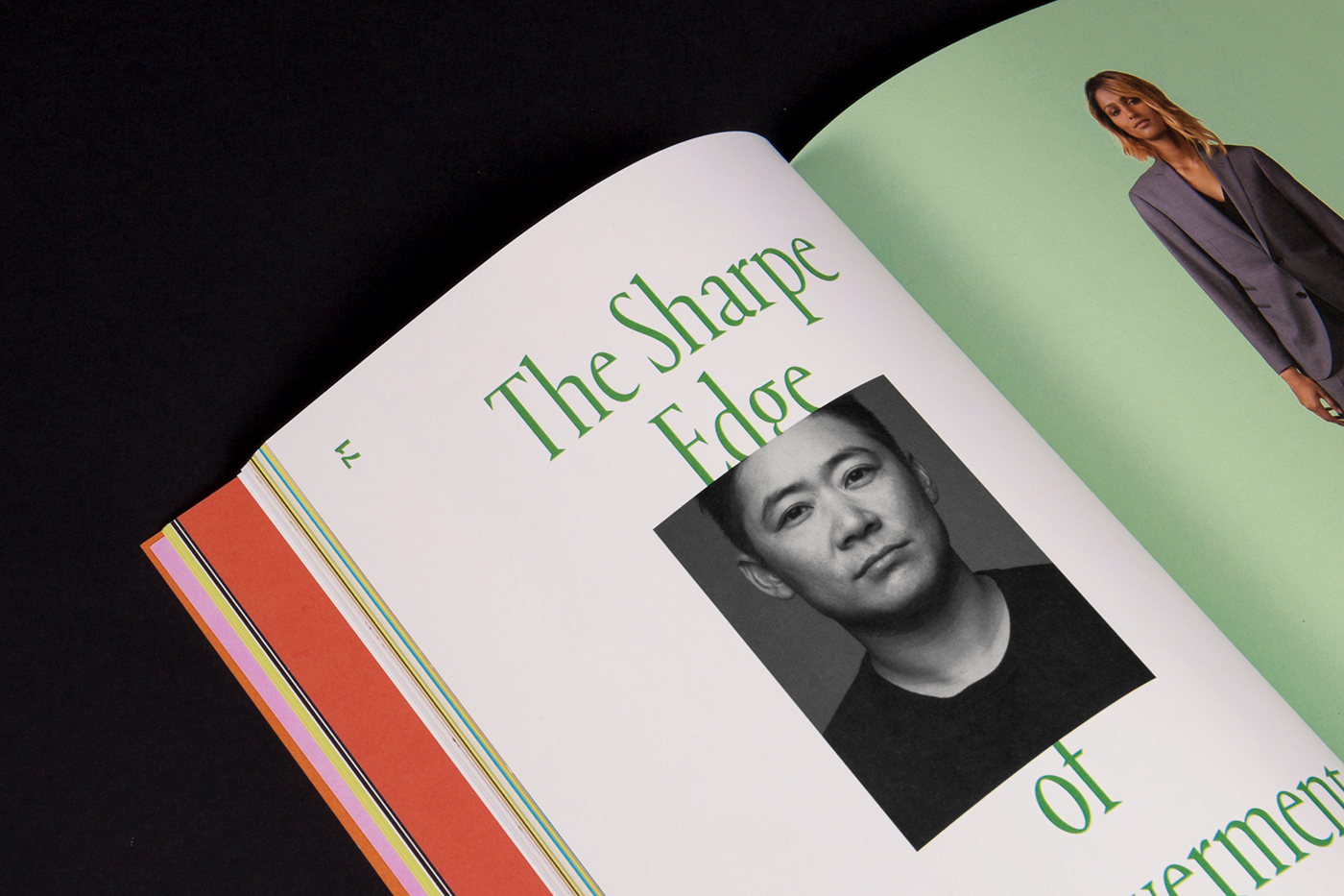
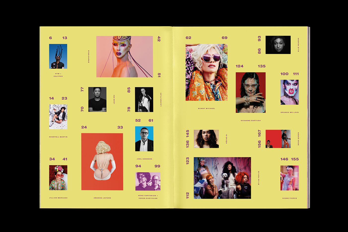
The solution was a strong use of color, not limited to a set palette, allowing for interpreting each article with its own hue. The abundance of strong colors ties everything together. A narrowed type palette helped create a cohesive experience, relying on only two alternative title typefaces: Portrait Condensed – a skinny and tall serif – and Dia Black – a bold and wide sans serif. With their opposing features, the fonts act as another analogy for the expression of identity. The Boss Issue (03/16) is the first to showcase the redesign of the magazine.
Client: Posture | Services: Editorial: Redesign and Design of Issue 03 | Year: 2016
Editor-In-Chief: Winter Mendelson | Publisher: Wayward Wild | Design director: Ryan Essmaker | Cover photo: Kate Owen