This is a kinetic typography video where I animated the text to Sia's song, "The Greatest."
"The Greatest" by Sia. Songwriters: Greg Kurstin / Kendrick Lamar / Blair Mackichan / Sia Kate Furler.
The Greatest lyrics © Warner/Chappell Music, Inc, Sony/ATV Music Publishing LLC.
"The Greatest" by Sia. Songwriters: Greg Kurstin / Kendrick Lamar / Blair Mackichan / Sia Kate Furler.
The Greatest lyrics © Warner/Chappell Music, Inc, Sony/ATV Music Publishing LLC.
MY PROCESS:
I wanted the color scheme to be upbeat and relative to the music video.
I watched the original music video and saw that around 3:30 (https://www.youtube.com/watch?v=GKSRyLdjsPA) in the music video, there's this bright red color that reflects off the dancers' skin. With my background for this kinetic typography piece, I incorporated a similar color with the red of the red-purple gradient.
With the typography, I remained minimalist in style and used two colors - white and a deep purple. I also used a similar system with the font families and only using two families as well. By utilizing both a minimalist style in colors and font families, I felt that it would be readable for the viewer.
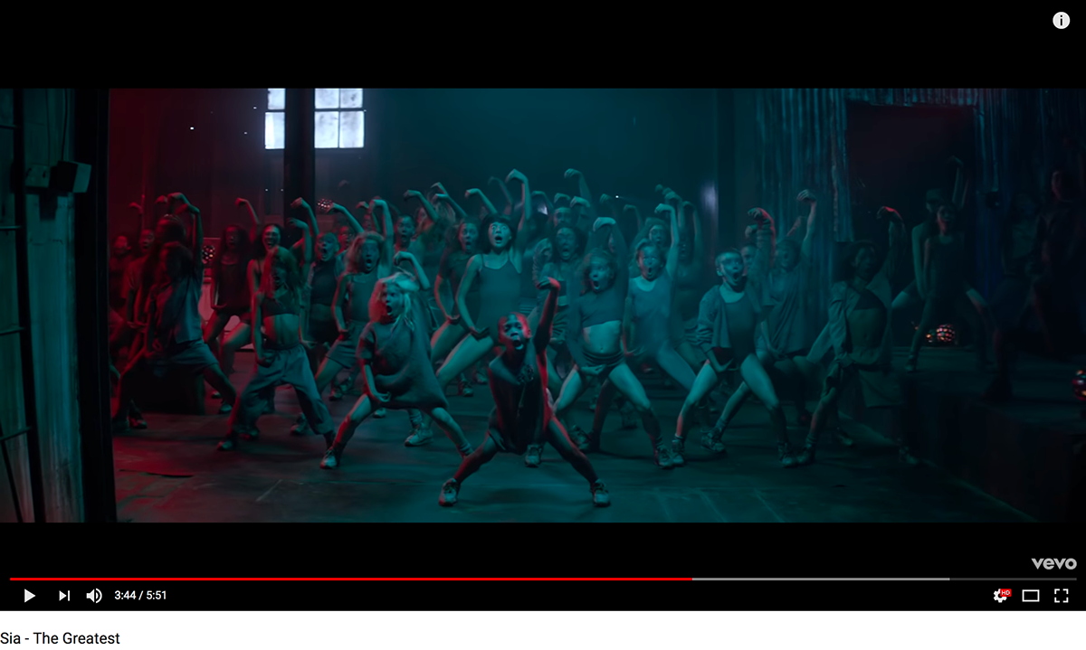
A still image I screenshot from Sia's "The Greatest" music video.
See Sia's music video for "The Greatest" here: https://www.youtube.com/watch?v=GKSRyLdjsPA
I wanted to incorporate this red color reflecting off the dancers (around 3:30 - 5:09 in the music video)
into the gradient I used as the background for the kinetic typography I created for the song.
into the gradient I used as the background for the kinetic typography I created for the song.
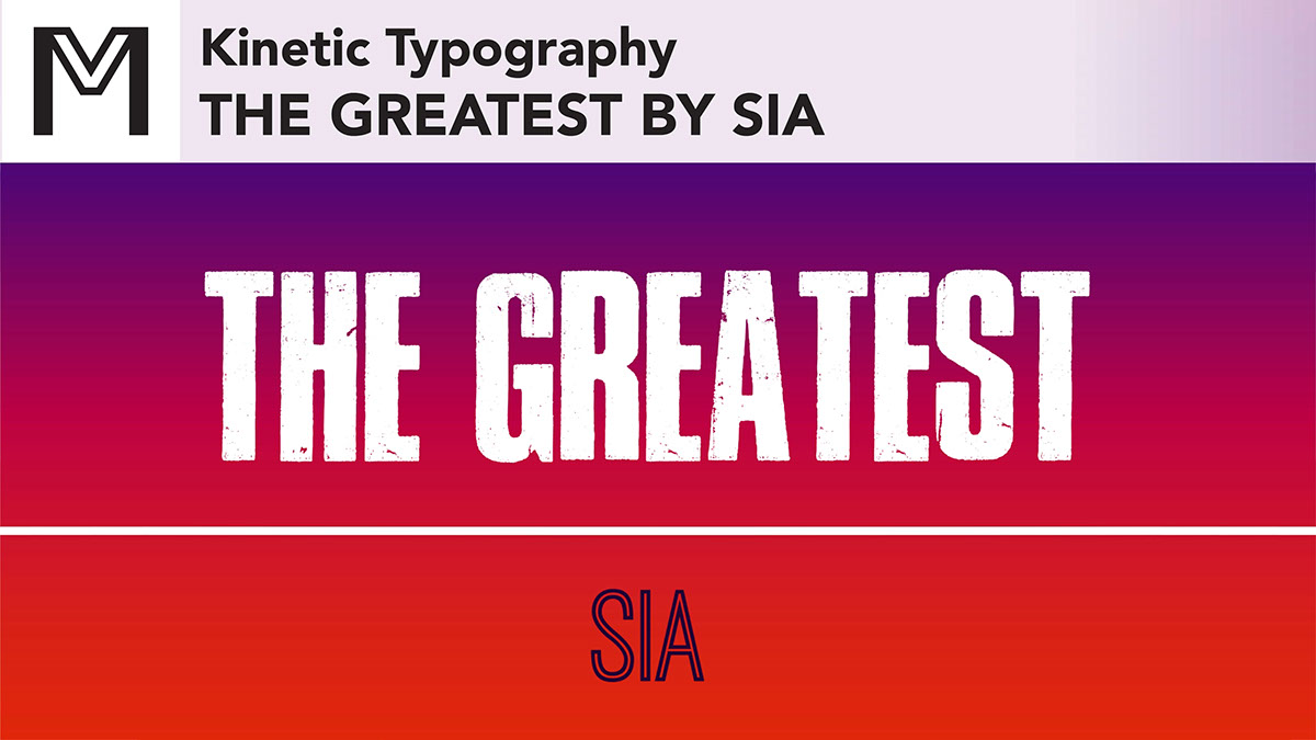
Below are screenshots from my kinetic typography video on my YouTube (The Art of Marie Louise)
The stills of the video are from the video above or here: https://www.youtube.com/watch?v=hz-_dm08-KE&t=111s
The stills of the video are from the video above or here: https://www.youtube.com/watch?v=hz-_dm08-KE&t=111s
Some of the layouts I created for this kinetic typography video.
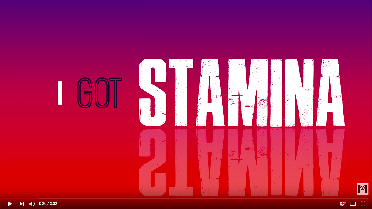
I wanted "stamina" to be reflected for added emphasis.
This is a common phrase that Sia repeats throughout the entire song ("I got stamina").
This is a common phrase that Sia repeats throughout the entire song ("I got stamina").
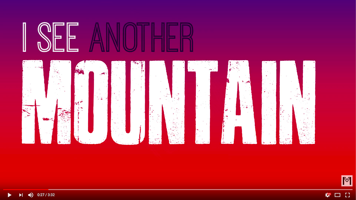
In the lyrics, Sia sings, "I see another mountain to climb" in the first verse (And uh-oh, I see another mountain to climb / But I, I, I got stamina).
I wanted to be a little creative with the typography, so with the "MOUNTAIN" seen above here, the image below is where I had rotated it quickly and zoomed in to an extreme close up of one of the letters. I changed the color from white to the dark purple from the two-colored type scheme. This created a very simple version of a mountain image. I used "TO CLIMB" from the lyrics animating it moving up the "mountain."
I wanted to be a little creative with the typography, so with the "MOUNTAIN" seen above here, the image below is where I had rotated it quickly and zoomed in to an extreme close up of one of the letters. I changed the color from white to the dark purple from the two-colored type scheme. This created a very simple version of a mountain image. I used "TO CLIMB" from the lyrics animating it moving up the "mountain."
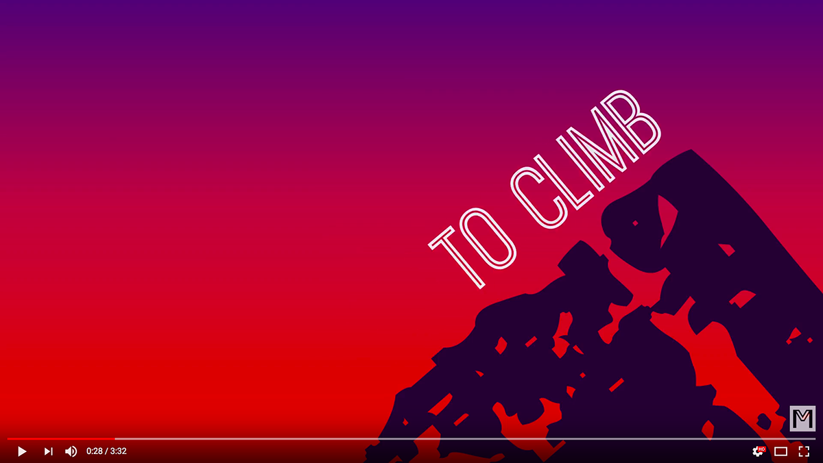
In the lyrics, Sia sings, "I see another mountain to climb" in the first verse (And uh-oh, I see another mountain to climb / But I, I, I got stamina).
I wanted to be a little creative with the typography, so with the "MOUNTAIN" seen from the image previous, the image above is where I had rotated it quickly and zoomed in to an extreme close up of one of the letters. I changed the color from white to the dark purple from the two-colored type scheme. This created a very simple version of a mountain image. I used "TO CLIMB" from the lyrics animating it moving up the "mountain."
So the type is climbing up the mountain as she sings, "I see another mountain to climb."
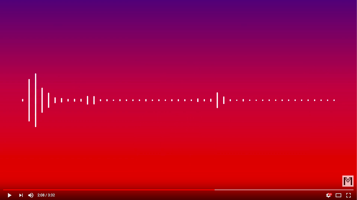
When the music is only playing around 2:07, I used an audio waveform with 49 lines representing the 49 dancers from Sia's original music video.
It was written in an article on Billboard (http://www.billboard.com/articles/columns/pop/7496119/sia-the-greatest-video-orlando-nightclub-shooting-tribute-49-dancers) that Sia used 49 dancers to represent the 49 lives lost from the shooting at Orlando nightclub Pulse (June 12, 2016).
It was written in an article on Billboard (http://www.billboard.com/articles/columns/pop/7496119/sia-the-greatest-video-orlando-nightclub-shooting-tribute-49-dancers) that Sia used 49 dancers to represent the 49 lives lost from the shooting at Orlando nightclub Pulse (June 12, 2016).
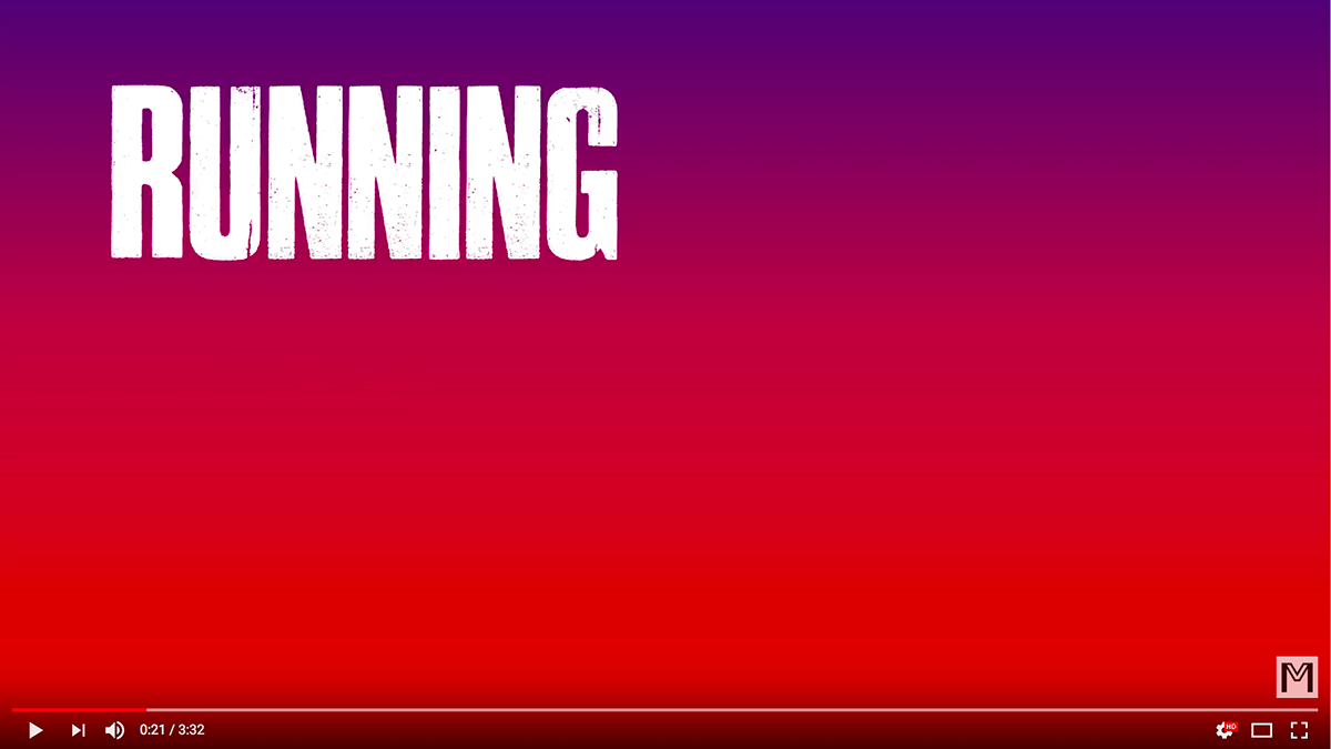
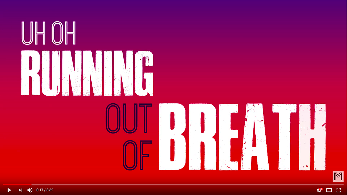
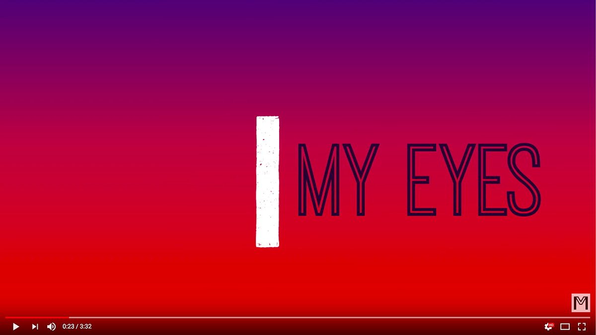
Throughout the verses, Sia often repeats "Uh-oh, running now I close my eyes / Well, oh, I got stamina."
With the next sequence of photos below, I wanted to show almost a frame by frame of what I did with the type animation of this phrase.
With the next sequence of photos below, I wanted to show almost a frame by frame of what I did with the type animation of this phrase.
I wanted "RUNNING" to rotate quickly and slide into the "I" from "I close" ("I close my eyes"). Then I had "close" disappear in the same motion one would close their eyes. I then had "MY EYES" appear immediately after.

I wanted "RUNNING" to rotate quickly and slide into the "I" from "I close" ("I close my eyes").
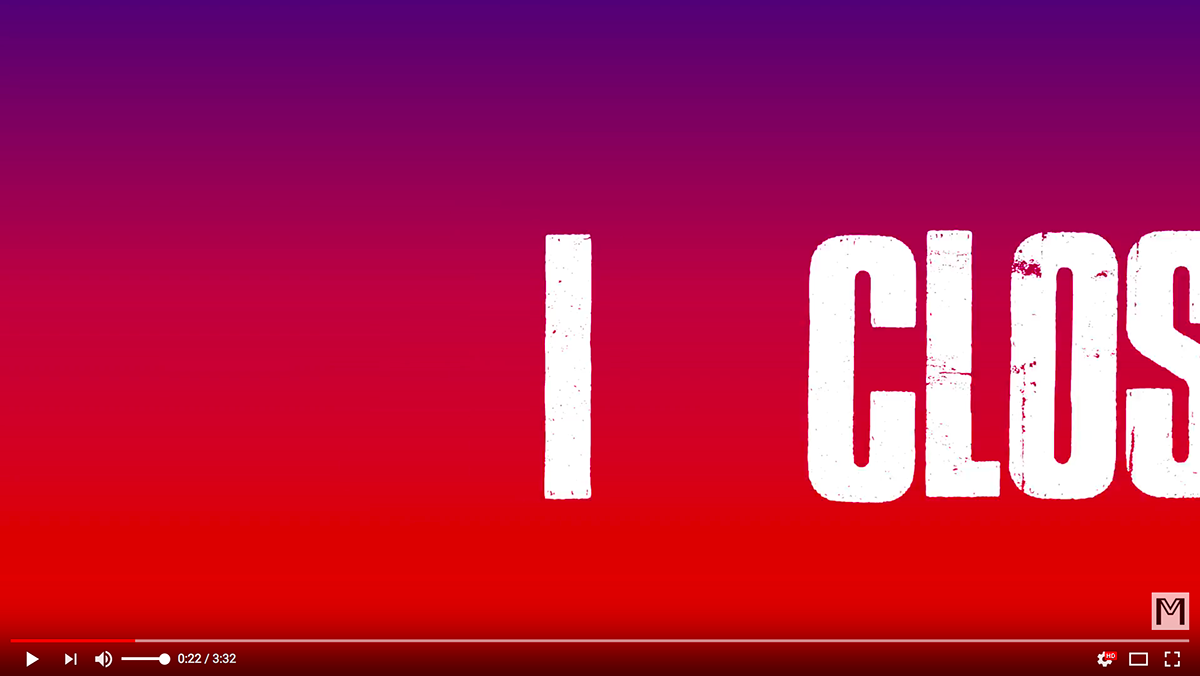
I wanted "RUNNING" to rotate quickly and slide into the "I" from "I close" ("I close my eyes"). I had "CLOSE" move quickly into the "I" to become "I CLOSE" seen below.
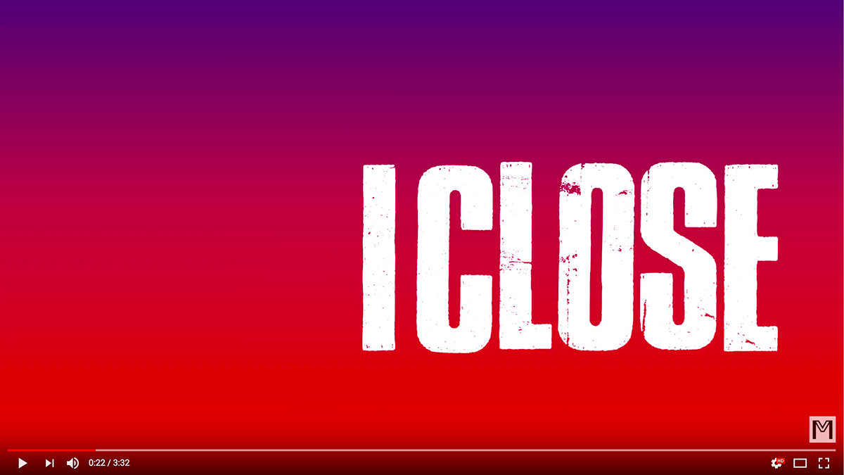
"I CLOSE" appears.
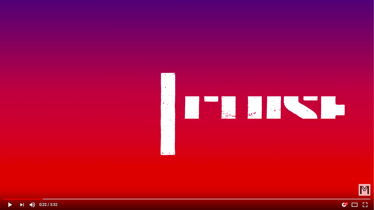
I "close" disappears in the same motion one would close their eyes. A still shot of the image "CLOSE" mid way into closing and then becoming "MY EYES" as seen below.
After "CLOSE" disappears in the same motion as one would close their eyes, "MY EYES" appears in its place.