


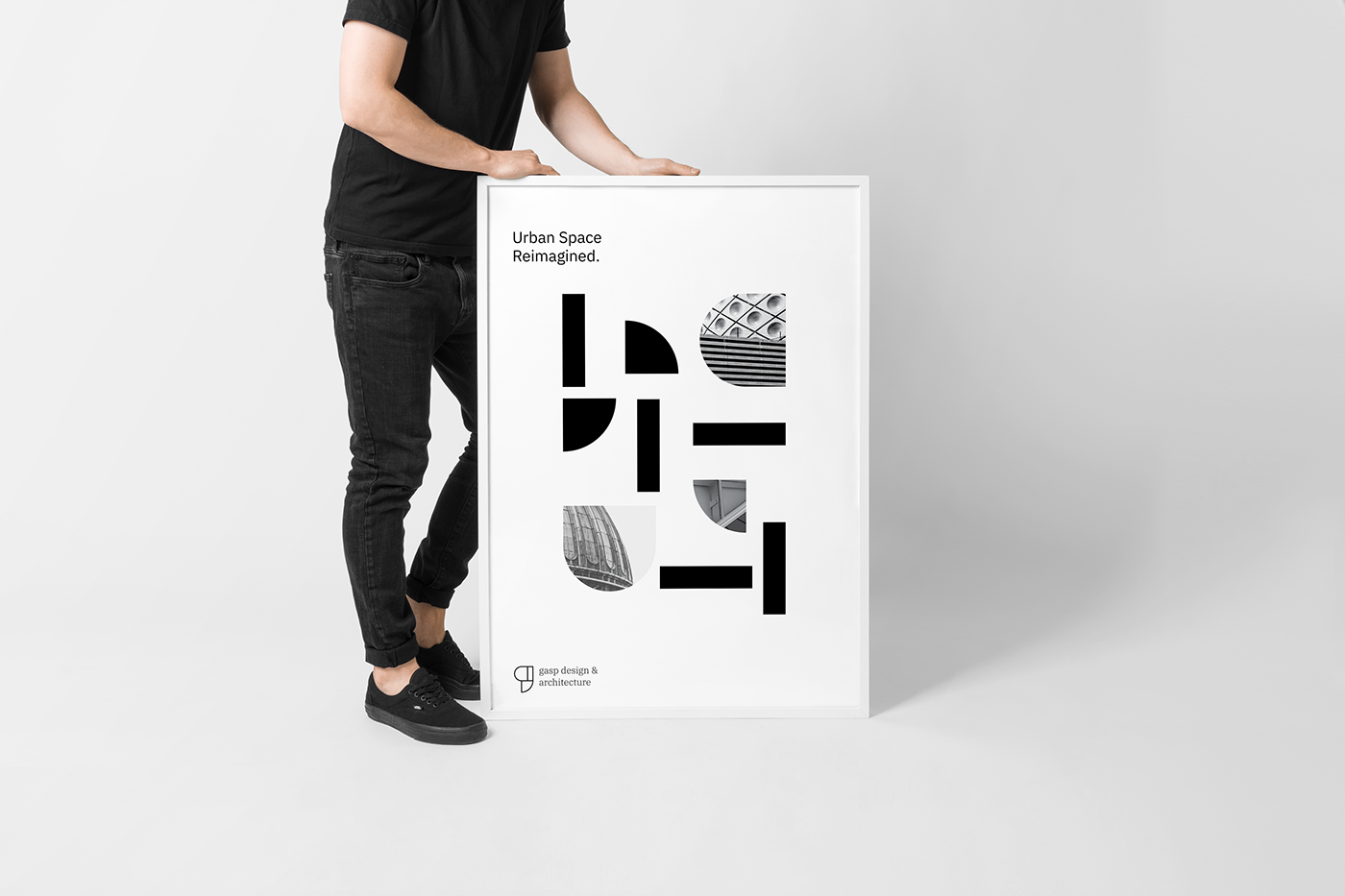
Concept:
Gasp is a conceptual side project driven by a creative brief that was built by LogoCore, a creative studio that provides visual identity courses. For this assignment, I took on the task of providing brand identity and messaging for Gasp, an architectural studio that prides itself on the emphasis on space, inclusivity and being a high-end firm. With these concepts in mind, I decided to approach the construction of the identity system using shapes to create a feeling of space and connection while using typography and a minimal color palette to capture the high end feel that the firm wanted to capture.

The Logomark:
The mark itself represents a few concepts:
1. The letter "g" being constructed.
2. Shapes coming together to emulate inclusiveness and connection.
3. Simple color and space around the mark to emulate a high-end feel.

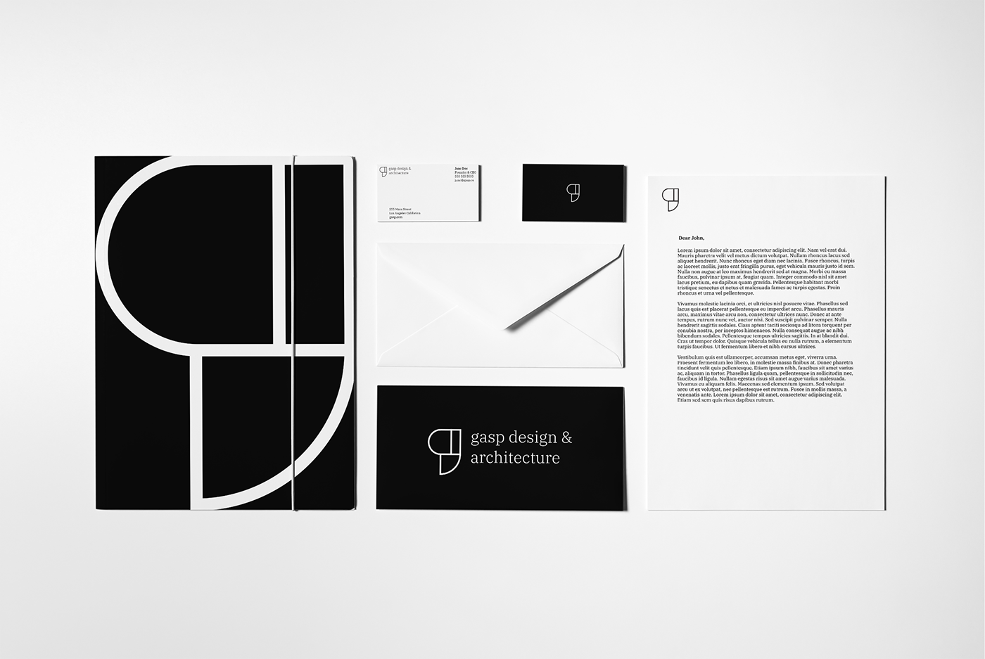

Challenges:
The logomark itself was the most challenging portion of the engagement. I explored several different solutions in an attempt to combine space and inclusivity to the mark. Ultimately I felt that a solution based on "building blocks" or shapes coming together to form the mark would be the best approach. Furthermore, I looked to use the mark in the full identity system by first using its shape as a mask to create interesting uses of space on printed material, and secondly, I broke up the mark in the various printed materials to simulate the beginning of that connection or inclusivity.


Conclusion:
I enjoyed experimenting with a black and white color palette as I usually rely on strong color to anchor the solutions I create. I also was happy that I used this project as an opportunity to continue my exploration in the use of shape and typography in my designs and overall approach.


