Helvetica
Helvetica is possibly the most famous sans-serif typeface in the world. If it looks familiar, that’s because it can be found everywhere: corporate logos, income tax forms, and even NASA space shuttles all use this classic font.
To achieve this minimal and modern look, incorporate bright, primary colors. Furniture should combine straight and curved lines. Think functional, clean, and fresh. The ideal place to focus and clear your workload.

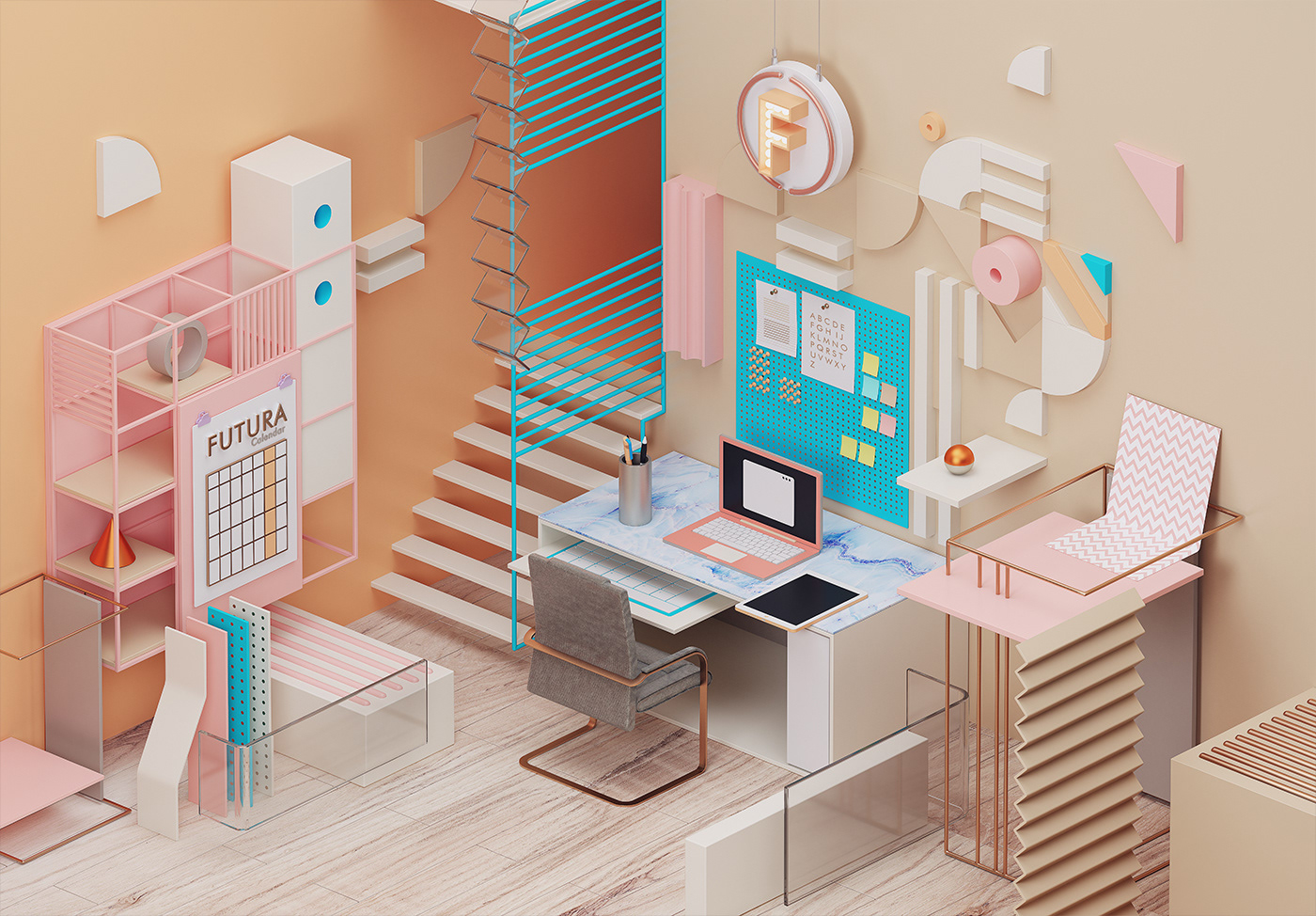
Futura
Futura is timeless and modern. Based on simple geometric forms, this sans-serif font comes out of the classic Bauhaus movement. The Futura office is a striking, tasteful, and elegant space for the analytically minded.
To create this clutter-free space, organize your items in lines and add a healthy dose of monochromatic color paired with a contrasting hue to make it a place where you can both work hard and relax.
Baskerville
Baskerville was first designed in 1754 by master type-founder John Baskerville, but the present design is based on George W. Jones’s 1929 revision. This font is the perfect meeting of Baroque and modern styles, and one of the most widely used fonts in recent centuries.
To create this serene, elegant, and refined workspace, choose furniture with crisp edges and classic, metallic finishes mixed with muted light blues and beige.

Bickham Script
Bickham Script is an ornate, formal, cursive font based on the lettering of 18th century writing masters. For many years it has added its signature to uncountable wedding invitations and menus.
This workspace is for the more extravagant readers out there. Make sure your office is filled with luxury, dramatic furniture and walls that are rich neutrals or jewel hues.

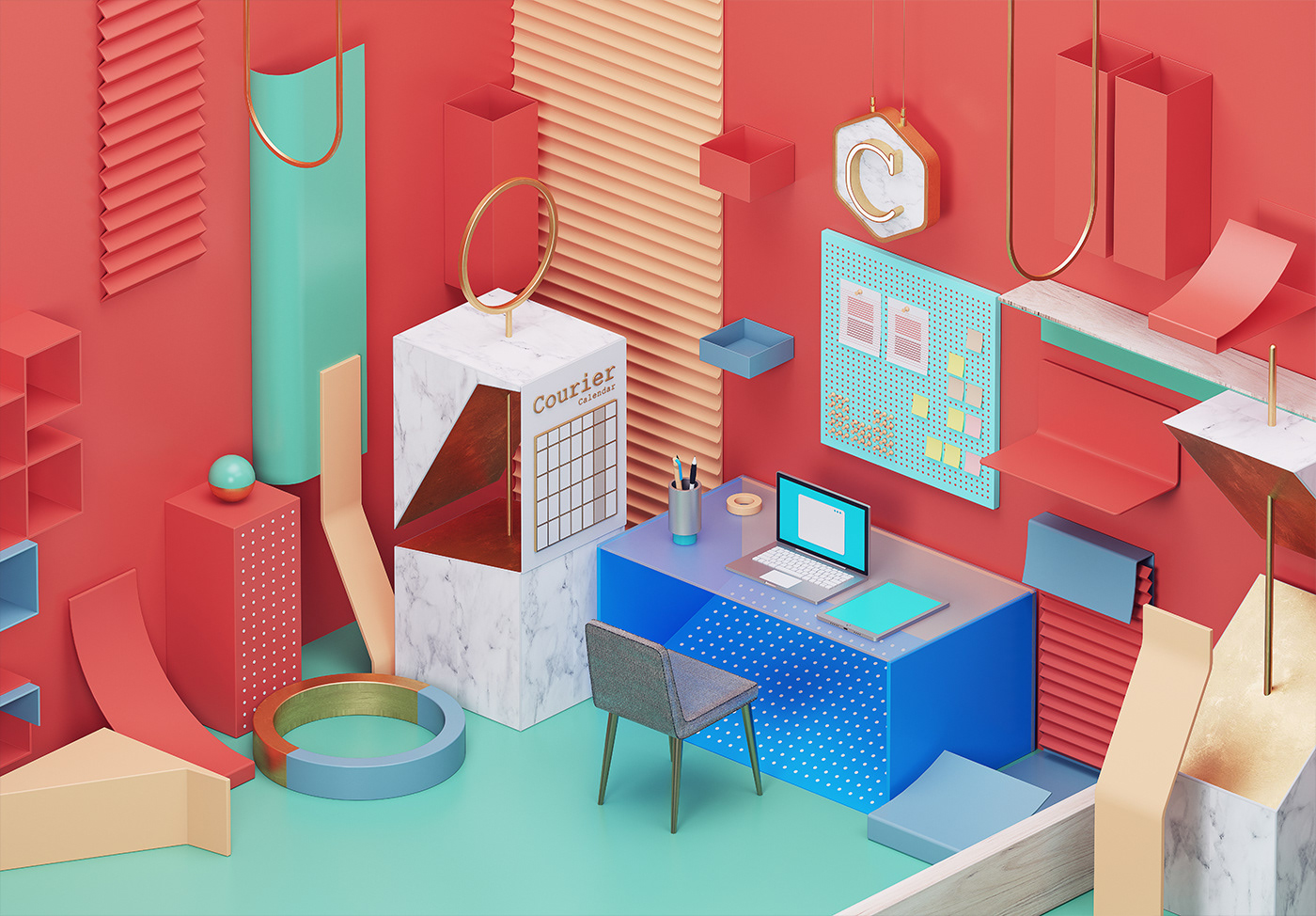
Courier
If you’ve ever owned a typewriter, you’ll recognize this mono-spaced slab serif “typewriter” font. Courier was famously used by IBM, but due to the lack of exclusivity, almost every other typewriter company followed suit. This is an office for those who value an old-fashioned look and want a space where they can focus on the work at hand.
To create this stable, prestigious, and nostalgic vibe, you’ll need lots of white-space contrasted by a few earth-toned lines. Or, go for a more updated look and replace the white page look with a candy or coral shade. Furniture should be functional and refined with thin, natural edges.
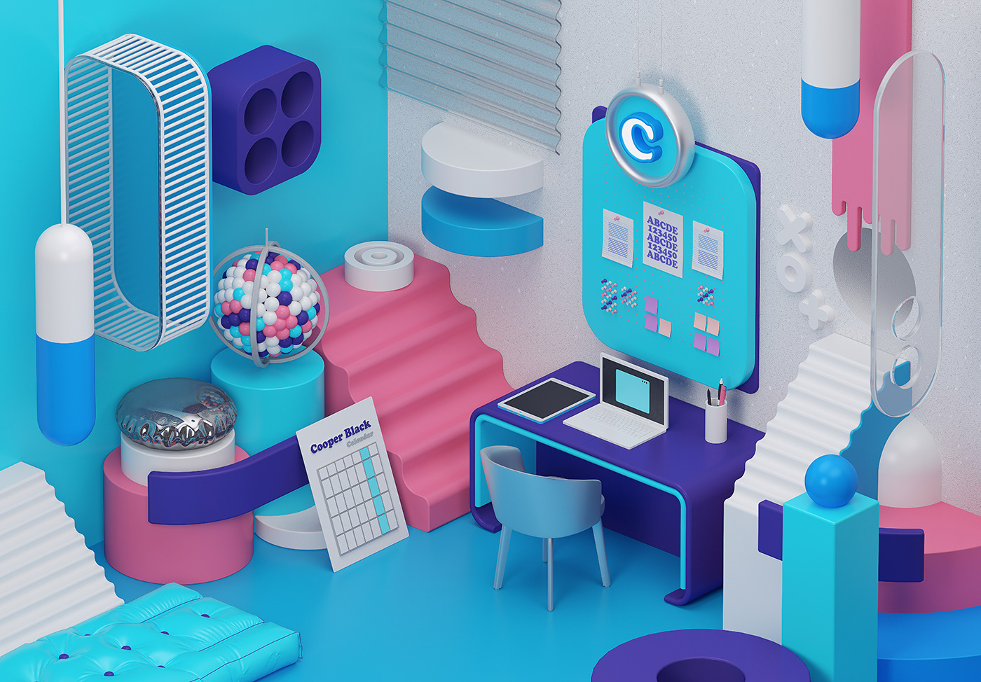
Cooper Black
Cooper Black is synonymous with the 1960s and 70s culture, appearing on classic album covers and TV shows throughout both decades. This heavily weighted, old style serif typeface has recently made a major comeback and is being called the most fashionable font of 2017.
This is the perfect workspace for the young or young-at-heart. Think retro – you’ll need different shades of dark and bright colors. Be on the lookout for squat or mid-century furniture with rounded edges to get that authentic look.
Clay Version