The whole typeface started with a double-story 'a' in August 2015. I didn't work on this typeface full-time. Just when I wanted to work on it. The main problem is, I'm not familiar with making fonts moreover a multiple weights fonts. I had to rework about 5 times for the kerning, metrics and multiple-masters. It was such a journey.
See it in use on hagano.com


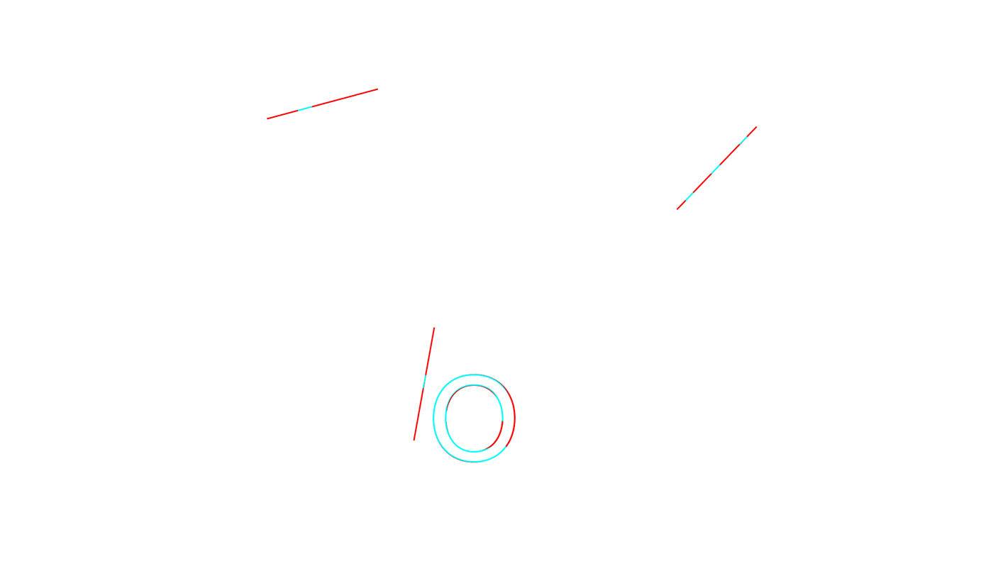


This font family is far from perfect, and I still need to work more on diacritic, tabular lining numbers, and currency signs. Critics are welcome.
Follow my Instagram @laurensiusadi_

