
1. Alabama - This state already has a pretty straightforward designed flag. They literally just stole the old Spanish flag. I thought it would be pretty boring starting off not changing anything (personally I don't mind the original flag) so I added extra lines to make it have a more unique american look.

Current
2. Alaska - I would agree that this flag does pretty well. The only thing that's going against it is the generic bed sheet navy blue it has in the background. I decided to spice things up and used colors found in the aurora borealis as the backdrop for the classic big dipper constellation.

Current
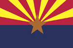
3. Arizona - Don't worry we'll get to the bad designs soon enough. Arizona was pretty close to being perfect. The only thing that could have been improved was the star color. My version fixes the contrast and brings it out from the background.

Current
4. Arkansas - You were so close with this one Arkansas, but you broke one of the most important rules of flag designs. If you need to put the name on the flag then you failed the flags purpose. Luckily I was able to mend this error.
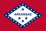
Current
5. California - I'm not really a fan of realistic depictions of animals/objects on flags (It's more of a state seal thing). The bear on the Cali flag however is too iconic to remove. I did the best I could cleaning things without causing a uproar with the Cali flag devoted.
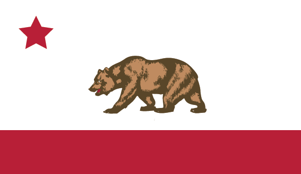

Current
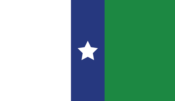
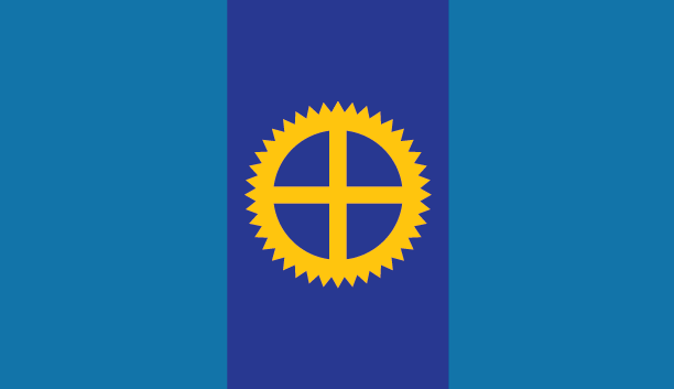
6. Colorado - Oh I get it because C stands for Colorado. Yeah don't think because you used only one letter it let's you break the no titles rule. Other than that it's a pretty solid design.


Current
7. Connecticut - So it begins. Let's get this over with now, state seals on a bed sheet is not a proper flag. Unfortunately more than half the states used this strategy and it just fails miserably. It does make it more challenging for me to come up with something. In this design the blue stripe represents the Connecticut river that divides the state.The white represents industry, the green represents the fertile land, and the star stands for the union.
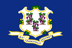
Current
8. Delaware - This is what the date looks like on the Delaware flag when 300 feet away in a parking lot: December 7th 1787. Delaware was the first state to join the union so I gave them one star. I thought the colors were unique (colonial blue and buff according to wikipedia) so I just kept them the same.


Current
9. Florida - You'll notice the southern states like to borrow each others designs. Pretty sure if you ask any Floridian whats on the seal they wouldn't know. I do think the general shape is recognizable so I kept the red saltire and simplified the seal.

Current
10. Georgia - So after some further research apparently Georgia's flag is just the original confederate banner with a seal slapped on it. In my redesign I kept the general design, but shifted the colors to emulate a more union flag rather than a confederate one. The 4 stars represent Georgia as the 4th state in the Union.
Current
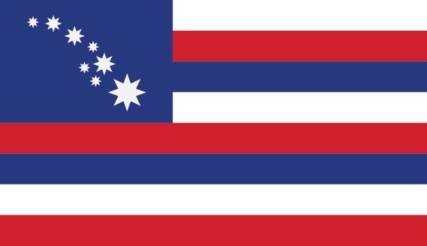
11. Hawaii - This one was a tough because it was already a fairly decent design. I believe it was ranked 11th by the North American Vexillological Association. One thing that bugged me was the horizontal bar on the union jack not lining up with one of the 8 horizontal bars. So sorry Brits, but this is gonna be a purely American redesign. I replaced the Union Jack with a 8 stars representing the layout of the Hawaiian islands.

Current
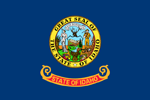
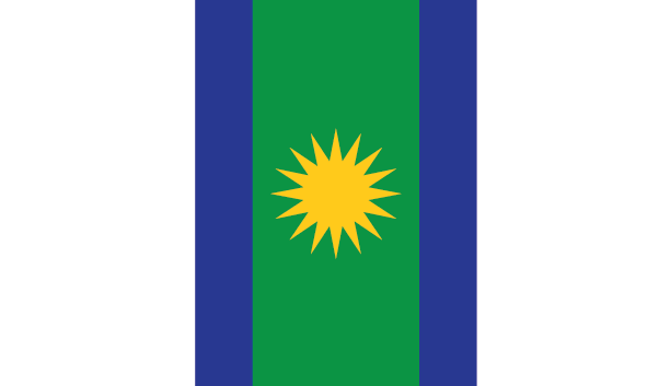
12. Idaho - While I do kinda enjoy the whimsical banner displaying the states name, as mentioned before seals on a bed sheet is not a flag. So I resisted slapping a potato on a flag and decided to go simplistic with this one. The 3 colors represent the natural landscape of Idaho: Green for the national forests, tan for the dry plains, and white for the rocky mountain tops. Since there is a high reported German ancestry in Idaho I decided to borrow the 3 stripe style.

Current
13. Illinois - Hmmm, yes the classic MS Paint seal. Let's fix that why don't we. The sun in the center represents the new dawn of innovation and adventure. The blue and green columns stand for the abundance of natural resources and beauty. The white represents the strong history of industry the state was built upon. I will say this one was tough since the original flag gave me nothing to go off of.

Current
14. Indiana - Not too bad actually, just needed a bit of clean up for this one. It does remind me of EU flag a bit too much though.


Current
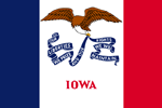
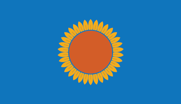
15. Iowa - They were on the right track with this one, unfortunately the eagle is a bit too detailed for a flag. I used the same French flag background, but updated the eagle and made it a black hawk since they are known as the Hawkeye state.

Current
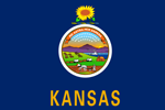
16. Kansas - It always makes me laugh seeing the state name plastered on the flag. Anyway, Kansas is the sunflower state. There are exactly 34 petals on the flower since Kansas is the 34th state to join the union.
Current
17. Kentucky - I like how this one turned out. The icon at the center is the goldenrod flower which is the state flower that is also represented in the original flag.


Current
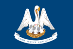
18. Louisiana - I originally started with using the pelican in the design, but it turned out to be too detailed. Instead I used the fleur-de-lis symbol and the French colors to represent the French/Cajun culture of southern Louisiana. The 2 stars each have 9 points that add up to 18 since Louisiana was the 18th state to enter the union.

Current
19. Maine - This state turned out to be pretty simple. I didn't really care for the tree in the original design, but I liked the look of the north star.


Current
20. Maryland - Wait...you're not changing the Maryland flag? Nope, I like it. This one has quite the divide, you either love it or despise it. Honestly, I think it's easily recognizable and it doesn't really break any design rules. Maybe I'll give a redesign a try later, but for now this one stays the same.

Current
21. Massachusetts - Birthplace of the revolution. I took the shield and arrow held by the native american and combined them. I also placed the union star right in the center. The red, white and blue represent the founding of patriotism in the state.


Current
22. Michigan - Ack! too many animals. Alright, the 3 blue columns represent the 3 great lakes that surround Michigan. The 27 stars signify Michigan being the 27th state. The white represents Michigan's industrious past.

Current
23. Minnesota - The state flag of the land of 10000 lakes features 4 wavy blue bands that represent the many waters of Minnesota. The star in the center is the north star that is a central icon of Minnesota's culture.

Current
24. Mississippi - Let's just focus on the redesign for this one. I decided to keep the 3 horizontal stripes and replaced the top corner with a blue square with a white 20 pointed star. The 20 points represent Mississippi as the 20th state in the union.

Current
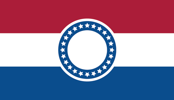
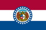
25. Missouri - Alright, halfway there. Missouri's redesign is pretty straight forward. I basically kept everything except for the seal within the star circle.
Current
26. Montana - This one I was able to get a bit more creative. I based the flag off of two things: The state motto which is "oro y plata" or silver and gold, and the region called the "crown of the continent" which encompasses the northern Rockies of Montana and Canada.


Current
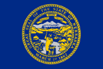
27. Nebraska - The yellow background represents the Nebraska's bright future...but it mostly means corn. The blue represents the rivers and natural landscape, and the star represents the union.
Current
28. Nevada - Why are so many states obsessed with having a blue banner? Anyway, Nevada is known as the silver and gold state so the color choice was easy on my end; Although anything but blue would have sufficed. The black star in the upper left is meant to represent the state motto which is "The battle born State".


Current
29. New Hampshire - I moved the 9 stars and placed them in the upper left (9 for 9th state). The blue represents the natural beauty of the land, and the gold/yellow represents the natural resources such as granite.


Current
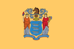
30. New Jersey - Colonial people really liked that "Buff" color. The color adds to the uniqueness of the flag so I kept it. Since they are called the garden state I decided to keep the cornucopia as the central icon of the flag. The 3 buff color bands represent New Jersey as the 3rd state to join the union.

Current
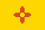
31. New Mexico - Bask in the glory of the number one state flag. Nothing to change here.
Current
32. New York - You would think a state like New York would have a decent design. In my design the blue represents the waterways that historically connected the city to the rest of the state (Erie canal). The green represents the natural beauty of the state, and the rising sun represents the promising future. New York is the 11th state so it gets 11 stars.


Current
32. North Carolina - I thought that North Carolina's flag was fairly recognizable so I mainly kept it the same. There were just a few things that needed tidying up. The star is 12 sided since you guessed it NC is the 12th state to join the union.

Current
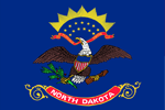
34. North Dakota - While I do love the fancy banner that envelops the state name, it needs to go. The blue represents the blue rivers and waterways that are throughout the state. The star on the top is the north star. The green line represents the agriculture and natural beauty of the state. The yellow line is a representation of the Lewis and Clark expedition trail.

Current
35. Ohio - Once you know Ohio's flag you'll never forget it. Job well done.

Current
36. Oklahoma - I wonder where the need to place the name of the state on the flag started. I like the Osage Nation buffalo-skin shield and decided to simplify it to improve readability.


Current
37. Oregon - Well obviously flags are really not that important to Oregonians. I bet you can't guess what Oregon's famous for? Whats that? You died of dysentery? Anyway, the yellow stripes leading to the star represent the many paths people took to reach the famous region of Oregon (some paths better than others).

Current
38. Pennsylvania - Since this state has such a rich revolutionary history I decided to emulate the US flag. The 13 blue and white stripes represent being part of the original 13 colonies. The 2 black stars signify that Pennsylvania was the 2nd state to join the union (I think Delaware cut the line). I'm not sure what the horses represented on the original flag, but I retained their essence by coloring the 2 stars black.

Current
39. Rhode Island - There is no hope (hard to see but the original flag that has banner with the word "hope" on it). Everything else can stay.


Current
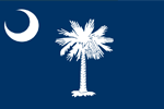
40. South Carolina - I thought that the palm tree was recognizable enough for it to remain on the flag. However, rather than the whole tree I opted for just a branch.

Current
41. South Dakota - It's a flag South Dakota, not a travel brochure. In my design I incorporated the center "sun" and molded it into a medicine wheel icon. The medicine wheel is a common icon of the native americans which have a large presence in the state. The navy dark blue represents the Missouri river that divides the states, and the light represents the open plains and blue skies.

Current
42. Tennessee - Not too shabby. The only changes I made were removing the blue strip on the right side and adjusting the dragon ball.

Current
43. Texas - I feel like if I even attempted to change this one I would be hunted down, tarred, and feathered. Good thing Texas did a great job on this one.
Current
44. Utah - So apparently the beehive icon is a big deal over in Utah. I went along with it and made it the main focus of the redesign. The 6 yellow stripes represent the worker bee mentality of industry in Utah. The icon on the right is the sego lily which is the state flower of Utah and is also displayed on the original flag.


Current
45. Vermont - Since New Hampshire and Vermont are similar I decided to have their flags emulate each other. The cluster of stars in the top left were used by the "Green Mountain Boys" which is what the Vermont militia was referred to as. The dark blue background represents the clear skies of Vermont, and the green represents the green mountains.

Current
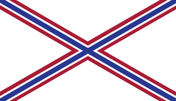
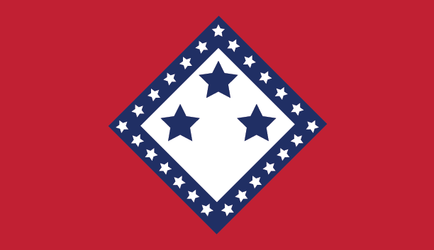
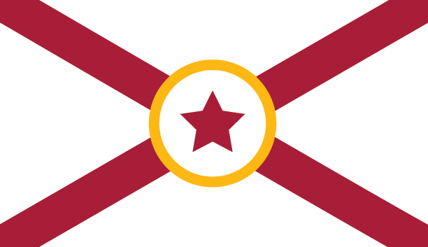
46. Virginia - While Virtus stepping on Tyranny is pretty cool, it does not make for a good flag. The 10 stars signify Virginia is the 10th state to join the union, and the 13 stripes represent the 13 original colonies.


Current
47. Washington - How creative Washington. In my redesign I replaced Washington's face with the symbols found on his family crest.


Current
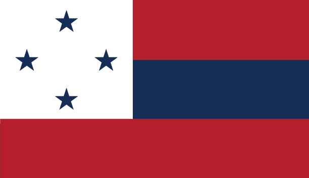
48. West Virginia - Black represents the states history in coal mining and the green represents the natural beauty of the state. The blue diagonal and star signify West Virginia as part of the Union.

Current
49. Wisconsin - I'm sorry, I just can't get over the fact that so many states feel the need to title and date their flag like they are submitting an essay. In my redesign the yellow represents the states cheese/dairy products, the 2 blue bands represent the 2 great lake coastlines, and the green represents the national and state forests.


Current
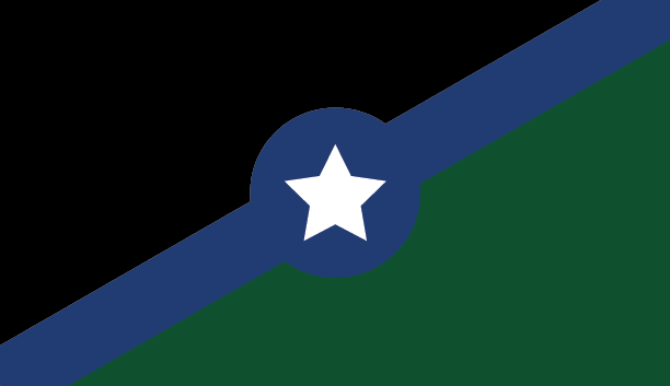
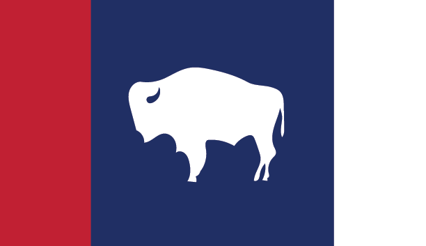
50. Wyoming - And finally we make it to the last state on our list. I think you all know what needs to go in this redesign.

Current


