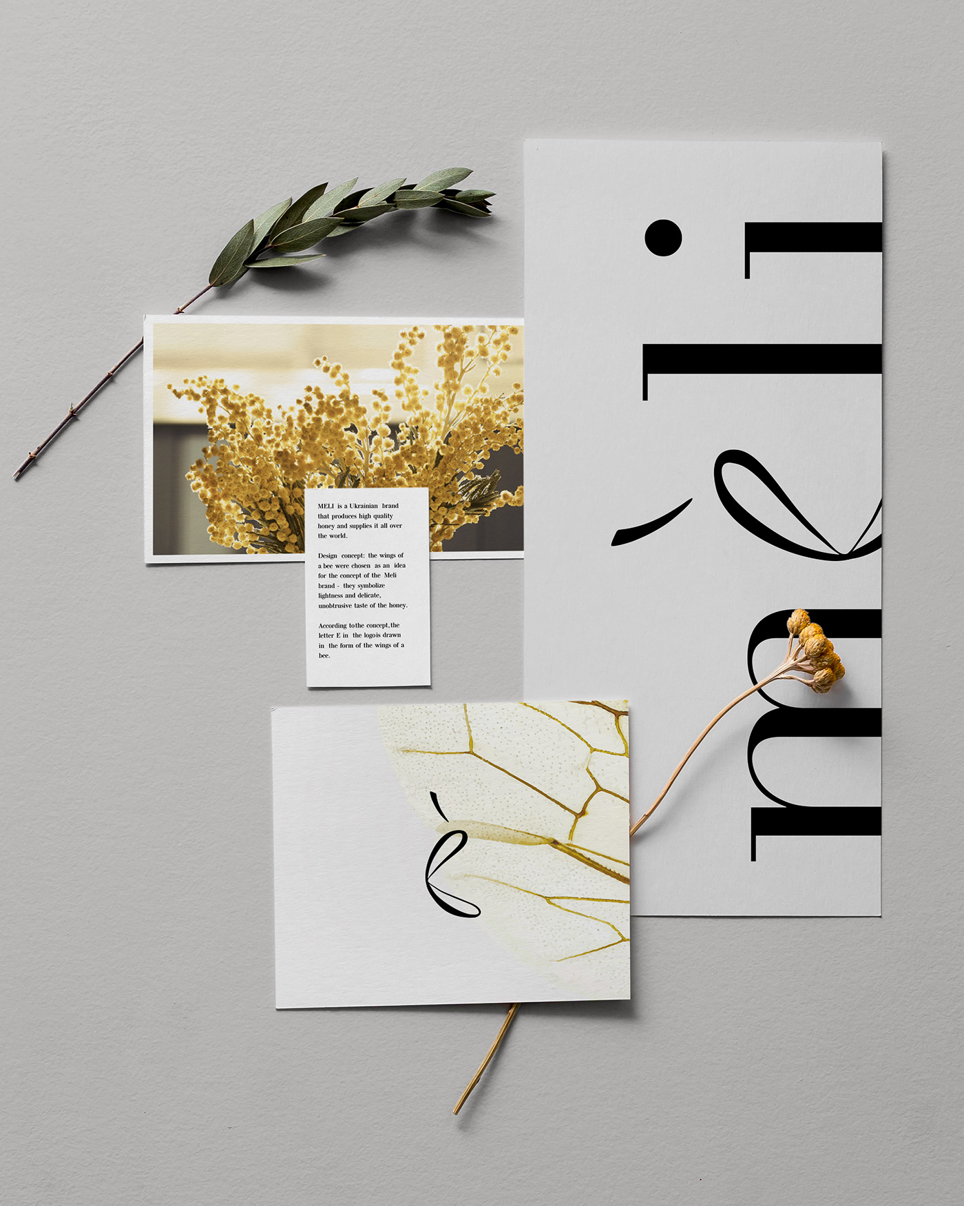
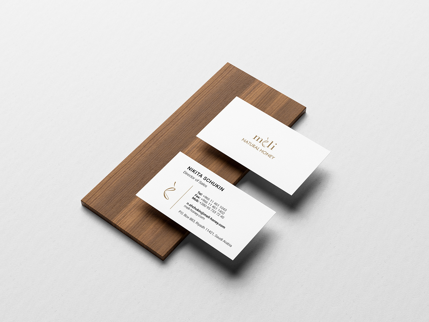
MELI is a Ukrainian brand that produces high quality honey and supplies it all over the world.
The identity system balances the natural with the aesthetic.
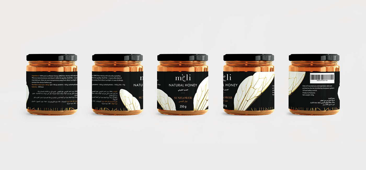
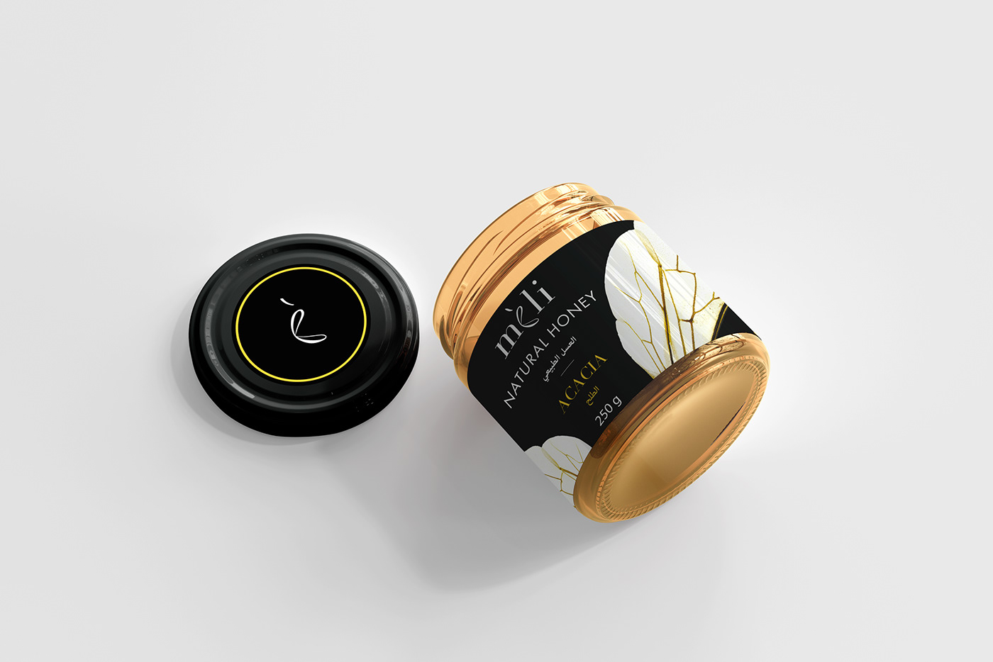
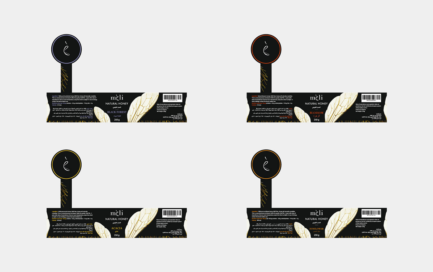
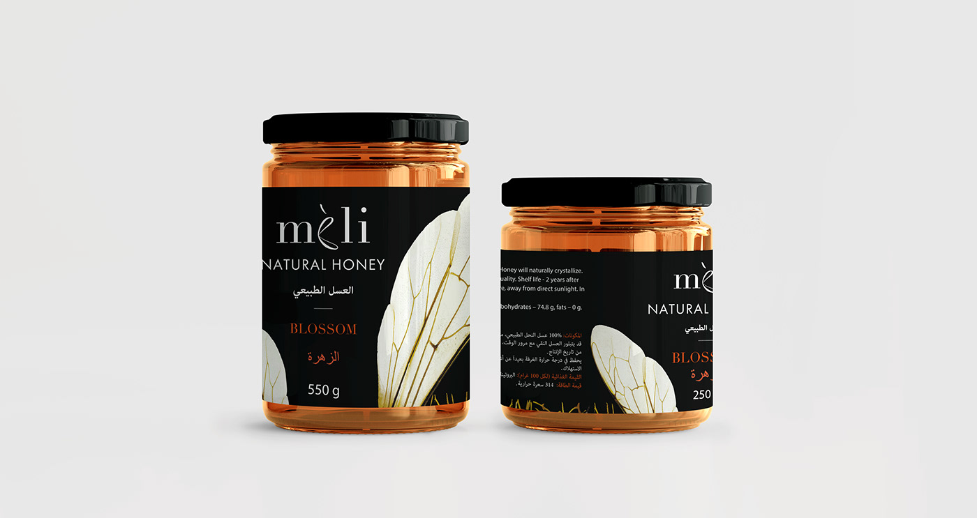
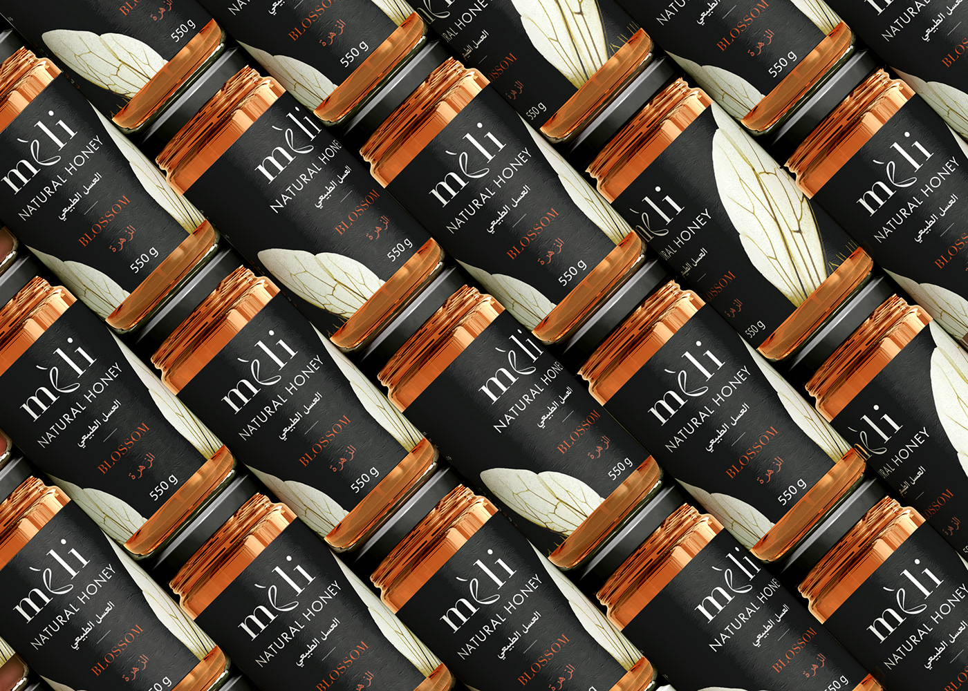
Design concept: the wings of a bee were chosen as an idea for the concept of the Meli brand - they symbolize lightness and delicate, unobtrusive taste of the honey. The typography is clean and the color codes extracted from nature.
Design concept: the wings of a bee were chosen as an idea for the concept of the Meli brand - they symbolize lightness and delicate, unobtrusive taste of the honey. The typography is clean and the color codes extracted from nature.
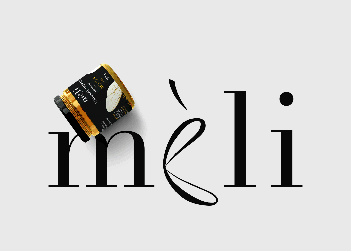
According to the concept, the letter E in the logo is drawn in the form of the wings of a bee.

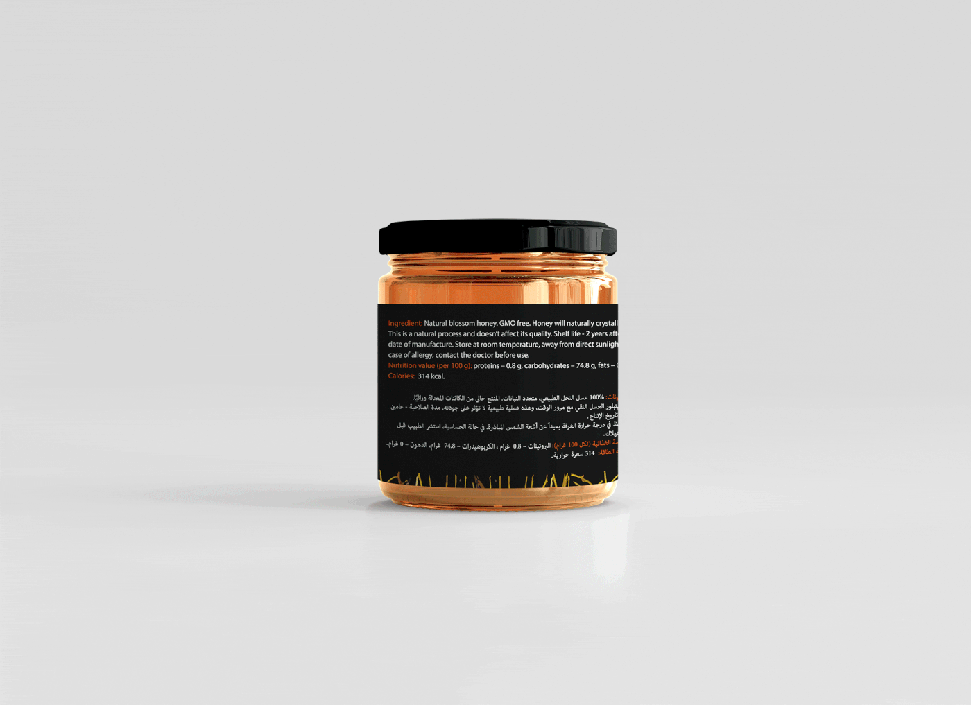
The label is adapted for two jar sizes: 250 and 550 g.


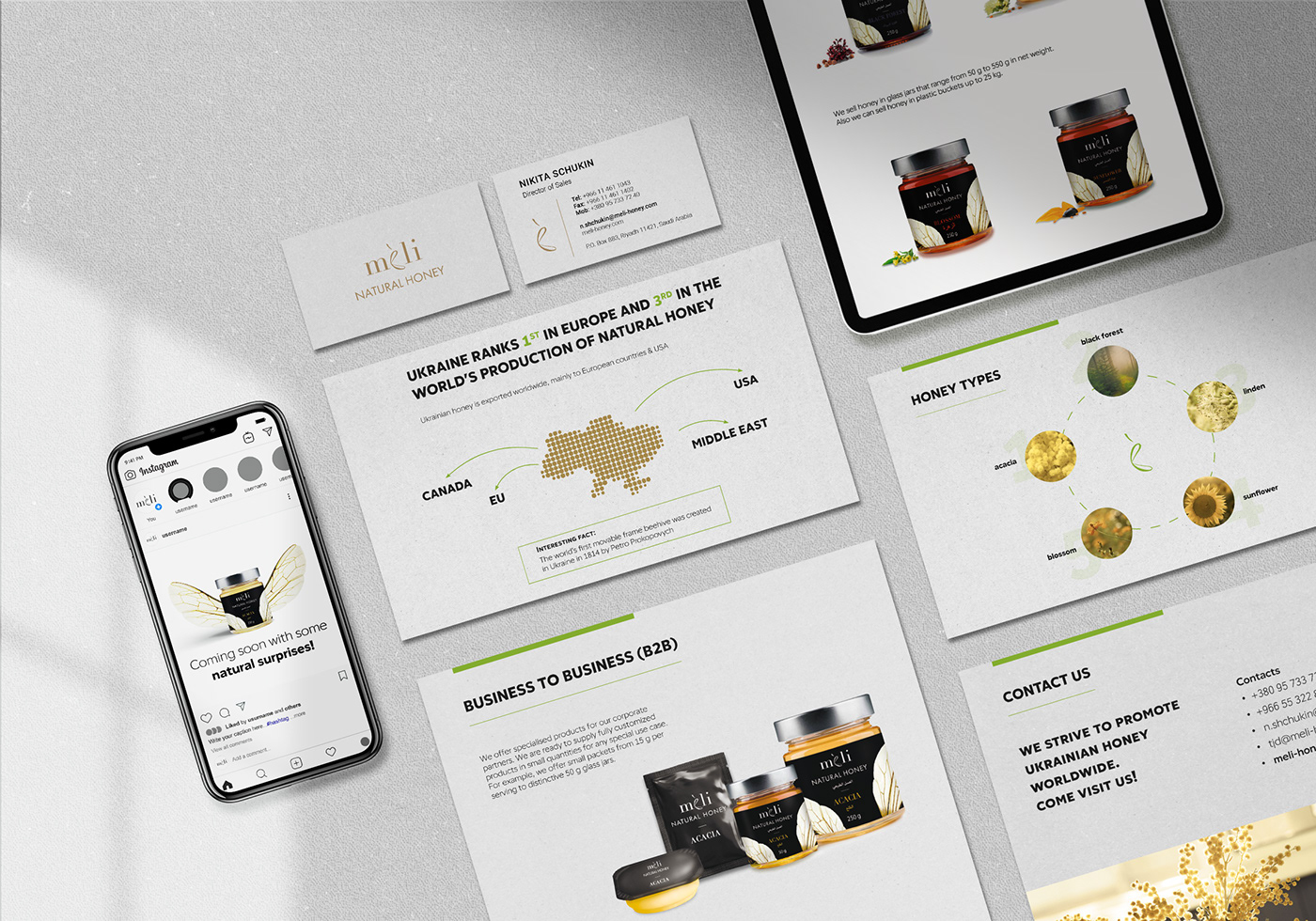
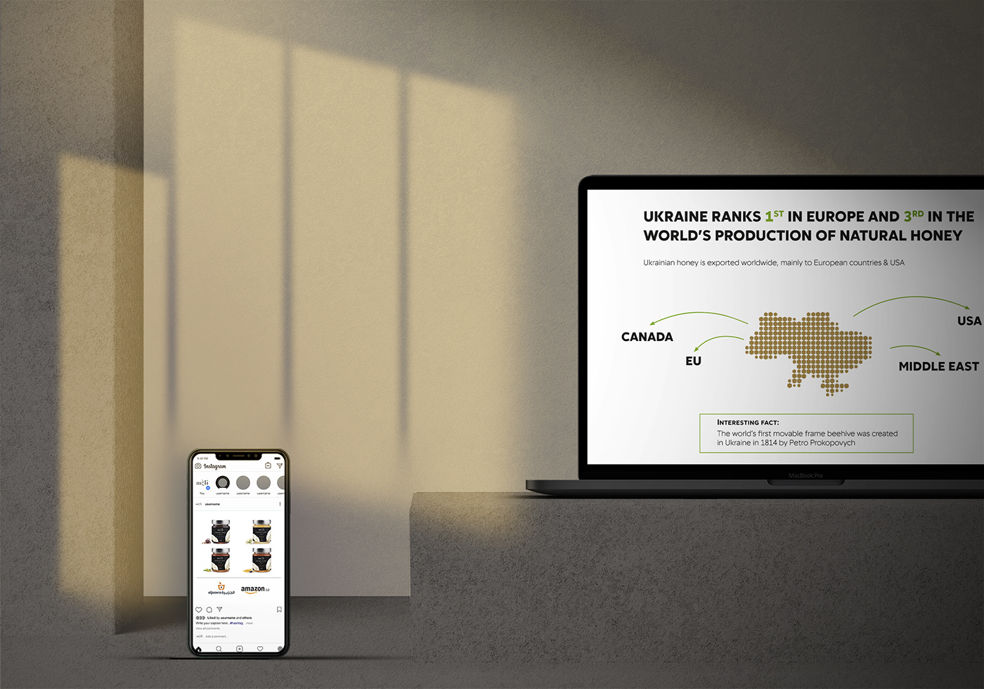
As part of the corporate identity, a printed catalog was developed to advertise products.