Danse Danse - Branding project
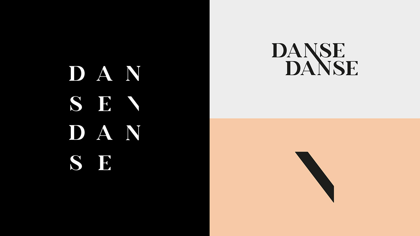
Based on the old logo, clients wanted to feel a connection between the letters. Something that brings tension but also elegance. They wanted to be on the edge but also classic. In the same order as the old logo, we used the N to create all those intentions. The line in the N represent the chemistry between dancers (both N) but it can also be a single dancer in his mouvement from head to feet.
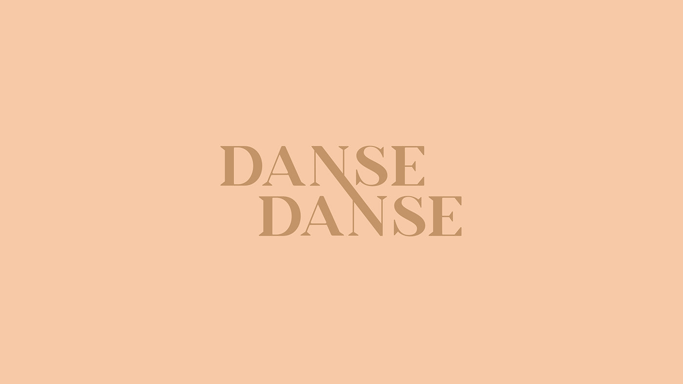
Based on the old logo, clients wanted to feel a connection between the letters. Something that brings tension but also elegance. They wanted to be on the edge but also classic. In the same order as the old logo, we used the N to create all those intentions. The line in the N represent the chemistry between dancers (both N) but it can also be a single dancer in his mouvement from head to feet.
Agency - Sid Lee
Creative Direction - Philippe Meunier
Art Direction - Marie-Eve Poirier
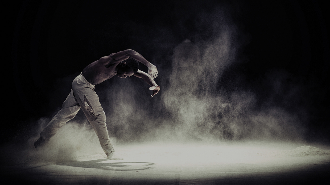
Photographer - Danse Danse pictures