


Prix - Naming | Identidade Visual
| 2017

Naming
Desafio
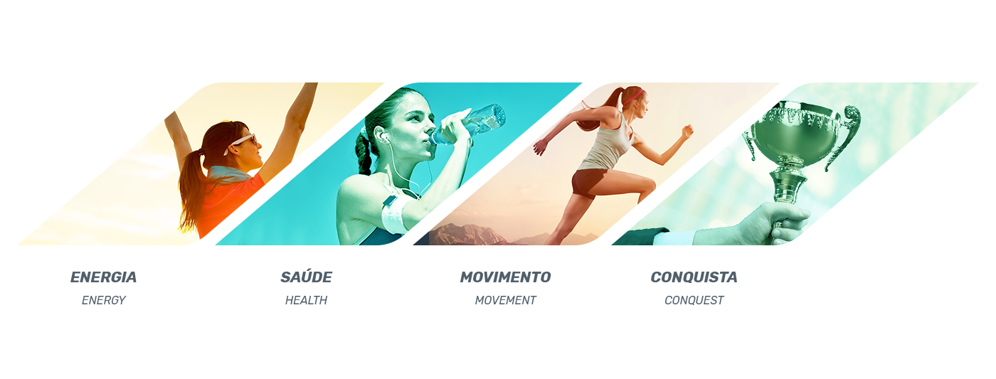
Criação de nome único que, junto à identidade visual, possam atrair, impactar e diferenciar-se diante de um mercado concorrido. A empresa tem a proposta de ser diferenciada, se mostrando focada em qualidade, desde os equipamentos até o atendimento. Os principais serviços oferecidos na verdade são SAÚDE e BEM ESTAR, traduzidos em exercícios físicos e life style.
Proposta
Quem busca por uma academia, já de início busca com um objetivo. A função de uma academia é orientar o cliente para que mantenha o foco e alcance seus objetivos, sendo assim “premiado” por isso. Prix é uma palavra que remete a prêmio em francês, a conquista de cada pessoa que vai
a uma academia é o seu prêmio, corpo e mente saudáveis.
Challenge
Creation of a unique name that, along with the visual identity, can attract, impact and differentiate in front of a crowded market. The company has the proposal of being differentiated, if it is focused on quality, from equipment to service. The main services offered are actually HEALTH and WELL-BEING, translated into physical exercises and life style.
Proposal
Those who search for a gym, already search with a goal. The function of the staff is to guide the client to stay focused and reach their goals, thus being "rewarded" for it. Prix is a word that refers to prize in French, the achievement of every person who goes to an academy is their prize, body and mind healthy.


Identidade Visual
Desafio
Uma empresa nova que necessita de uma identidade pregnante, que reflita melhor o tipo de serviço que oferece, bem-estar, boa forma, energia e a conquista de um corpo e uma mente saudável. Algo que traduza movimento e conquista, principal meio e principal objetivo da atividade física.
Proposta
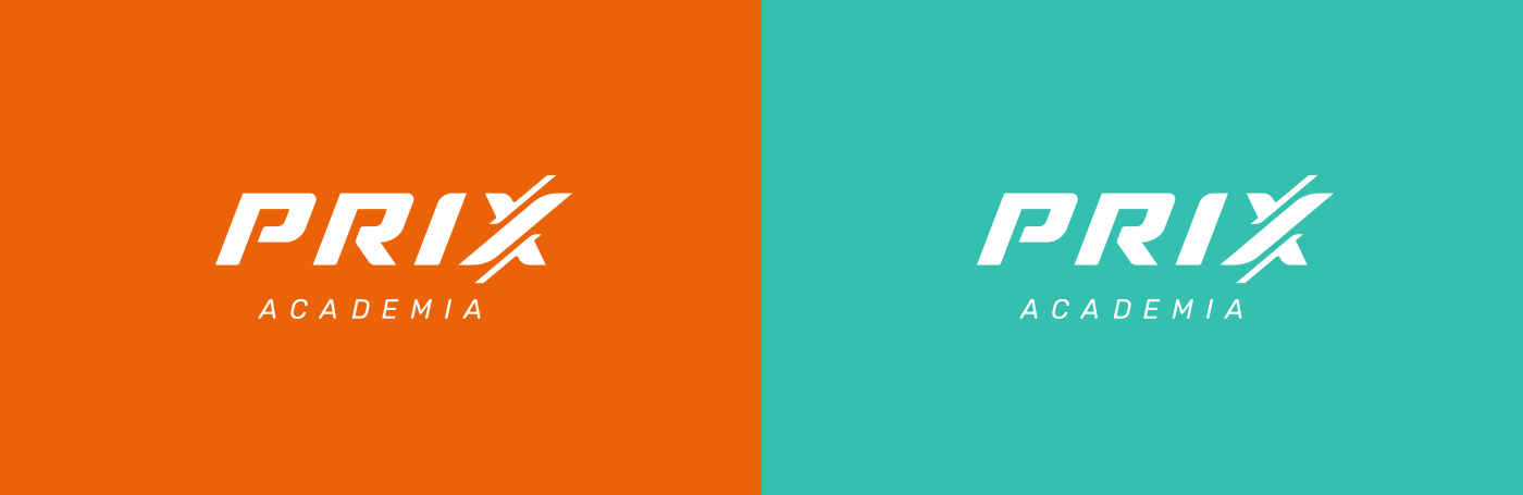
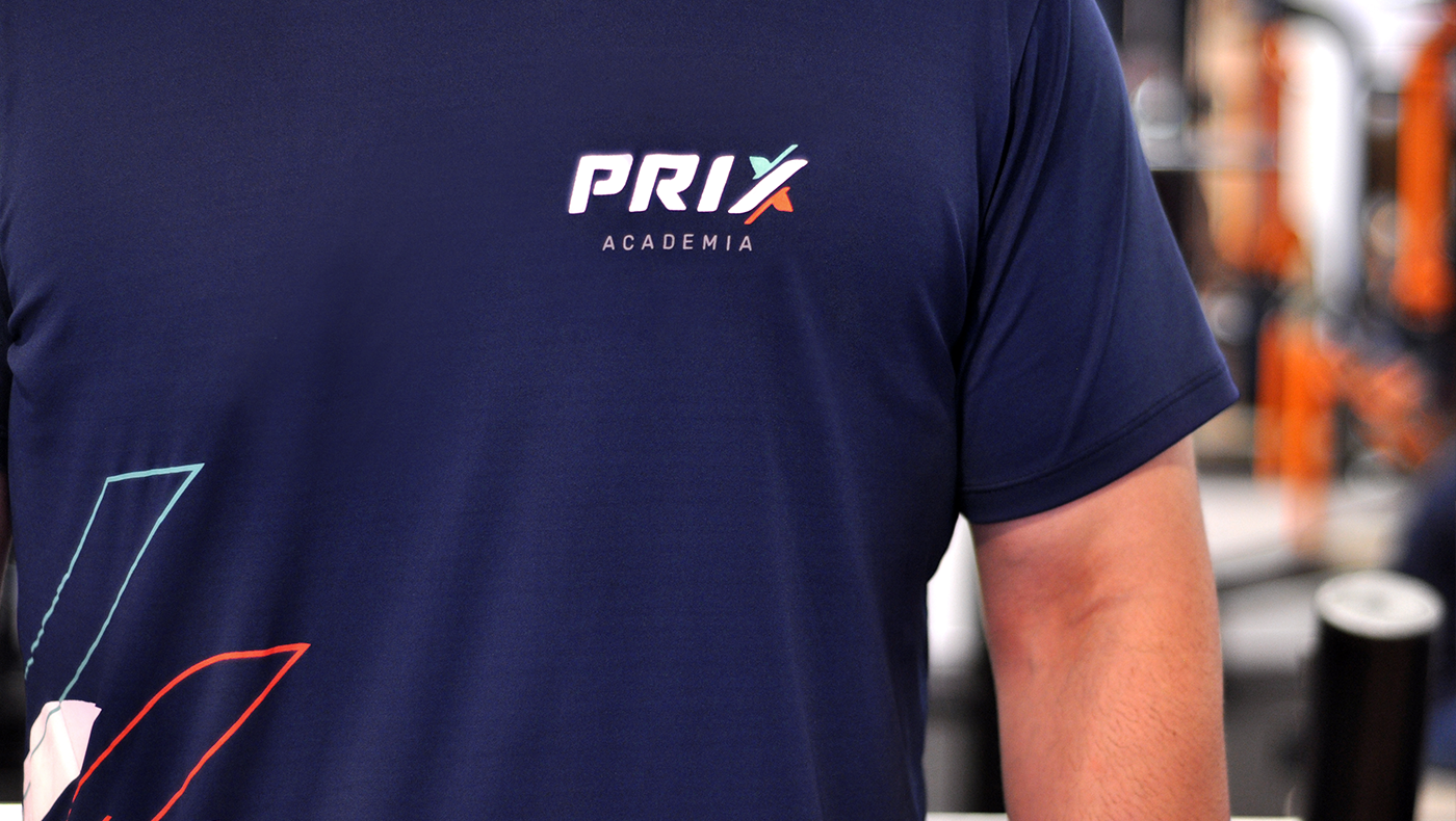
Optamos por trabalhar um logo tipográfico com largura fixa, transmite a ideia de tecnologia e modernidade e onde a letra X possui linhas trabalhadas que representam os movimentos feitos durante a atividade física. A cores laranja e verde são trabalhadas em paralelo, representando a saúde e a energia, que são conquistas buscadas na atividade física.
Challenge
A new company that needs a pregnant identity that better reflects the type of service it offers, well-being, good form, energy and the attainment of a healthy body and mind. Something that translates movement and conquest, main means and main goal of physical activity.
Proposal
We chose to work with a fixed-width typographic logo, conveys the idea of trecnology and modernity and where the letter X has worked lines that represent the movements made during physical activity. The colors orange and green are worked in parallel, representing health and energy, which are achievements sought in physical activity.


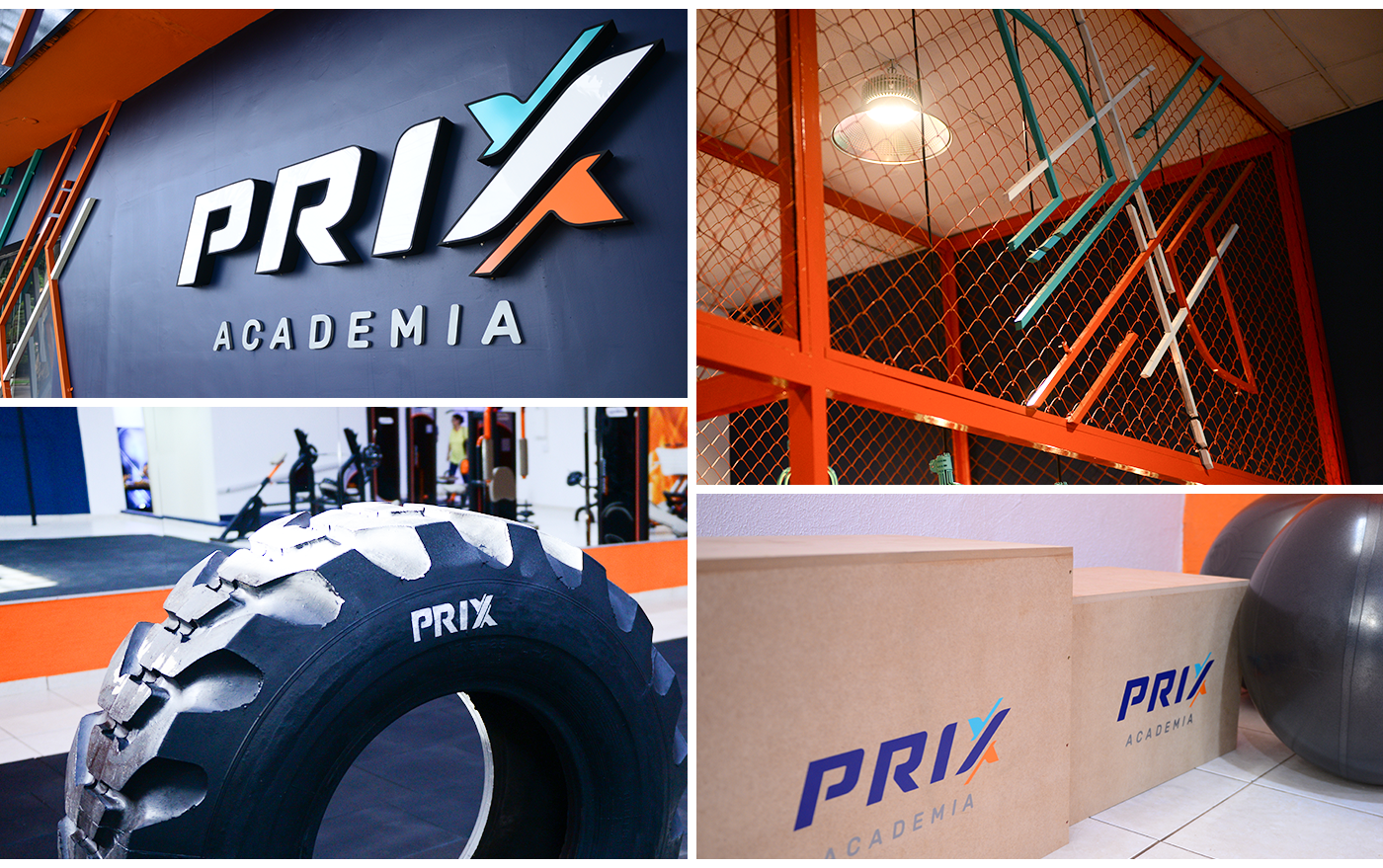


Arquitetura Interna: Lenara Skovroski
Fotos: Studio Vip | Campo Mourão - PR


