Brand Identity and Packaging
Dr. Ducko's
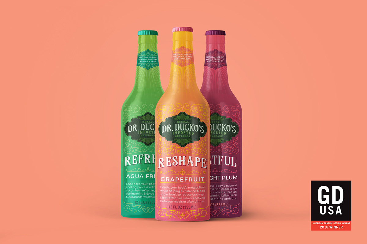
2018 GD USA, American Graphic Design Awards Winner
OBJECTIVE: To introduce a new European herbal health beverage into a growing but already crowded US marketplace with domestic competitors.
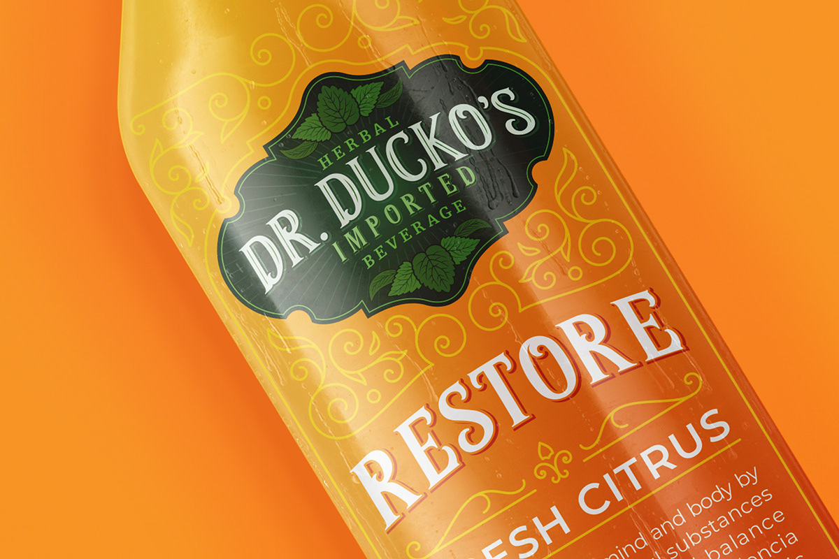
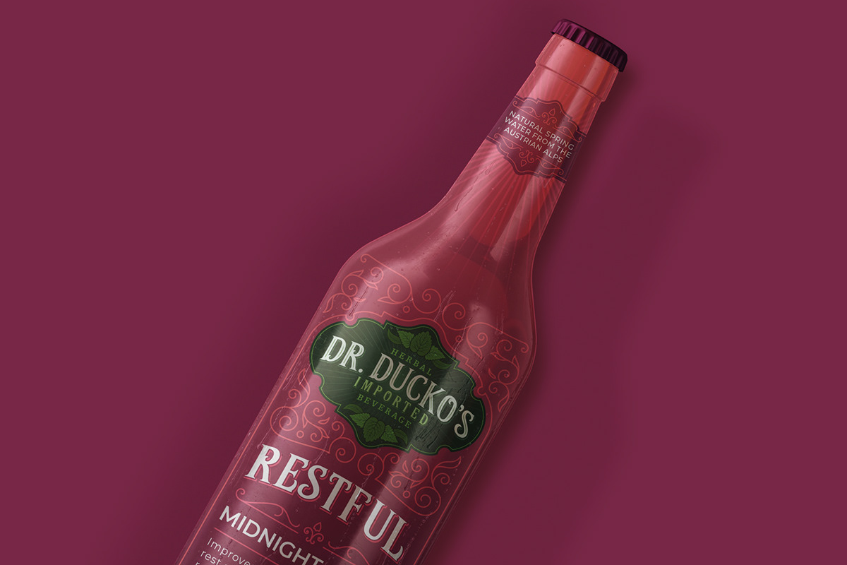
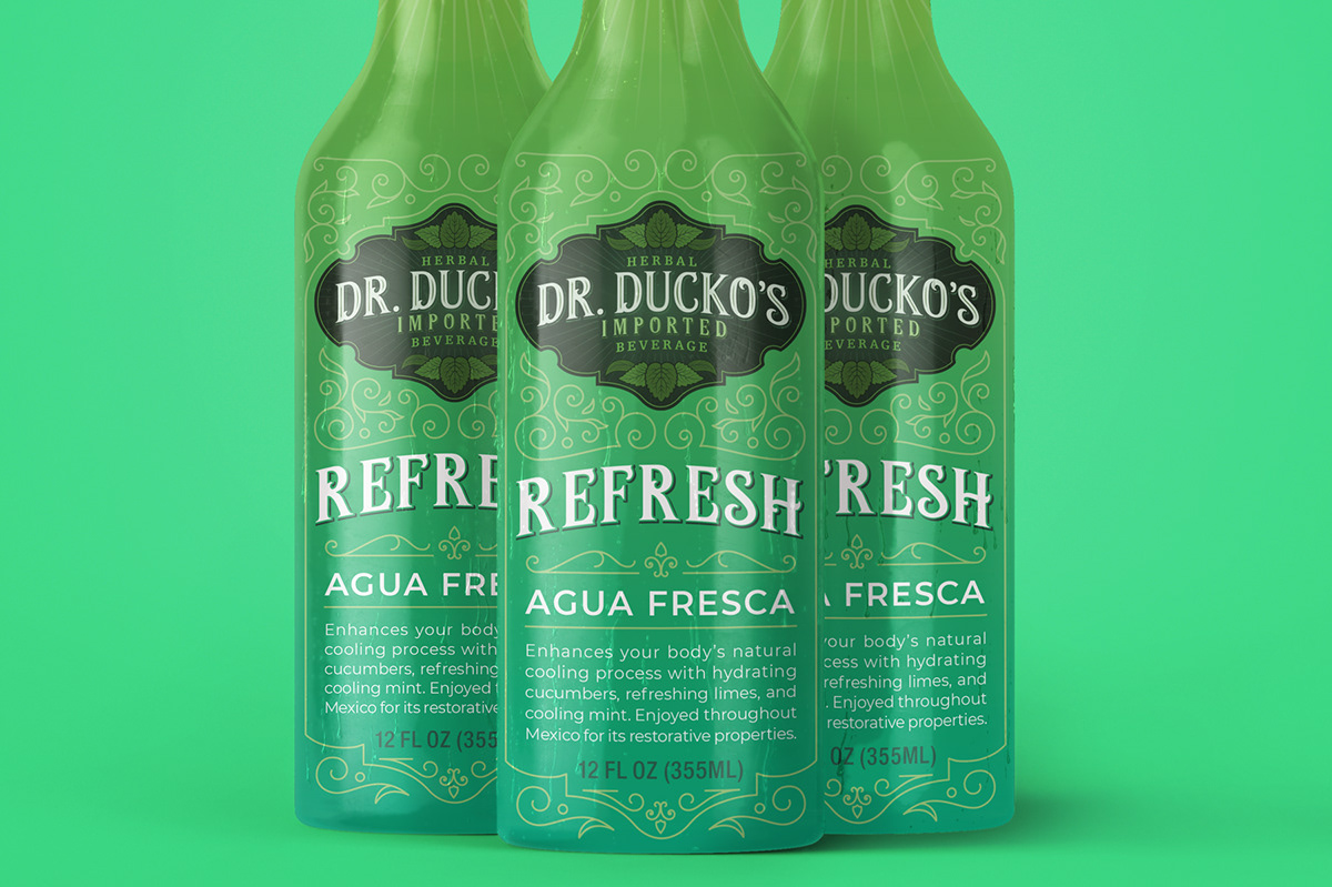
SOLUTION: In our research, we found that Dr. Ducko's recipe derives from a centuries-old tradition of herbal medicine in Europe, which is still popular because of its effectiveness. Honoring that tradition, we developed a bottle wrap that invokes the storied history of herbal beverages and apothecaries. We then flipped the script by using vibrant colors to provide a unique balance of history and modernity.
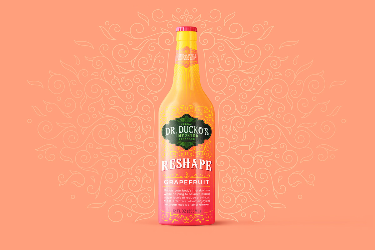

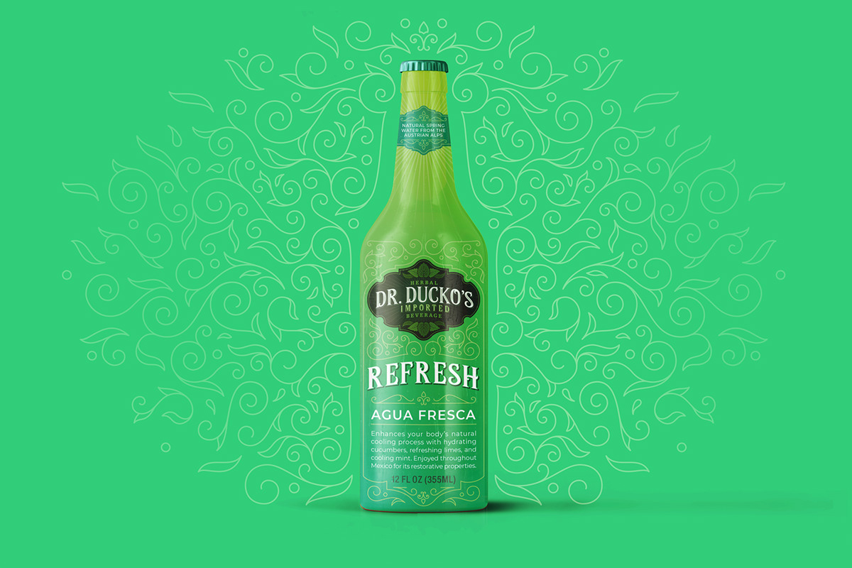
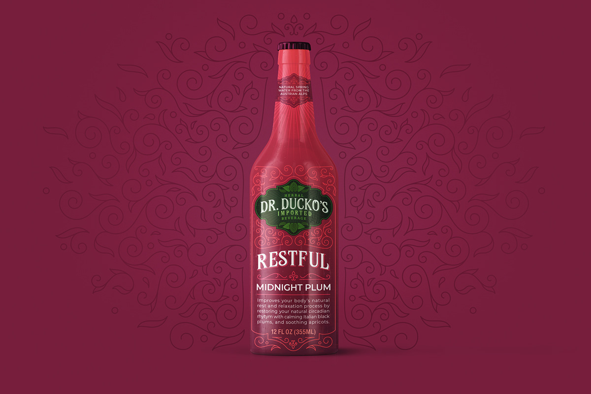
The product has a refreshing and energizing effect that we sought to embody in the logo itself. This is incorporated into a shield that invokes historical heraldry but also clearly conveys the herbal nature of the products with a burst of radial energy.