
Client: Safeway
Art Director: Alex Santiago, Tom Bosch
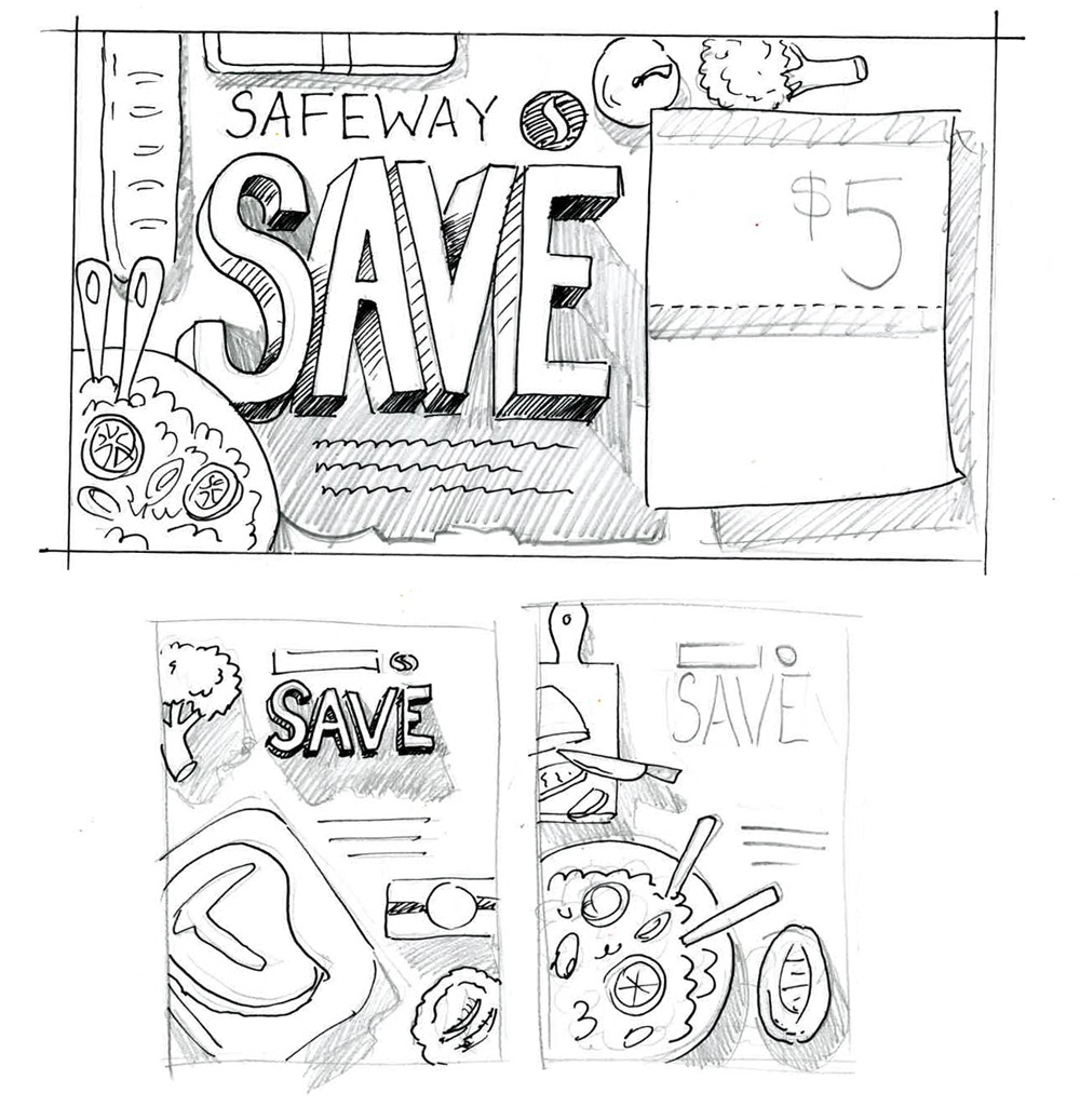
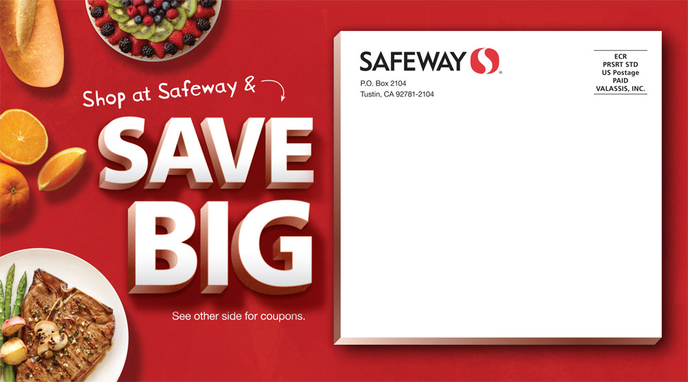
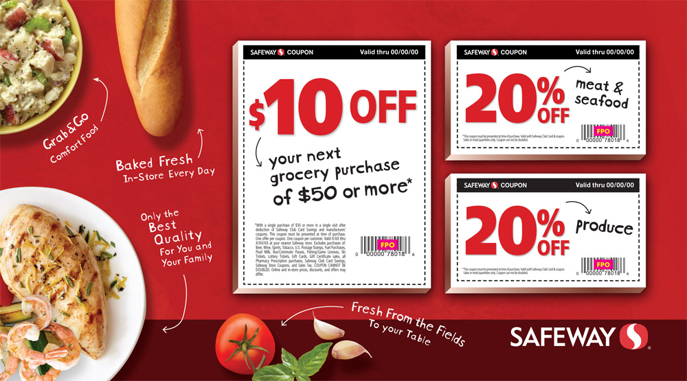
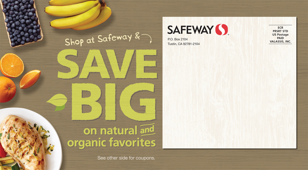
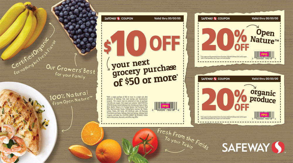
When faced with designing a competitive mailer I tried to design a more friendly look still with the Safeway red and feel. I decided doing a Birdseye view would give the receipient a more personal feeling for the postcard. This postcard is to entice customers to try shopping at Safeway or come back, that its not the same old Safeway, it's new and refreshed.


