
This is a winning design entry for “Unofficial Community Contest - Sony Playstation 4 Logo Design”, held by 99designs team in 2013. The competition gain global attention, since at the time the new PS4 console was supposed to be released. The console, as well as the logo, were highly anticipated.
The contest ended with 4,800 proposals, submited by 1,160 designers. Logo was featured in local news, creative blogs and online publications.
The contest ended with 4,800 proposals, submited by 1,160 designers. Logo was featured in local news, creative blogs and online publications.
"This design is exactly what we were looking for - clean, creative, and iconic. We felt that the design also fit well with Sony's past branding, but also looks to the future and helps build up the excitement and anticipation of their next generation of game console. Our first thought was that we could see ourselves flipping through a gaming magazine and seeing this as a full-page advertisement for the PS4 (or whatever they decide to call it). Great job, Nemanja, and congratulations on your win!"
99designs Team

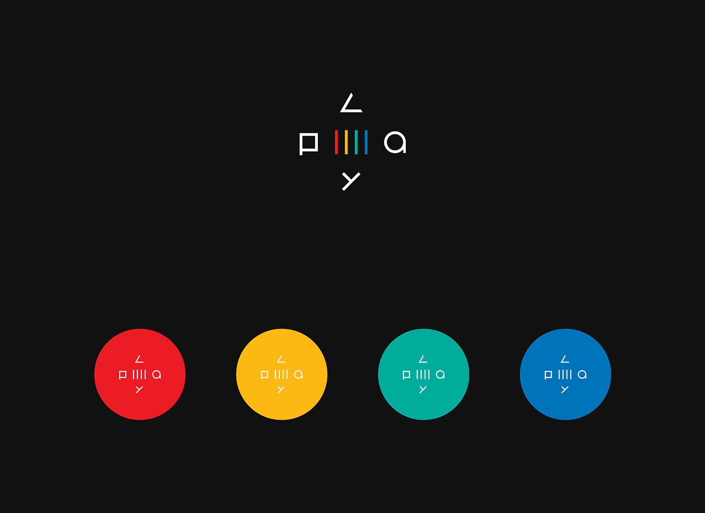
The inspiration for the logo were Playstation’s iconic buttons of the controller: the Square, Triangle, Circle and the X. With certain manipulations, every mark of the button became a letter that spelled the word “PLAY”. It was interesting to notice that number 4 was related to more than just being the fouth console: contoller has 4 main buttons, word PLAY (from PlayStation) has 4 letters, and the original Playstation logo had 4 colors.
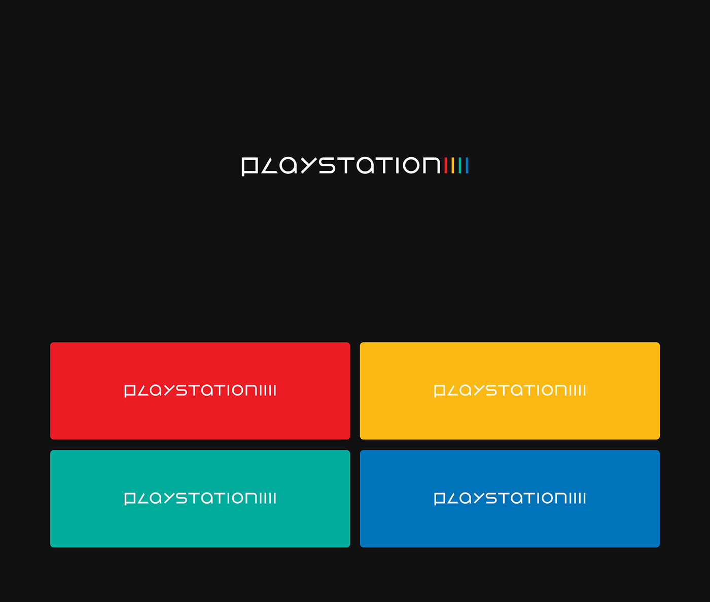
Removing the previous branding of “PS + number” (PS1, PS2, PS3), it became apparent that the new logo could be explored to act as an advertisement, because essentially the new logo would spell “PLAY 4”.
Removing the previous branding of “PS + number” (PS1, PS2, PS3), it became apparent that the new logo could be explored to act as an advertisement, because essentially the new logo would spell “PLAY 4”.
More accurately, it's spelled “PLAY IIII”. At the time, I wasn’t thinking much about this. But now, in 2020, which is when this presentation is refreshed, I see that it would create readability issues, so the advertising idea wasn’t explored. It would require to redesign the number to actually read like number 4. Maybe I will explore it sometime in the future.
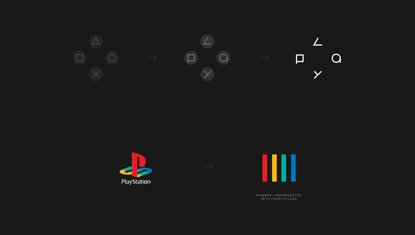
The chosen color scheme was identical to the original PlayStation One logo which at the time was the console of new, revolutionary generation of video games, just like the new Playstation 4 was anticipated to be. Because of this, the the logo has a retro vibe, indicating that it pays homage to the past.


Disclaimer:
This project was refreshed in 2020. The logo was slightly visually updated from the original winning entry. The idea remains the same.
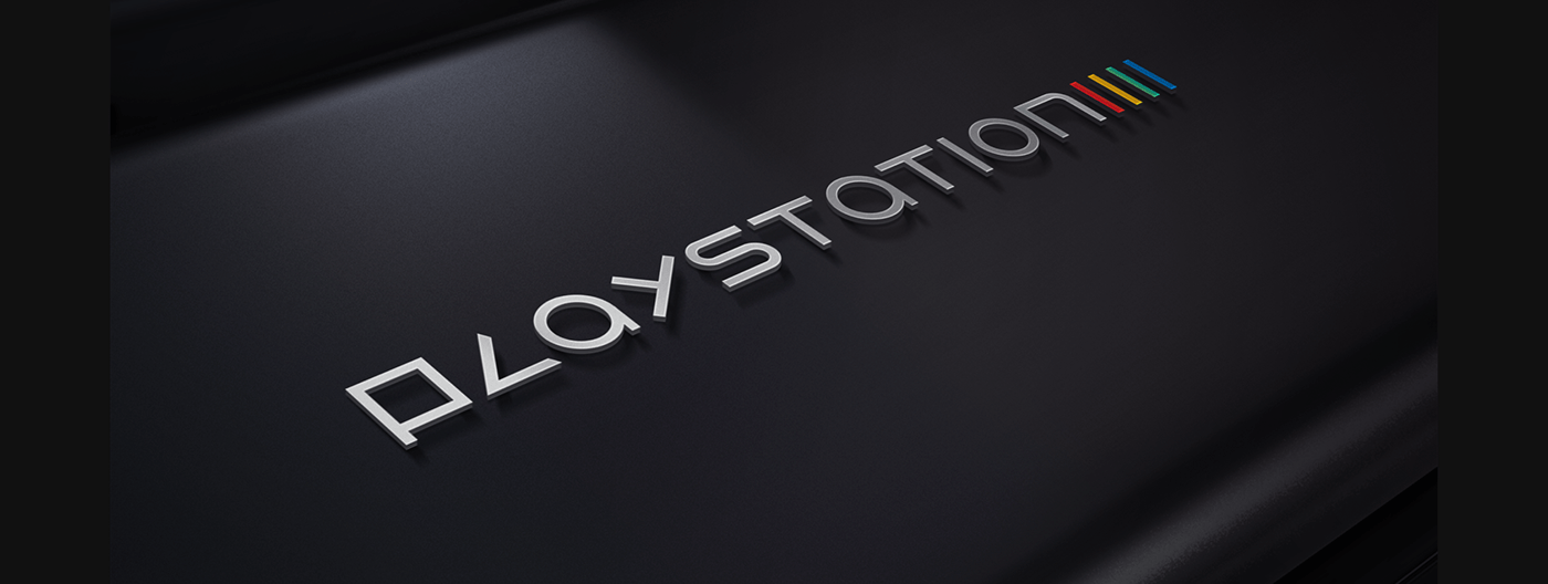
Photos may include presentation of the newer console.


