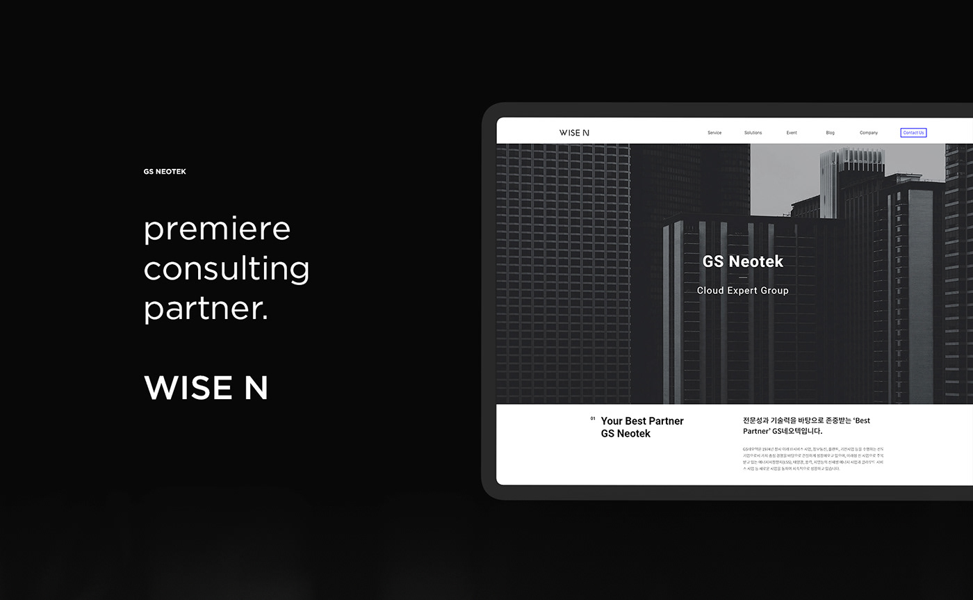


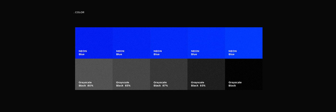


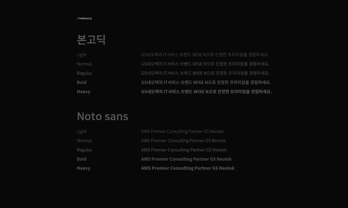


GS Neotek is a consulting company specializing in IT services under GS Group. We needed to develop a new brand identity to deliver more professional image to GS Neotek's clients. In order to symbolize fast and professional service, we have used the diagonal line motifs and solved the blue color in various materials and forms, thus establishing the unique identity of GS Neotek. We have designed the main tools necessary for sales such as homepage, brochure, booth, and various promotional tools to consistently give a deep impression to customers.
GS Neotekは、GS GroupのITサービスを専門とするコンサルティング会社です。 GS Neotekの顧客によりプロフェッショナルなイメージを提供するために、新しいブランドアイデンティティを開発する必要がありました。 迅速でプロフェッショナルなサービスを象徴するために、我々は対角線のモチーフを使用して様々な素材と形で青い色を解明し、GS Neotekのユニークなアイデンティティを確立しました。 私たちは、ホームページ、パンフレット、ブース、そしてさまざまな宣伝ツールなど、販売に必要な主要ツールを一貫してお客様に深い印象を与えるようにデザインしました。
Project Directing : Sungmin Kim
Brand Story & Planning : Hyojin Kim
Brand Identity Design : Sugyeong Kim
Brand Website Design : Heechan Moon
BI Application Design : Sugyeong Kim / Heechan Moon

