City Brand Identity - Istanbul
Level 02 - Nov 2018
Level 02 - Nov 2018
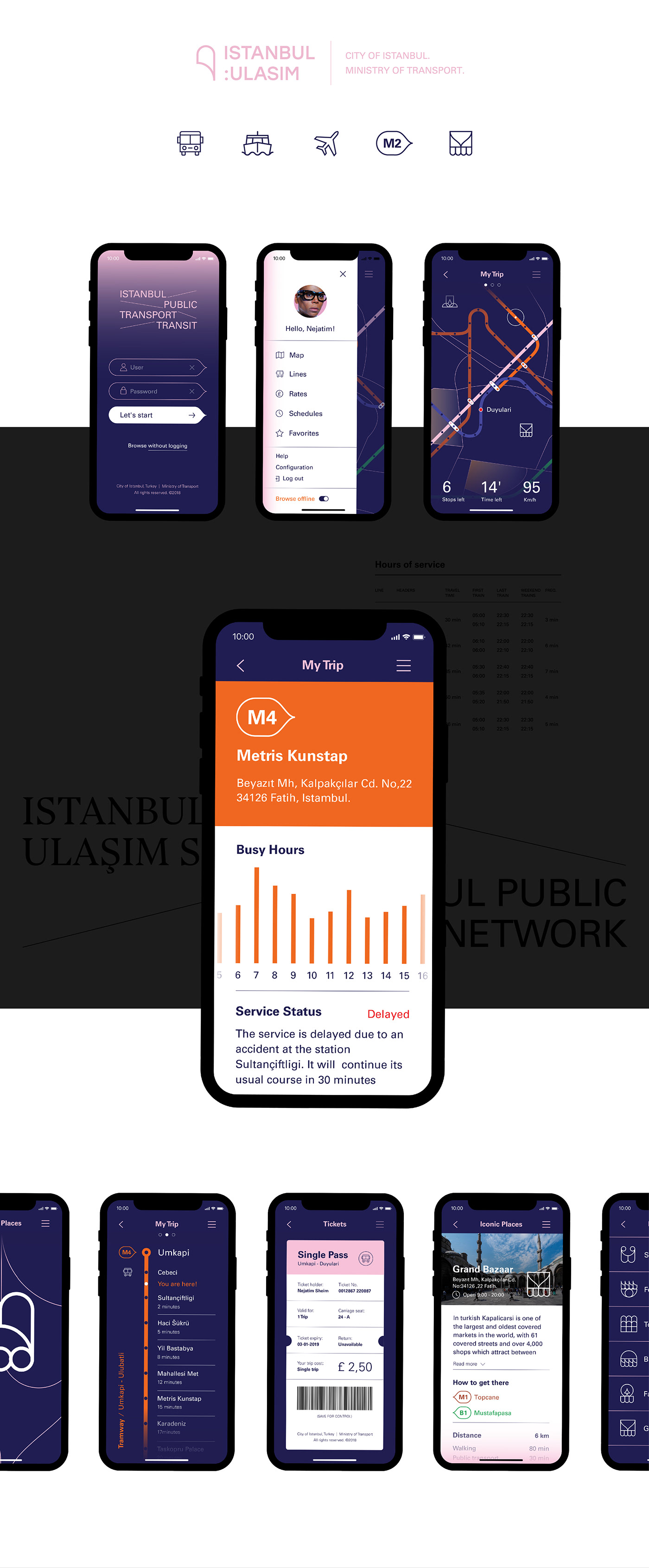
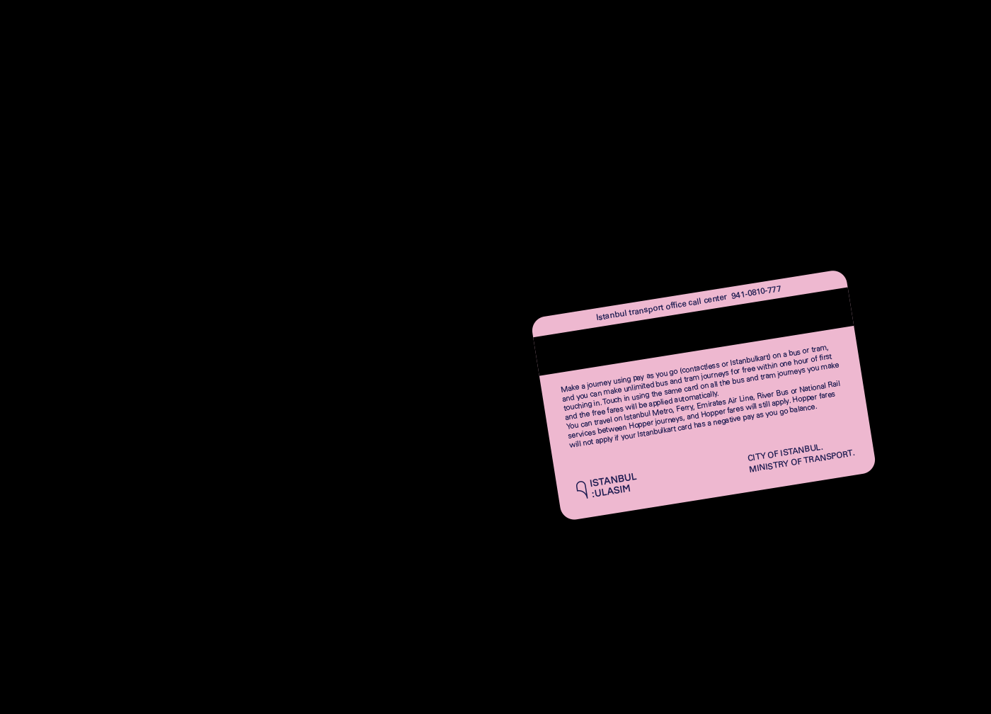
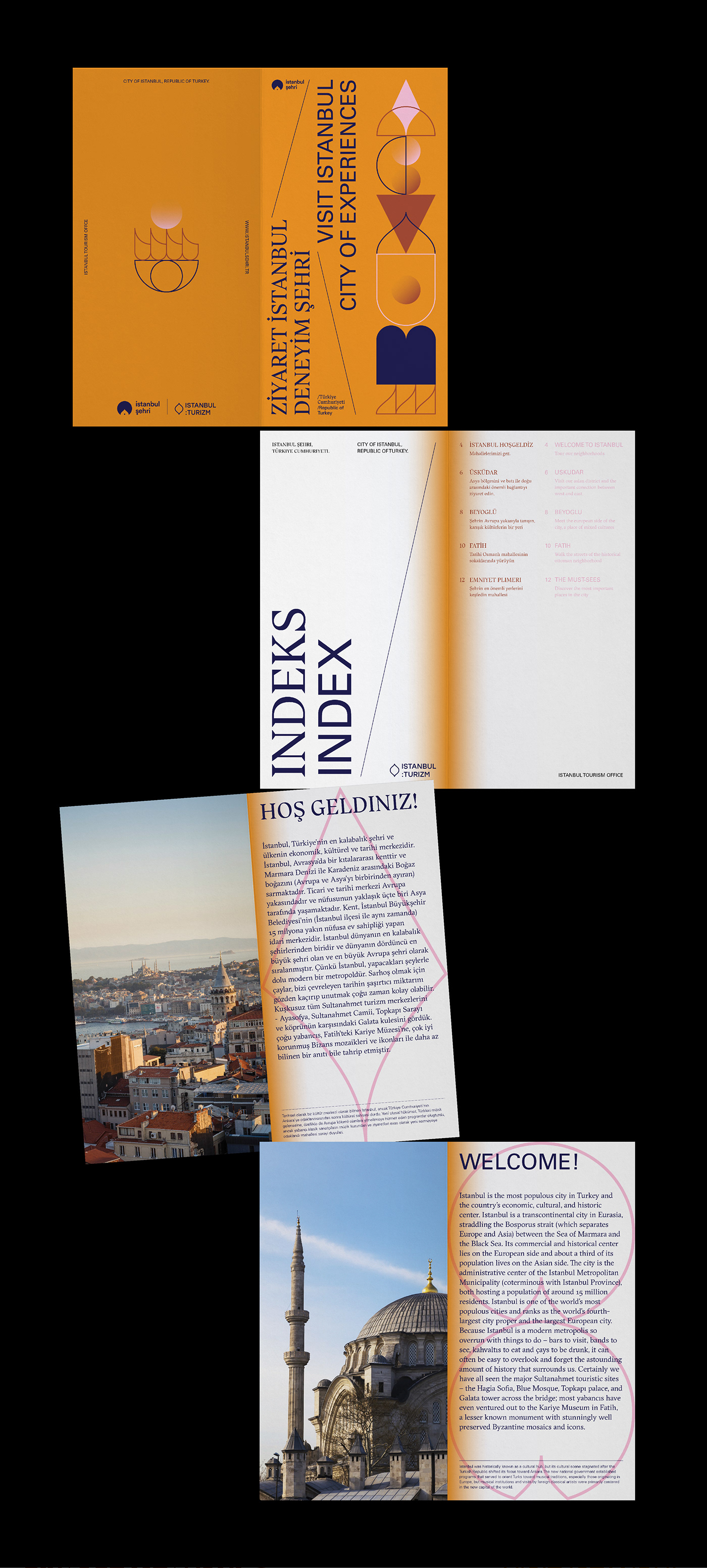
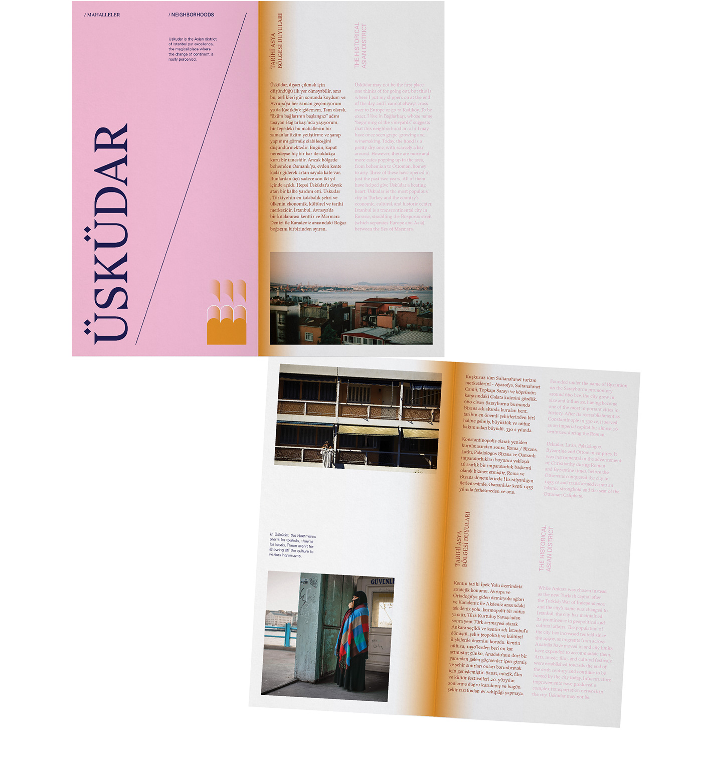
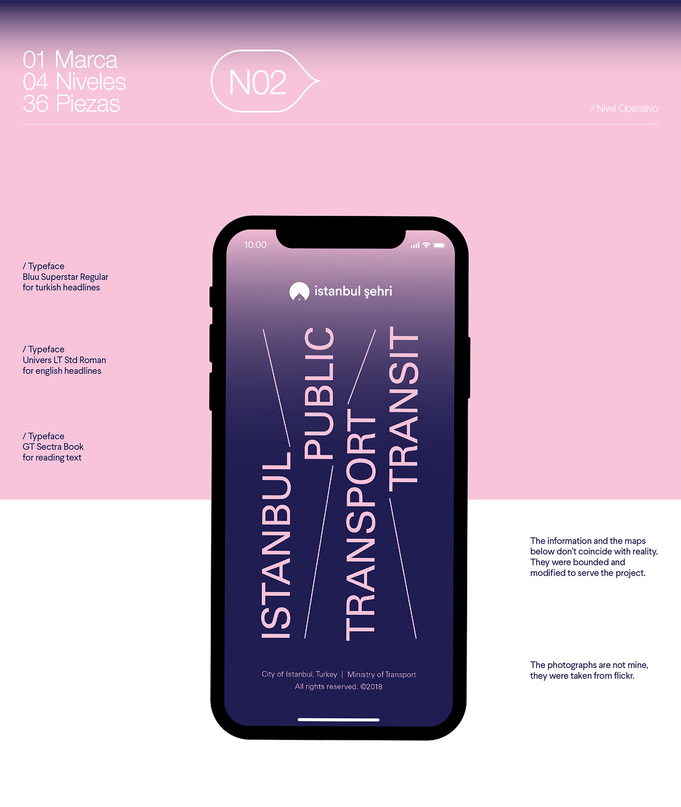
At the operational level, the typographic choice and the colour palette of Level 01 (base mark) are maintained but a change is made in the percentage of colour usage.
For the transport client, the colour blue (which was previously only used in typography) becomes predominant along with pink.
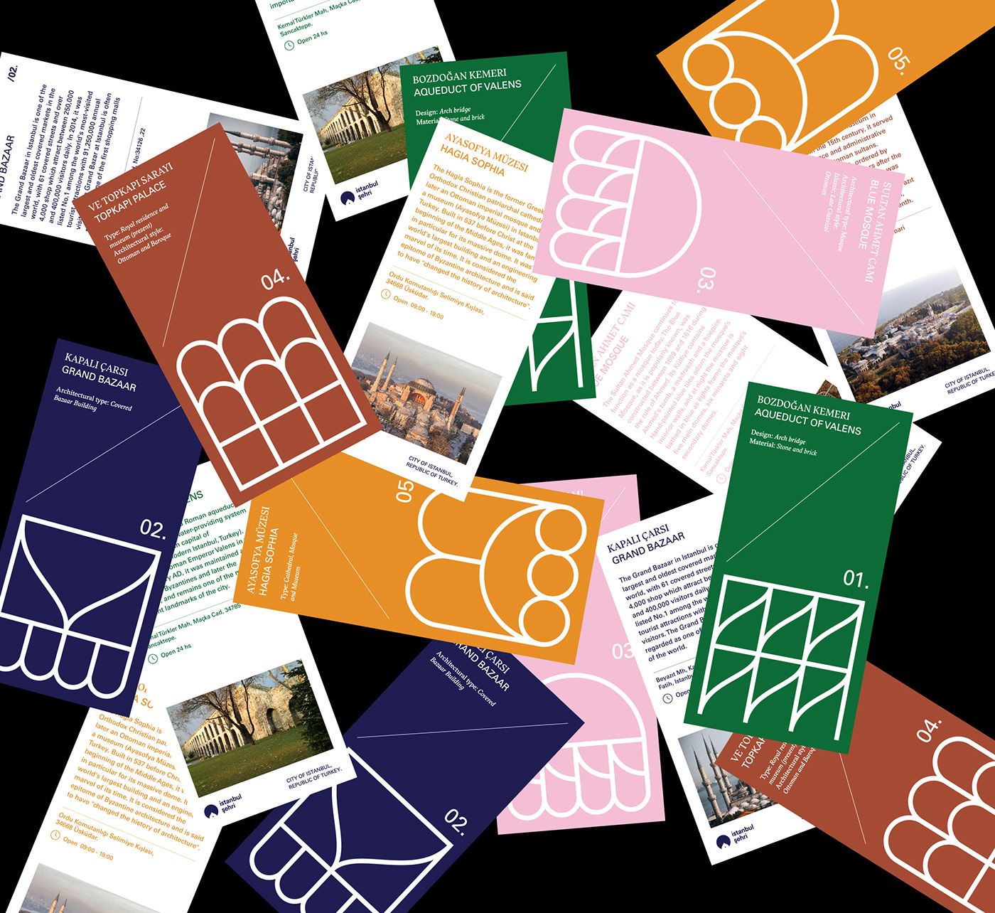
For the city client, orange is the colour that is used in the greatest quantity. Geometric shapes are reinterpreted to illustrate the iconic sites of the city and gradients are used in a smaller proportion than at the base level, only for details.