


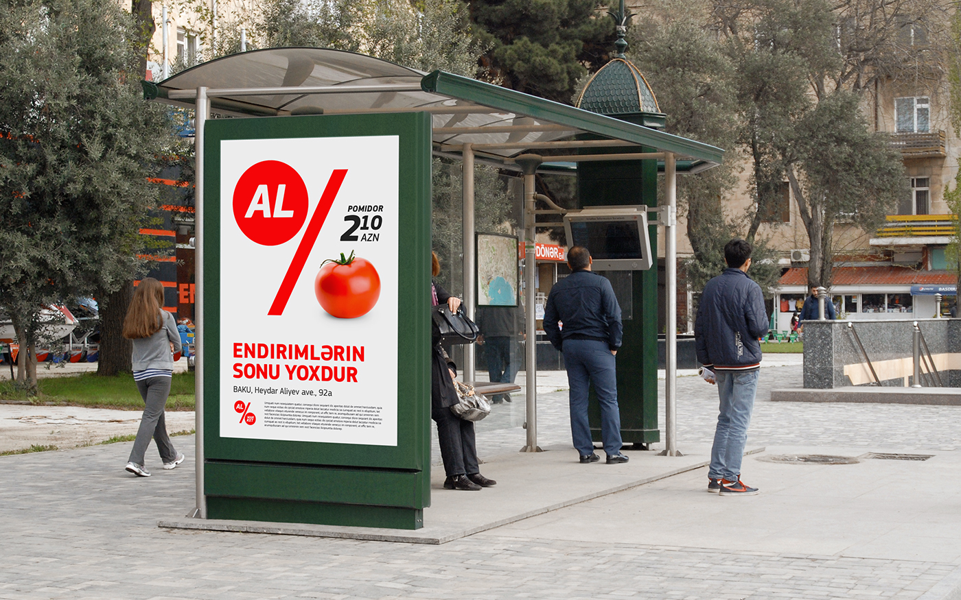
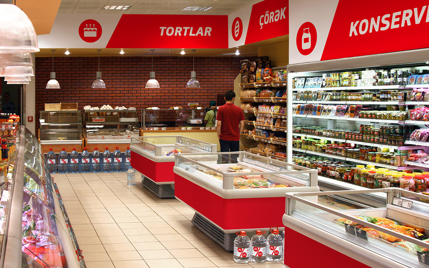
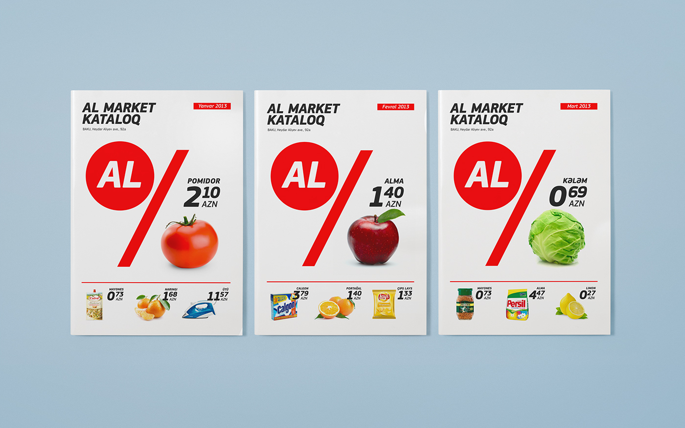
Al Market identity
Brief: We were asked to develop identity of a new supermarket chain in Azerbaijan, named Al Market, where «AL» means «BUY, TAKE».
Challenge: Identity was challenged to be clearly understood as a hard discounter from one side, but differ from various hard discounters image from another. It shouldn’t scream about low prices loudly, but deliver this message clearly, as well as be client oriented and flexible within wide range of brand implication.

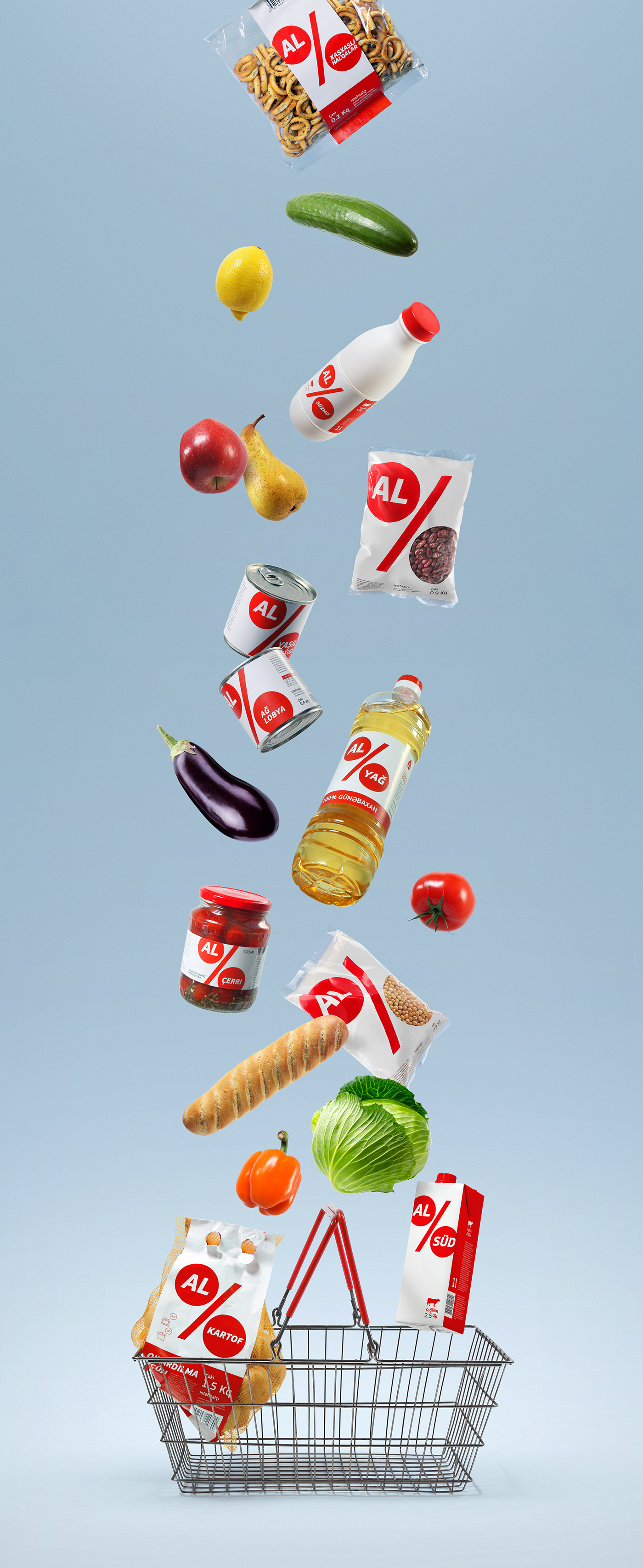
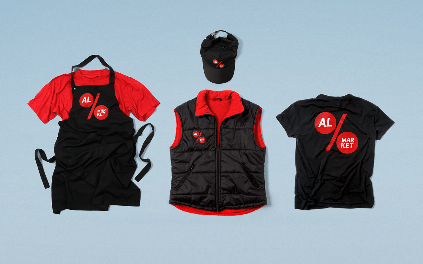
Solution: As a basis for logo we used the best known symbol of low prices and discounts. Communication system is constructed within the symbol, where the lower part changes into a text box, product image and any other image, so that «AL» becomes not just brand name but a part of a message and call-to-action.


Buy / As much as you can
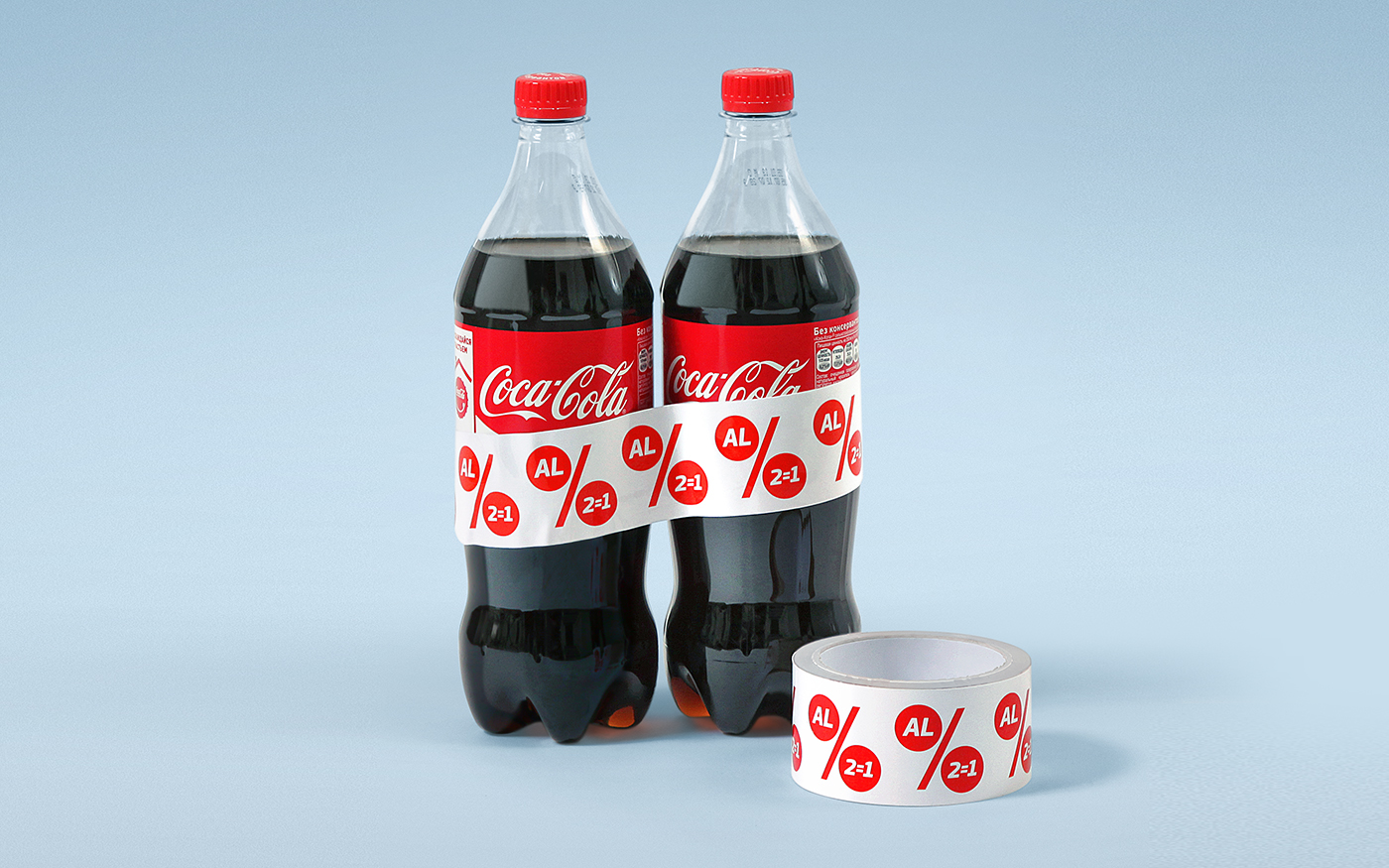

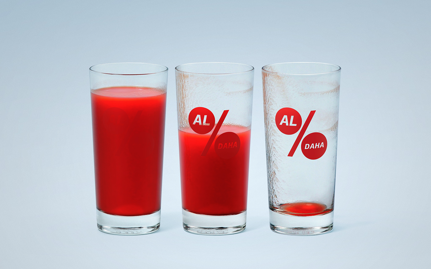
Buy / More

Buy / Fresh


