Cyklos - Electric Mobility
• Naming
• Identidade Visual
• Website
| 2018
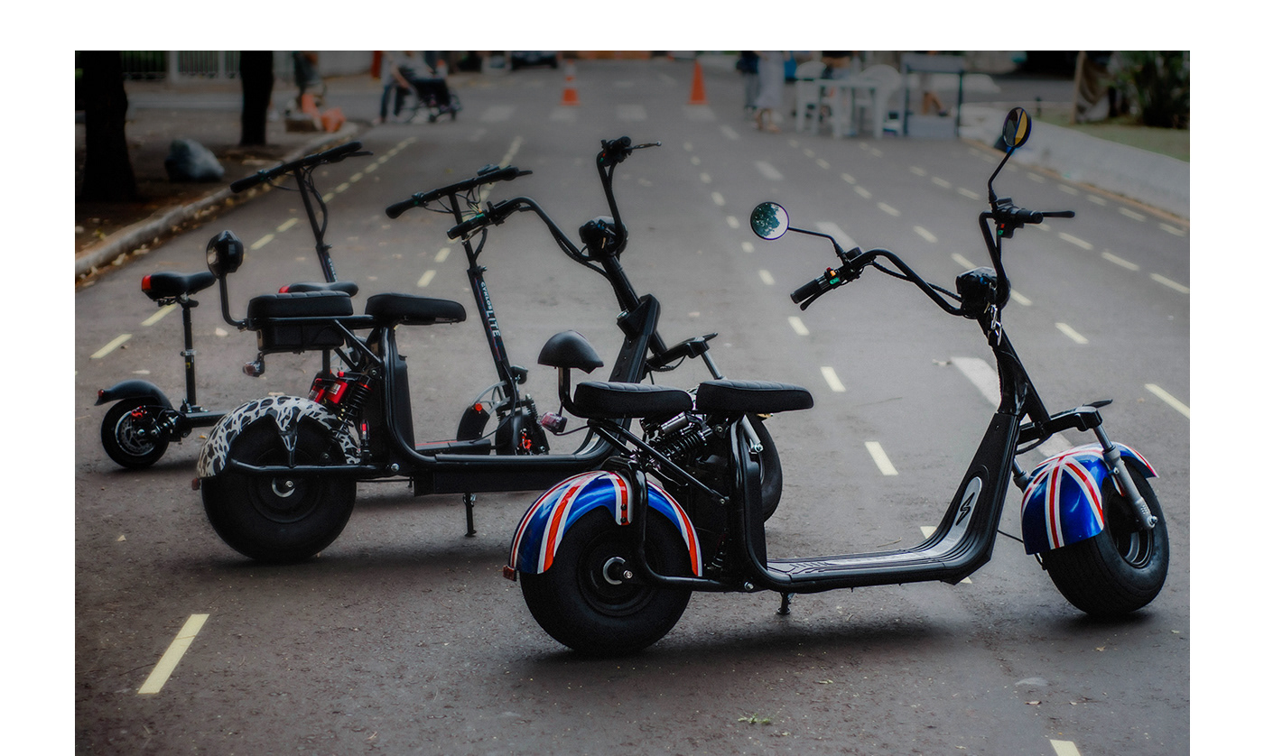
A Cyklos surgiu com o objetivo de oferecer uma alternativa de qualidade e desempenho em mobilidade elétrica. A preservação do meio ambiente através de soluções inteligentes em mobilidade, é sua principal missão, comercializando produtos 100% elétricos.
Para expressar esses valores, em complemento com a ideia de movimento, buscamos um nome curto de fácil memorização que pudesse transmitir renovação e eletricidade.
Sendo assim, encontramos na palavra "ciclo" o conjunto ideal de significado e boa pronúncia. Modificamos sua estrutura dando mais personalidade e exclusividade à marca, sem perder a originalidade da palavra.
Sendo assim, encontramos na palavra "ciclo" o conjunto ideal de significado e boa pronúncia. Modificamos sua estrutura dando mais personalidade e exclusividade à marca, sem perder a originalidade da palavra.
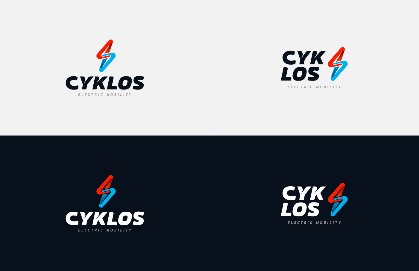
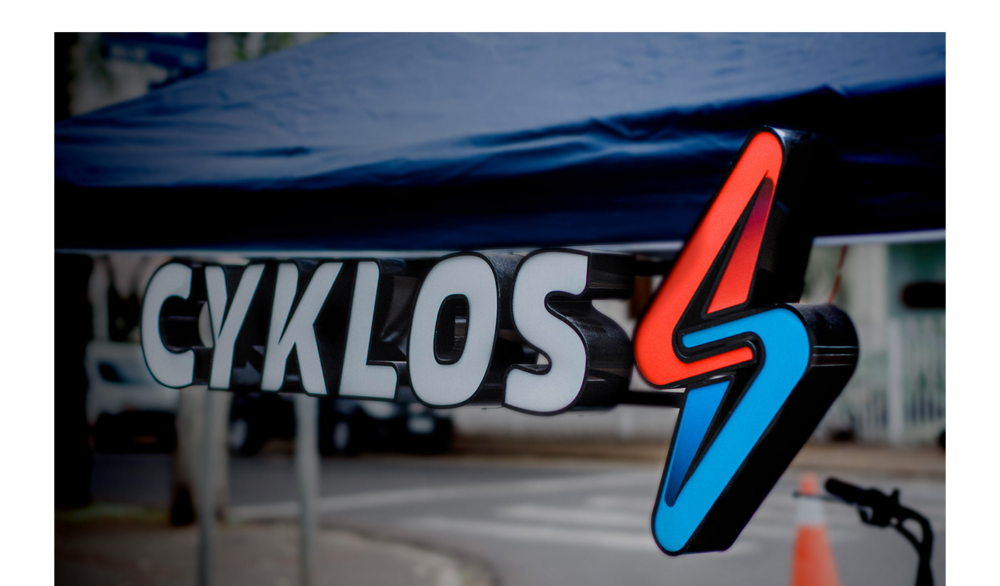
Na identidade visual, criamos um símbolo que une a imagem de raio/eletricidade com a de infinito. No complemento reforçamos o dinamismo e movimento que a marca representa, criando caminhos que vão, voltam, se cruzam e se afastam. Nas cores o foco foi transmitir vibração, encontramos isso na combinação de azul claro e vermelho em contraste com o preto de fundo. No entanto a identidade também possui versões que funcionam em fundo claro, caso seja necessário.
Além do nome e identidade visual, desenvolvemos também o layout de site: cyklos.com.br
Fotos: Beatriz Amaro
_
EN
Cyklos emerged with the objective of offering an alternative of quality and performance in electric mobility. Preserving the environment through intelligent mobility solutions is its main mission, selling 100% electric products.
To express these values, in addition to the idea of movement, we sought a short name that is easy to remember and that could transmit renewal and electricity.
Therefore, in the word "cycle" we find the ideal set of meaning and good pronunciation. We modified its structure giving more personality and exclusivity to the brand, without losing the originality of the word.
Therefore, in the word "cycle" we find the ideal set of meaning and good pronunciation. We modified its structure giving more personality and exclusivity to the brand, without losing the originality of the word.
In visual identity, we create a symbol that unites the image of lightning / electricity with that of infinity. In addition, we reinforce the dynamism and movement that the brand represents, creating paths that go, come back, cross and move away. In the colors, the focus was to transmit vibration, we found this in the combination of light blue and red in contrast to the black background. However, the identity also has versions that work on a light background, if necessary.
In addition to the name and visual identity, we also developed the website layout: cyklos.com.br