

[This post is constantly updated]
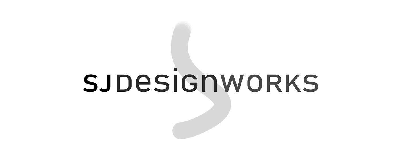
This is my official logo, currently. (August 1st, 2020+) Always improve. So, I also renamed my design business, "SJdesignworks" & improved the logo/graphics with a more sophisticated & focused brand.
A bit about this: Only less than 30% of the font is the same. Everything is tweaked, from the spacing to the height, from the weight to the width, & much more.
I carried over from the last logo below the idea of sophistication, with the clean layout & excitement, with the lowercase characters. This is repeated with each character's height at the exact same measure (sophistication), & in contrast no characters lining up with each other at their bottom (excitement, especially with the "i"'s dot sticking out & drawing your eye to the abstract "S/J" shape in the background.
There are more tricks. "SJ Design" was desired to carry itself through, so that is in a darker gray color, from the lighter gray "works". With "SJ" in black & "Design" in a very dark gray, "SJ Design" holds true.
With the addition of "works", I wanted to take my initials out of it without doing so. (This logo went through about 14 variations.) I also wanted "designworks" to imply projects I have done, over "designwork" as "some of my design work". To do this "designworks" is visually one word with "SJ" further spaced before the 'D'. This works out the "SJ Design" AND "DESIGNWORKS" which co-exists with the color.
Lastly, again, due to the color, subconsciously, it reads as: SJ Design, works. "Works" is all capital because its drives home that idea as a strong punctuation.
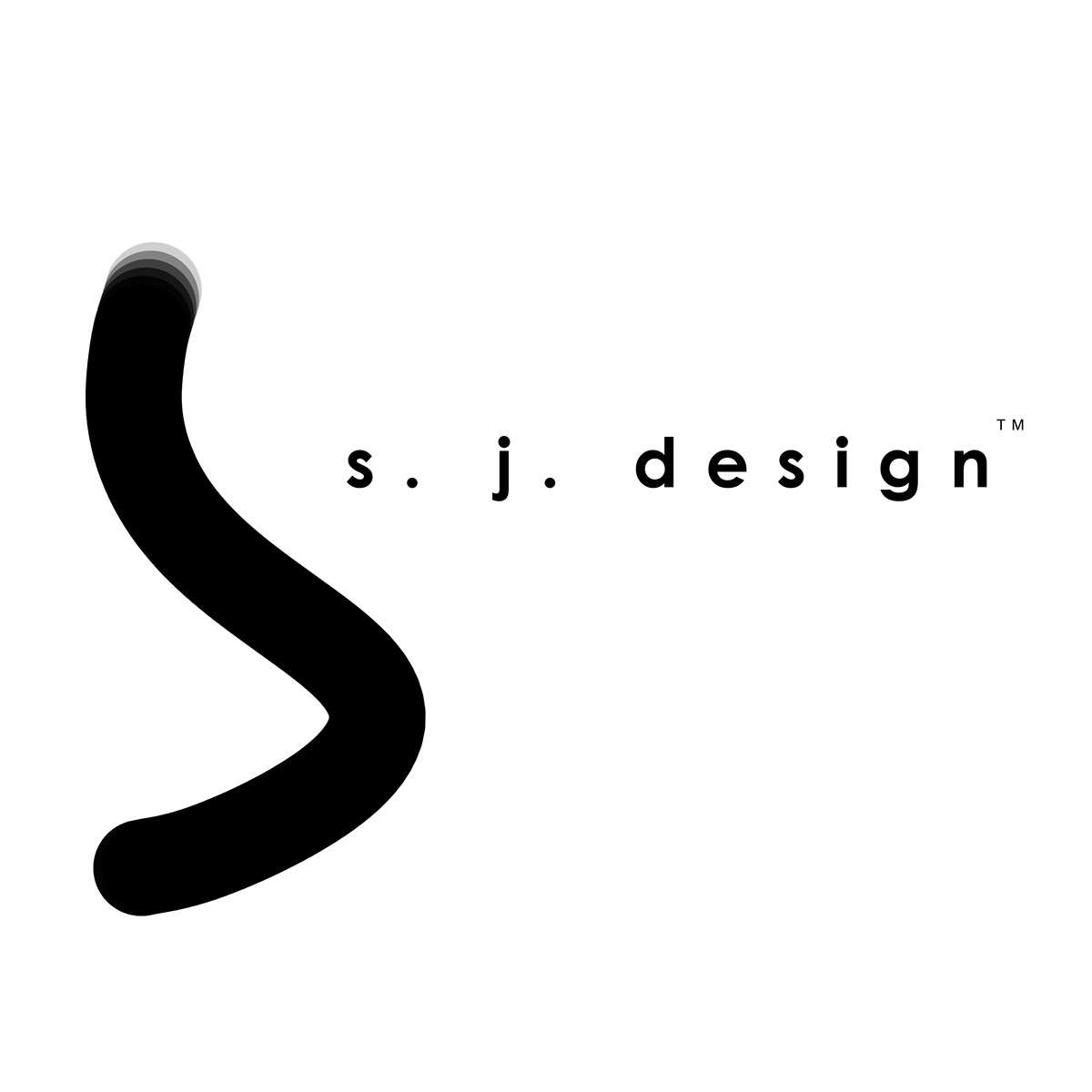
This was my original logo. (2017) This was a simple brush stroke that I loved how looked like it was both an "S" and a "J".


Here are my various logos (L to R): #1 (2017), #2 (2018) I invited the idea of squaring it off and smashing the lettering, #3 (2018) I finally changed it until a professor told me it resembled Super-man's "S" chest symbol, #4 (2019) I kind of sometimes use this one still. I like the colors which are three of my favorite. Aquamarine, since its always on the verge of blue and green, Purple and Gold because I got my design training at CCS (school colors) on a muted background. Much more modern than the last and easy to look at. I had the "D", "S", and "G" capital letters, whilst "e", "i", and "n" were lowercase & the reason was to show that I can combine both fun and work in a cohesive product & that as a designer I would provide my most sophisticated solution. #5 (2019/July2020) is a combination of #1, and #4.
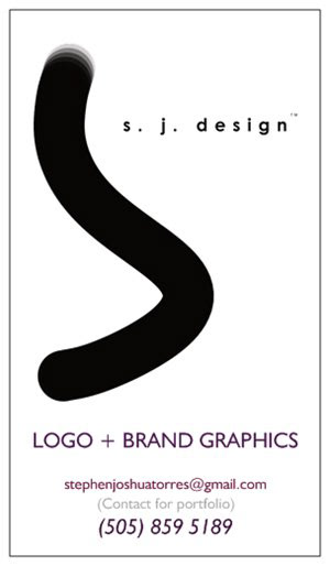
This is one of my business cards. This one is my focus on Logo & Brand Graphics.

This was a logo-graphic I was hired to do for the client above.
EC USA, LLC (2020)
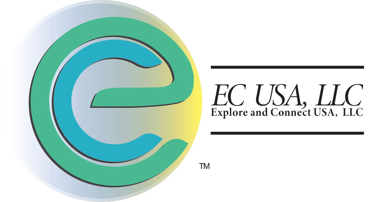
This was the first final logo (2019).


Here are some other semi-final variations of the same idea. The idea of exploration and the idea of connectivity are almost extreme opposites, so to place together an expressive and yet grounded concept was rather challenging. (First at the top left, is a much more graphically abstract logo, followed by a semi-abstract/lettered logo, and finally a letter based logo. -2019-) Another challenge was that the client needed both titles of "Explore and Connect USA, LLC" AND "EC USA, LLC" within the logo, but finally at the top of this scroll, I found a graphic that showed what I thought my client was about, which were, creativity and diversity, & opportunity and service.
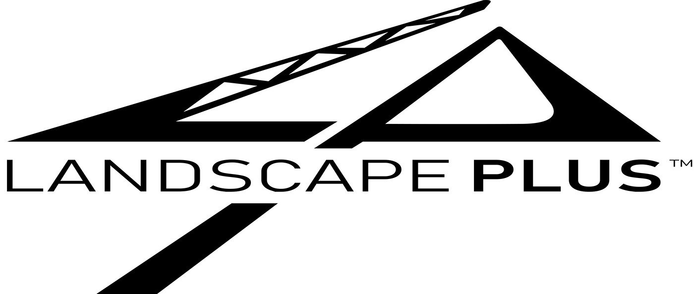
Here is a logo I worked on for year or two, here and there, for a rock crushing company. "Landscape Plus" is a crushing/mining company that specializes in crushed rock gravel and sand product and various ground work services in the local area of Mountainair, NM.
The "L" is a conveyor belt of a crusher plant, as the "P" is the gravel pile which is the symbol for how the products/material is made even though their brand name is more suggestive of a typical use of "landscape" which made it a challenge to help show what the company is. "Plus" is bold to help with the idea that its not a landscape service, rather a landscape material service.
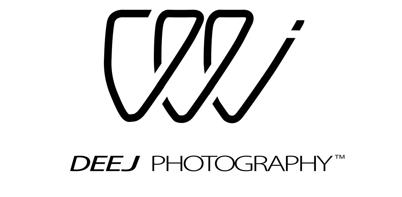
"DEEJ Photography" is a one-person photography outfit and studio. The client's/owner's nickname is "DEEJ" and so I created this abstract logo that was inspired from a cursive lettering.
(This is the 2019/Final version)
Changes that were made were the font which was needed to elevate the brand.
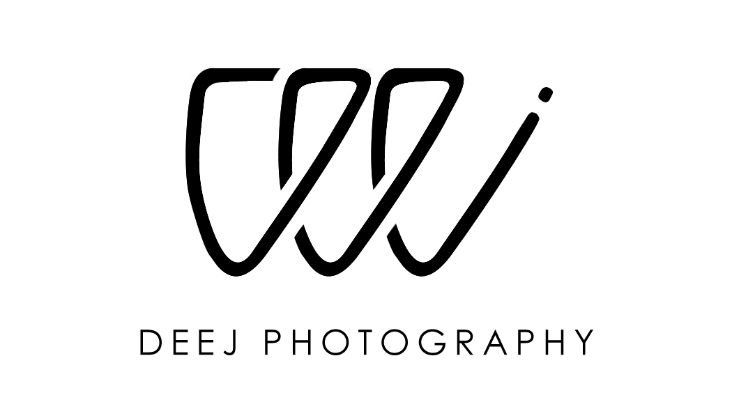
This is the first version from 2018 with more of a "hand-written" theme which plays with the idea of friendly service, as the lettering is modern and simple.


This is their business card, front and back. A simple suggestion of a camera face and lens with a space for a written appointment time/date.
If you're in the local area of Detroit, MI give her a look up!
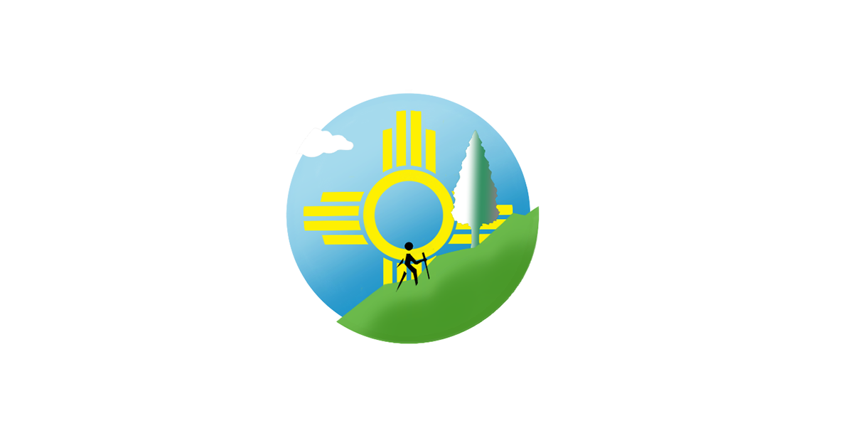
This was my first logo I was ever hired to do (2015) for a service in New Mexico named "Explore! New Mexico". The logo features the Zia-Symbol/NM's state flag symbol as while as a person hiking a trail.

These are ideation sketches, exploring the opportunities of the project.
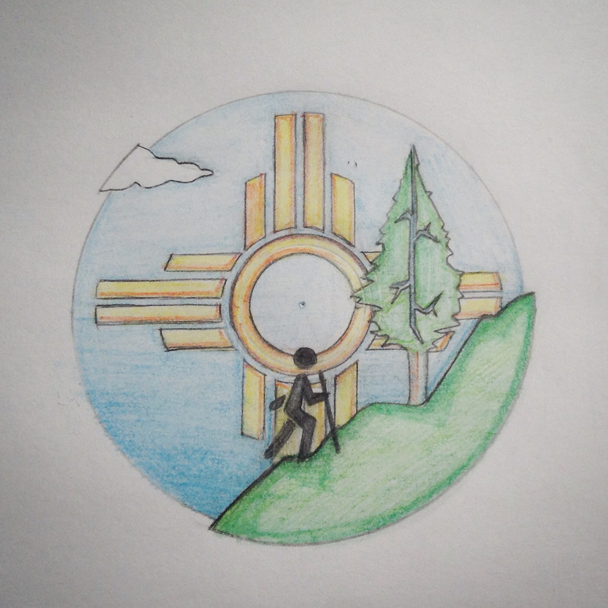
This was a final sketch of what I had envisioned.


I have a record/media label, which for, I created its logo. The original name was "JAI"SIC studios" (2015), then "Natatomaic Sound"(2016), but I then finally decided on "Absolute Faze Sound" (2018) which comes the term 'absolute phase' in audio producing which means "sounds as meant to be heard". The record label, owned by me, has been shortened to "AbFAZEsound". I liked the idea of a guitar pick, that morphed into a soft triangle that is both the "A" and the "B". Faze from phase, because that's just cool!
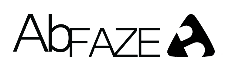

For 2021, (updated in December, 2020) I reverted it back to a more guitar pick shape with the sides curved out which is visually better than before. AbFAZE or AbF is a revamped company focusing on creator owned content in the music industry.


