DETROIT OPERA HOUSE
Identity for a famous staple of Detroit
Identity for a famous staple of Detroit
As a Detroit resident for about five years, I've come to associate the city with a few things. Of these things, Opera was definitely not on the list. However, during one of my last Visual Communications classes, my project partner Nick Moore & I were given the opportunity to redesign the identity for the Detroit Opera House. Through the use of thorough research, as well as hands-on experiences within the building & interviews with employees, we had come up with a clear vision of what the Detroit Opera House was doing right and, more importantly, what they needed to improve.
The Detroit Opera House (DOH) had a lot going for it. The interior was simply breathtaking (and I don't use that term often). It was a treat just walking around the inside, viewing the ornate details & sculptural aspects, and just feeling surrounded by class. The shows that they put on were also top-notch & entertaining even to those who would never feel the urge to see them otherwise (us). However, there is a set "type" that goes to the Opera. Although, DOH was trying to get younger people involved, they needed help. They also needed money & their advertising techniques left something to be desired. This is where we came in.
The Detroit Opera House (DOH) had a lot going for it. The interior was simply breathtaking (and I don't use that term often). It was a treat just walking around the inside, viewing the ornate details & sculptural aspects, and just feeling surrounded by class. The shows that they put on were also top-notch & entertaining even to those who would never feel the urge to see them otherwise (us). However, there is a set "type" that goes to the Opera. Although, DOH was trying to get younger people involved, they needed help. They also needed money & their advertising techniques left something to be desired. This is where we came in.
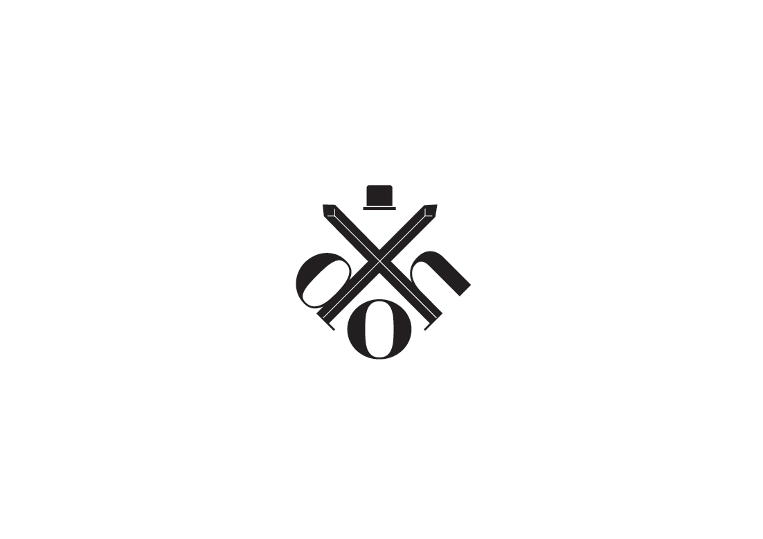
The first step we saw was to upgrade their logo. It worked, but it lacked a definite flare and could easily get lost in the crowd. Taking inspiration from the shapes & imagery within the structure, as well as the feelings we had while there, we decided that the logo should contain both class & structure. We simply shortened Detroit Opera House to DOH, but in our minds each letter also meant more than that. The D referred to Dance, the O is (of course) Opera, and the H stands for Histronics (a fancy word for Theatre). In the structure, we saw Opera as taking center stage, with Dance & Histronics protecting & supporting it. This was a metaphor for how we saw the company. Opera was it's main appeal, but Dance & Theatre also helped it flourish. Without all of these pieces, DOH would not be able to survive. We also added the "crown" at the top as it's default. The crown system comes into play in the next image, but this top hat simply emphasized the "class" of DOH, while acting as an official mark (this seal would be used for anything dealing with DOH as a whole).
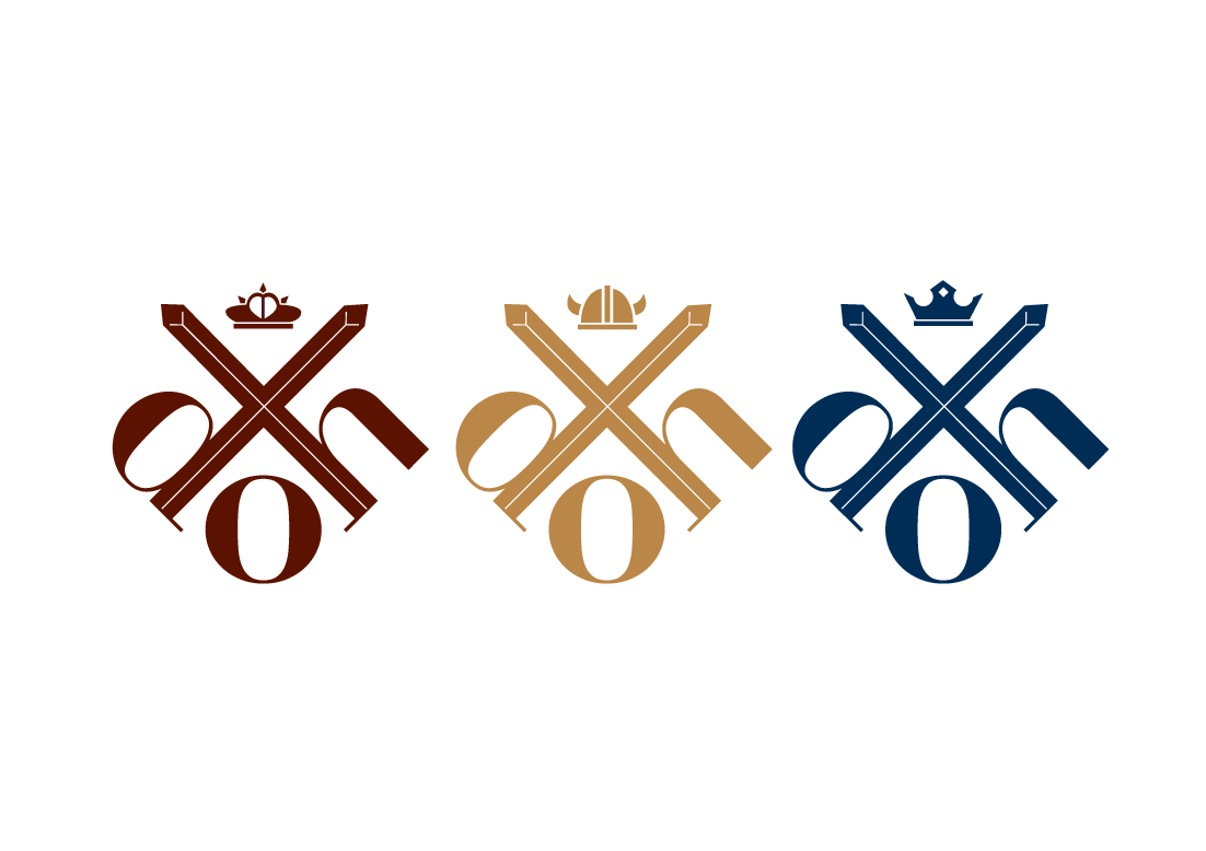
Here we move onto the different categories of DOH. We pulled the colors straight from the decor inside & developed different crowns for each of the main aspects. Dance was represented by the tiara, as well as the deep red. The red symbolized the energy & passion of Dance. Opera was represented by the viking helmet, as well as the gold. The gold symbolizes both the class associated with opera, as well as makes it stand out most out of the three. Lastly, Theatre is represented by the deep blue, as well as the king's crown. The deep blue represents the various feelings that Theatre can invoke from you, such as sadness.
We found it important to create these specific crowns / sub-logos to allow the viewer to know what is relevant to their interests, as well as to allow them to subscribe to just one category of entertainment. This allowed people to support both the Detroit Opera House as a whole, but a certain aspect as well. This is later employed further through pins & letterheads.
We found it important to create these specific crowns / sub-logos to allow the viewer to know what is relevant to their interests, as well as to allow them to subscribe to just one category of entertainment. This allowed people to support both the Detroit Opera House as a whole, but a certain aspect as well. This is later employed further through pins & letterheads.

The business cards kept the official seal & shape of the logo. The diamond it creates further emphasizes luxury & class that DOH is all about, as well as sets this card apart from others, making it memorable to anyone who receives it.
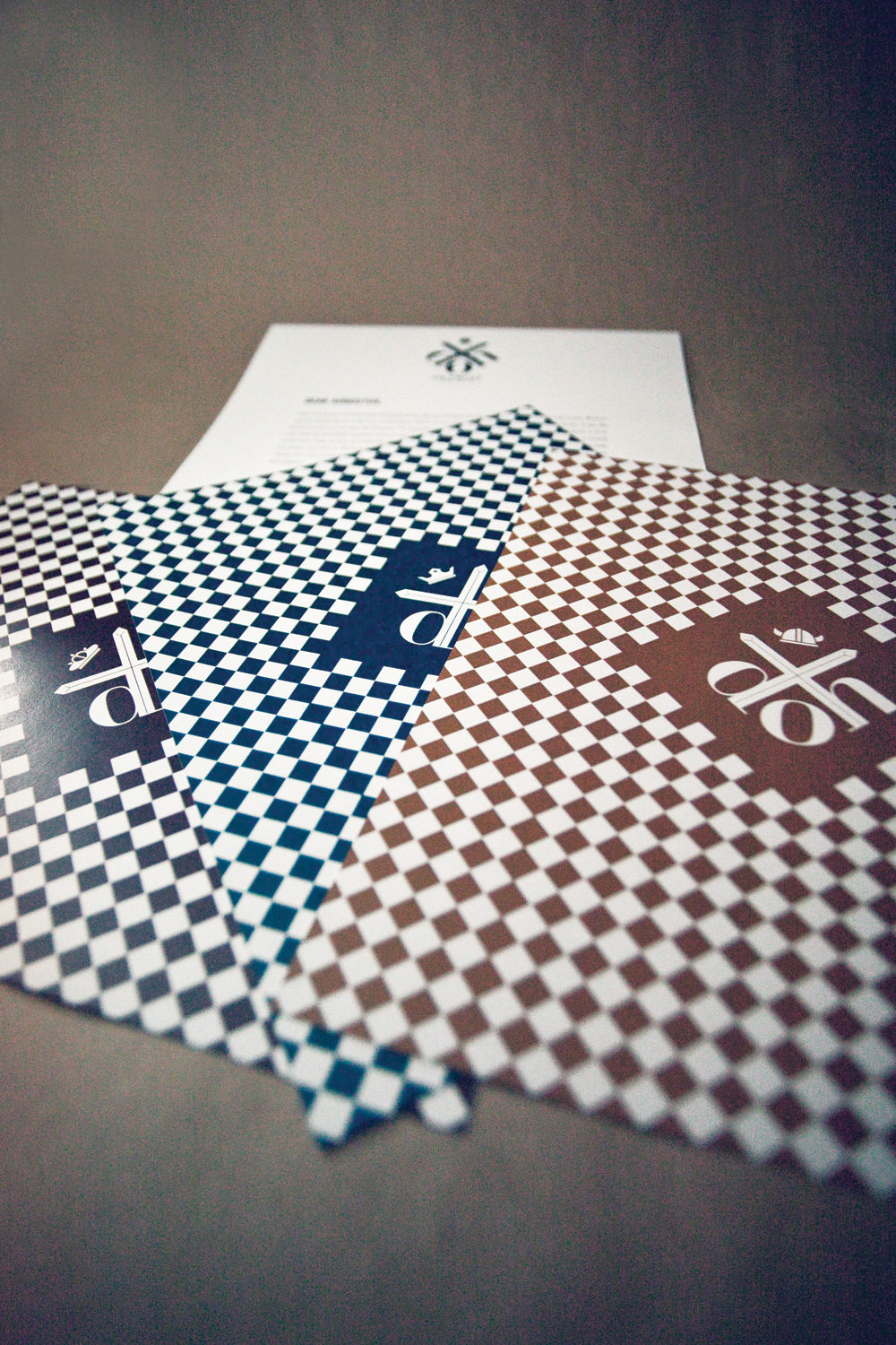
The stationary employs the two sides of the Opera House. The back side is intricate & detailed, much like the decor within. While the copy side is simple & elegant, like much of the entertainment. The crown system is also employed here, because most letters sent would be in reference to a certain show or donate that a patron made who belongs to a certain area of interest (like fans of Dance, fans of Opera, etc).
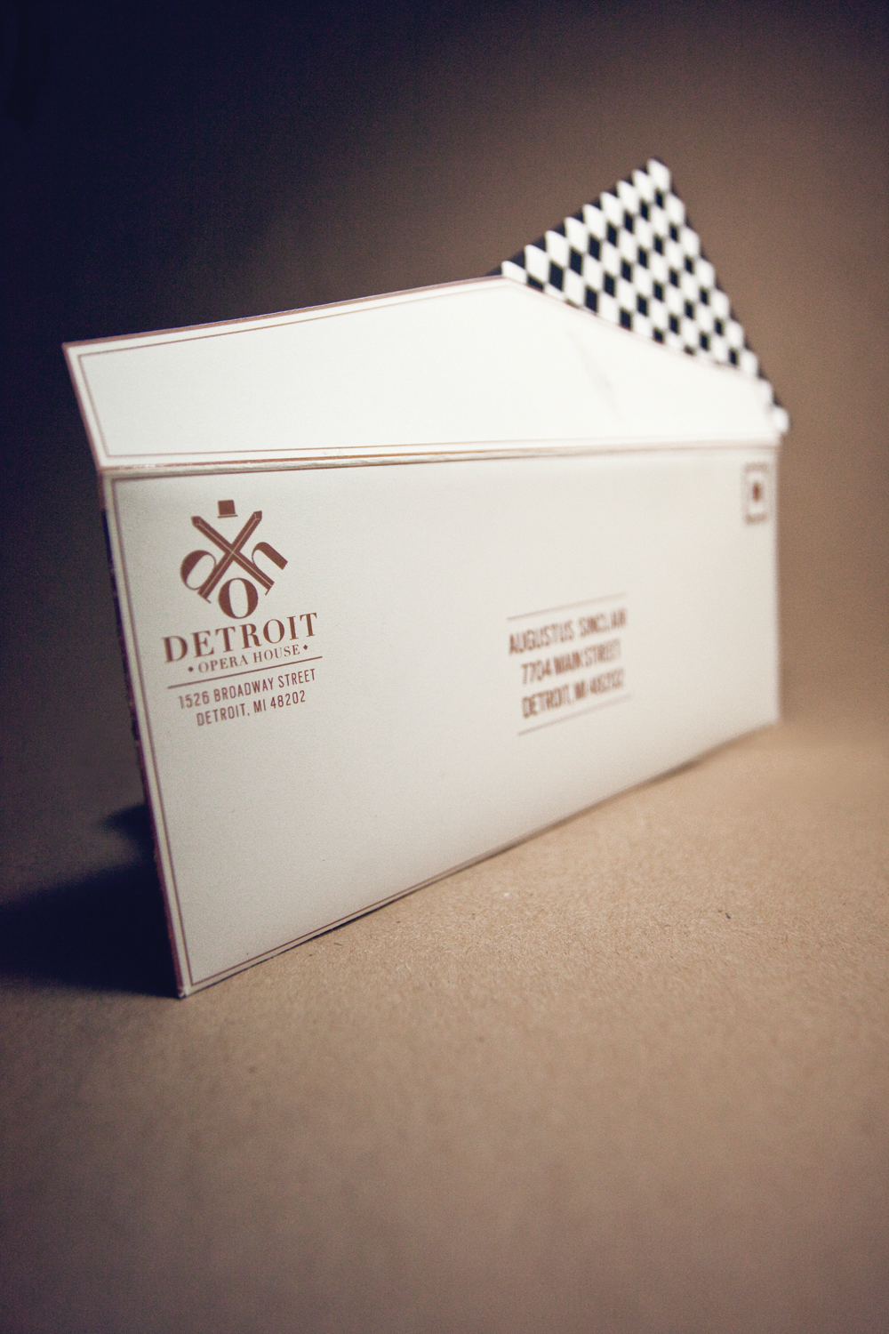
The envelopes were kept very low-key, but also eye-catching. We used the logo & simple lines of other pieces but made it appealing to the eye by making everything gold. "Who wouldn't want to get a gold envelope in the mail?" was our motto for this. I know that if I got a bunch of letters with this in the mix, I'd open the gold one first.

These pins would be sold to raise quick cash from patrons, as well as to spread the word of DOH. We created several shades of each primary color (deep, regular, light) with crowns. This allowed people to be fans of & show support for both DOH as a whole, as well as a certain aspect.
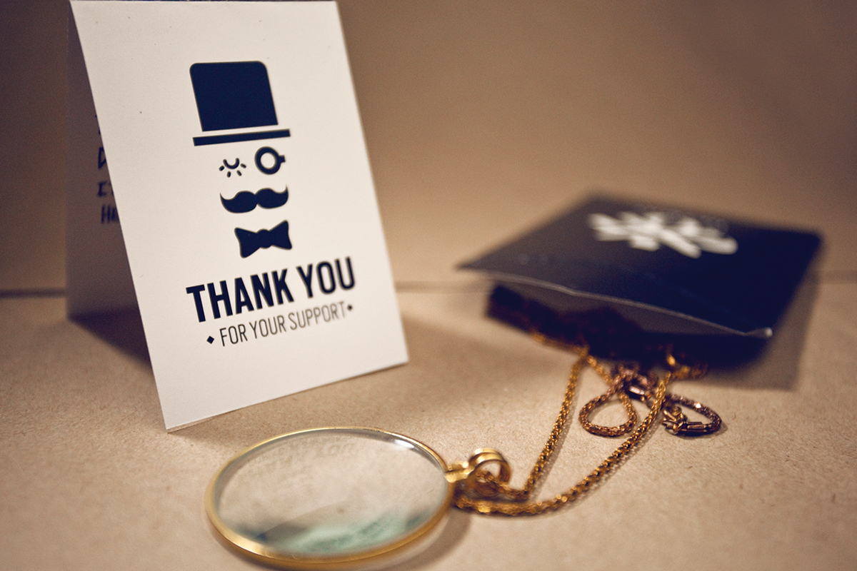
For patrons who donated a large amount, we created a thank you card & small gift of a monocle. This also showcases the employment of our mascot. My partner for the project & I both believed that any company needs a mascot, so we employed a moustachio'd face to DOH. He acted a merchandising agent, as well as a way to get a younger audience involved.
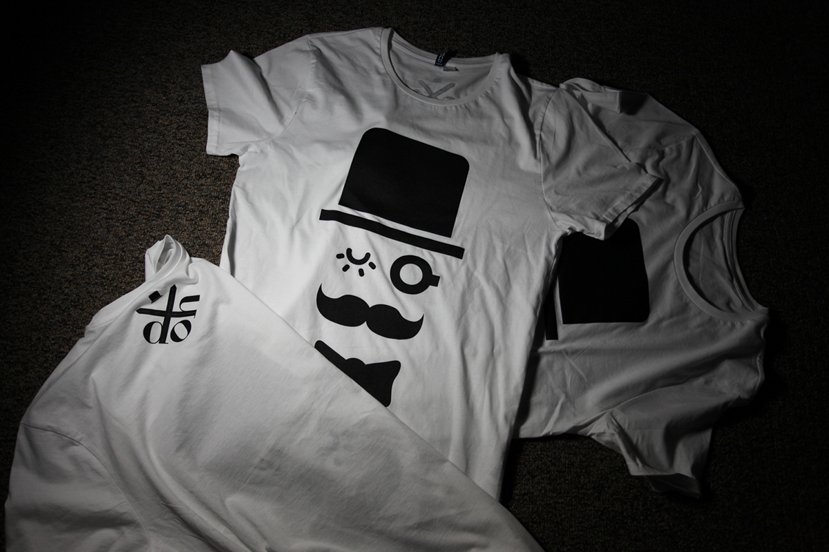
We end with the t-shirts of our mascot (screenprinted with the help of Nick's brother, Nate Moore with VG Kids in Ypsilanti, MI). These would be used to raise money (much like the pins) and to show support. We wanted to create something that most people would want to wear (as well as ourselves) but also distinctly showed support for DOH.
In fact, I still wear mine.
In fact, I still wear mine.
