
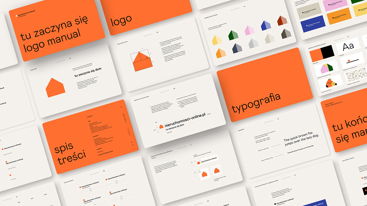
“This is where the home begins” – says the claim of the real estate portal nieruchomosci-online.pl. The claim itself has become the starting point for a new brand strategy and our work. Acting on the basis of the company’s strategy and in close cooperation with the client and their design and marketing departments, we have prepared a capacious, vivid visual identity that adapts to the activities of the portal’s user and can be applied in many different formats. We decided that the industry leader could “take over” the simplest symbol of the house, while we managed to derive a complex message system from this simplicity.
Nieruchomosci-online portal, the largest ad database in Poland, releases a huge amount of materials. So we needed a flexible, moveable sign that could be adapted to the content. As well as solutions that would allow us to adjust the message to the context. A system that will last, will stand up to the future rebuildings of the service, and at the same time will be economical and legible in its reception – just like the portal itself.


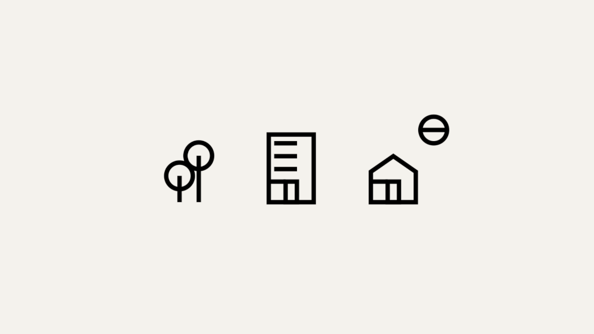
The sign has become an interpretation of the claim. A new place to live means many new possibilities, both to design your own space and to open up to a fresh start. Following this lead, we have applied a variable form of the sign that adapts to the content searched for, the message used or the context, giving fun opportunities. We showed the real estate-online team a direction that could be further developed to suit the dynamic market situation. The clear, capacious identification has an element of adventure and draws in the emotional aspect of the search.
Initially, we considered a static sign, but we decided that “home” means something different for everyone: while some people pay attention to the size of the surface, others focus on its layout or the surroundings. So we set the house symbol in motion. By rotating and animating it, we were able to match it to almost any search term. Depending on the message or action, the symbol changes size or shape. It becomes a moving key visual. By simplifying other elements, the system remains clear and legible.


Copyrights
Client: NNV Sp z o.o.
Agency: Hopa Studio
Project manager: Maria Lengren
Designer: Marcin Paściak
Motion design: Piotr Hołub
Agency: Hopa Studio
Project manager: Maria Lengren
Designer: Marcin Paściak
Motion design: Piotr Hołub
Scope of work:
– logo
– visual identity
– brand manual
– visual identity
– brand manual


